Intro
Receiver Operating Characteristic (ROC) plots are useful for visualizing a predictive model’s effectiveness. This tutorial explains how to code ROC plots in Python from scratch.
Data Preparation & Motivation
We’re going to use the breast cancer dataset from sklearn’s sample datasets. It is an accessible, binary classification dataset (malignant vs. benign) with 30 positive, real-valued features. To train a logistic regression model, the dataset is split into train-test pools, then the model is fit to the training data.
from sklearn.datasets import load_breast_cancer
from sklearn.linear_model import *
from sklearn.model_selection import train_test_split

# Load datasetd
dataset = load_breast_cancer()

# Split data into train-test pools
train, test, train_labels, test_labels = train_test_split(dataset['data'],
                                                          dataset['target'],
                                                          test_size=0.33)

# Train model
logregr = LogisticRegression().fit(train, train_labels)
Recall that the standard logistic regression model predicts the probability of a positive event in a binary situation. In this case, it predicts the probability [0,1] that a patient’s tumor is ‘benign’. But as you may have heard, logistic regression is considered a classification model. It turns out that it is a regression model until you apply a decision function, then it becomes a classifier. In logistic regression, the decision function is: if x > 0.5, then the positive event is true (where x is the predicted probability that the positive event occurs), else the other (negative) event is true.
With our newly-trained logistic regression model, we can predict the probabilities of the test examples.
# Rename, listify
actuals = list(test_labels)

# Predict probablities of test data [0,1]
scores = list(logregr.predict_proba(test)[:,1])

# Equivalently
import math
def sigmoid(x):
    return 1 / (1 + math.exp(-x))
scores = [sigmoid(logregr.coef_@test_i + logregr.intercept_) for test_i in test]
While the probabilities were continuous, we can discretize predictions by applying the decision function, the standard application of logistic regression.
# Predict binary outcomes (0,1)
predictions = list(logregr.predict(test))

# Equivalently
predictions = [1 if s>0.5 else 0 for s in scores]
And measure the accuracy of those predictions.
print("Accuracy = %.3f" % (sum([p==a for p, a in zip(predictions, actuals)])/len(predictions)))[Out] Accuracy = 0.957
To visualize these numbers, let's plot the predicted probabilities vs. array position. The higher an example's position on the vertical axis (closer to P=1.0), the more likely it belongs to the benign class (according to our trained model). On the other hand, there is no significance horizontal distribution since it's just the position in the array; it's only to separate the data points. Blue circles represent a benign example; red squares, malignant. The line at P=0.5 represents the decision boundary of the logistic regression model.

Anything above the line is classified as benign, whereas on and below are classified as malignant. Under this visualization, we can describe accuracy as the proportion of points placed inside their correct color.
However, while statistical accuracy accounts for when the model is correct, it is not nuanced enough to be the panacea of binary classification assessment. If you want to know more about the problems with accuracy, you can find that here. For now, we can review the confusion matrix and some of its properties to dig deeper into assessing our model.
Confusion Matrix
When calculating the probabilities of our test data, the variable was deliberately named scores instead of probabilities not only because of brevity but also due to the generality of the term 'scores'. In the case of logistic regression, we've considered the predicted probabilities as the scores, but other models may not use probability.
The confusion matrix is a 2x2 table specifying the four types of correctness or error. There are articles on confusion matrices all over, so I will simply describe the table elements in terms of our model:
- True Positive: Model correctly predicts benign
- False Positive: Model incorrectly predicts benign instead of malignant
- True Negative: Model correctly predicts malignant
- False Negative: Model incorrectly predicts malignant instead of benign
We can easily represent the confusion matrix with the standard library's collections.namedtuple:
import collections
ConfusionMatrix = collections.namedtuple('conf', ['tp','fp','tn','fn'])
To calculate the confusion matrix of a set of predictions, three items are required: the ground truth values (actuals), the predicted values (scores), and the decision boundary (threshold). In logistic regression, the threshold of 0.5 is the ideal optimal threshold for distinguishing between the two classes because of its probabilistic origins.
def calc_ConfusionMatrix(actuals, scores, threshold=0.5, positive_label=1):
    tp=fp=tn=fn=0
    bool_actuals = [act==positive_label for act in actuals]
    for truth, score in zip(bool_actuals, scores):
        if score > threshold:                      # predicted positive
            if truth:                              # actually positive
                tp += 1
            else:                                  # actually negative
                fp += 1
        else:                                      # predicted negative
            if not truth:                          # actually negative
                tn += 1
            else:                                  # actually positive
                fn += 1

    return ConfusionMatrix(tp, fp, tn, fn)
With our current data, calc_ConfusionMatrix(actuals, scores) returns
[Out] conf(tp=120, fp=4, tn=60, fn=4)
Confusion Matrix Statistics
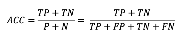
The four confusion matrix elements are the inputs to several statistical functions, most of which are listed/explained on Wikipedia. One of which we've already mentioned: Accuracy. Before, we directly calculated Accuracy by just checking whether predictions were equal to actuals. Instead, we can use the Confusion Matrix equation for finding Accuracy:
def ACC(conf_mtrx):
    return (conf_mtrx.tp + conf_mtrx.tn) / (conf_mtrx.fp + conf_mtrx.tn + conf_mtrx.tp + conf_mtrx.fn)
This equation makes sense; it's the proportion of correct predictions (TP's and TN's) out of all the predictions.
The functions we are interested in, however, are called the True Positive Rate (TPR) and the False Positive Rate (FPR).
Mathematically, they are also functions of the confusion matrix:

And in Python:
def FPR(conf_mtrx):
    return conf_mtrx.fp / (conf_mtrx.fp + conf_mtrx.tn) if (conf_mtrx.fp + conf_mtrx.tn)!=0 else 0
def TPR(conf_mtrx):
    return conf_mtrx.tp / (conf_mtrx.tp + conf_mtrx.fn) if (conf_mtrx.tp + conf_mtrx.fn)!=0 else 0
TPR is also called 'sensitivity' or 'recall' and corresponds to the ability to sense, or detect, a positive case. It's a more specific way of being correct than overall Accuracy since it only considers examples that are actually positive. Furthermore, TPR is the probability that the model predicts positive given that the example is actually positive. In our dataset, TPR is the probability that the model correctly predicts benign.
Note that if your model just predicts positive, no matter the input, it will have TPR = 1.0 because it correctly predicts all positive examples as being positive. Obviously, this is not a good model because it's too sensitive at detecting positives, since even negatives are predicted as positive (i.e., false positives).
FPR is also called 'fall-out' and is often defined as one minus specificity, or 1 - True Negative Rate (TNR). FPR is a more specific way of being wrong than 1 - Accuracy since it only considers examples that are actually negative. Furthermore, FPR is the probability that the model predicts positive given that the example is actually negative. In our dataset, FPR is the probability that the model incorrectly predicts benign instead of malignant.
Note that if your model just predicts positive, no matter the input, it will have FPR = 1.0 because it incorrectly predicts all negative examples as being positive, hence the name 'False Positive Rate'. Obviously, this is not a good model because it's not specific enough at distinguishing positives from negatives.
Sensitivity/Specificity Tradeoff
From the similarly-worded TPR and FPR sections, you may have noticed two things you want in a model: sensitivity and specificity. In other words, you want your model to be sensitive enough to correctly predict all positives, but specific enough to only predict truly positives as positive. The optimal model would have TPR = 1.0 while still having FPR = 0.0 (i.e., 1.0 - specificity = 0.0). Unfortunately, it's usually the case where the increasing sensitivity decreases specificity, vise versa. Look again at the decision boundary plot near P = 0.7 where some red and blue points are approximately equally-predicted as positive. If the decision boundary was moved to P = 0.7, it would include one positive example (increase sensitivity) at the cost of including some reds (decreasing specificity).
Thresholding
One of the major problems with using Accuracy is its discontinuity. Consider the fact that all false positives are considered as equally incorrect, no matter how confident the model is. Clearly, some wrongs are more wrong than others (as well as some rights), but a single Accuracy score ignores this fact. Is it possible to account for continuity by factoring in the distance of predictions from the ground truth?
Another potential problem we've encountered is the selection of the decision boundary. As said before, logistic regression's threshold for what is considered as positive starts at 0.5, and is technically the optimal threshold for separating classes. However, what if you weren't using logistic regression or something in which there isn't an understood optimal threshold?
Both of the above problems can be solved by what I've named thresholding. Before, we calculated confusion matrices and their statistics at a static threshold, namely 0.5. But what if we calculated confusion matrices for all possible threshold values?
The logic is simple: make the finite domain of your scoring system ([0,1] in steps of 0.001 in our case), calculate the confusion matrix at each threshold in the domain, then compute statistics on those confusion matrices.
def apply(actuals, scores, **fxns):
    # generate thresholds over score domain
    low = min(scores)
    high = max(scores)
    step = (abs(low) + abs(high)) / 1000
    thresholds = np.arange(low-step, high+step, step)

    # calculate confusion matrices for all thresholds
    confusionMatrices = []
    for threshold in thresholds:
        confusionMatrices.append(calc_ConfusionMatrix(actuals, scores, threshold))

    # apply functions to confusion matrices
    results = {fname:list(map(fxn, confusionMatrices)) for fname, fxn in fxns.items()}

    results["THR"] = thresholds
    return results
The most complicated aspect of the above code is populating the results dictionary. It loops through the **fxns parameter which is composed of confusion matrix functions, then maps the functions onto all of the recently-computed confusion matrices.
Now, there is no fixed threshold and we have statistics at every threshold so prediction-truth distances lie somewhere within the results dict. But how can we summarize, visualize, and interpret the huge array of numbers?
Receiver Operating Characteristic Plots and Beyond
Recall that the end goal is to assess how quality our model is. We know its Accuracy at threshold = 0.5, but let's try and visualize it for all thresholds. Using our previous construction:
acc = apply(actuals, scores, ACC=ACC)acc now holds Accuracies and thresholds and can be plotted in matplotlib easily.

The orange dot shows the Accuracy at threshold = 0.5, valued at 0.957; the blue dot is the best Accuracy at 0.973 when the threshold is at 0.8. Note that the 0.5 was not the best Accuracy threshold and that these values are subject to change if the model were retrained. Furthermore, see that at the edges of thresholds the Accuracy tapers off. Higher thresholds lower Accuracy because of increasing false negatives, whereas lower thresholds increase false positives. The problems of accuracy are still encountered, even at all thresholds. Therefore, it's time to introduce ROC plots.
ROC plots are simply TPR vs. FPR for all thresholds. In Python, we can use the same codes as before:
def ROC(actuals, scores):
    return apply(actuals, scores, FPR=FPR, TPR=TPR)
Plotting TPR vs. FPR produces a very simple-looking figure known as the ROC plot:

The best scenario is TPR = 1.0 for all FPR over the threshold domain. One trick to looking at this plot is imagining the threshold as increasing from right to left along the curve, where it's maximal at the bottom left corner. This makes sense because, in general, at higher thresholds, there are less false positives and true positives because the criteria for being considered as positive are stricter. On the other end, lower thresholds loosen the criteria for being considered positive so much that everything is labeled as positive eventually (the upper right part of the curve).
The worst scenario for ROC plots is along the diagonal, which corresponds to a random classifier. If the curve dipped beneath the random line, then it's non-randomly predicting the opposite of the truth. In this case, just do the opposite of whatever the model predicts (or check your math) and you'll get better results.
The most important thing to look for is the curves proximity to (0, 1). It means that it is balancing between sensitivity and specificity. While the curve tells you a lot of useful information, it would be nice to have a single number that captures it. Conveniently, if you take the Area Under the ROC curve (AUC), you get a simple, interpretable number that is very often used to quickly describe a model's effectiveness.
The AUC corresponds to the probability that some positive example ranks above some negative example. You can go deep into this interpretation here. Nevertheless, the number gets straight to the point: the higher the better. It factors in specificity and sensitivity across all thresholds, so it does not suffer the same fate as Accuracy.
For our dataset, we computed an AUC of 0.995 which quite high. However useful, sometimes you want to get more specific than a generic number across all thresholds. What if you only care about thresholds above 0.9? Or, what if a false negative has severe consequences? Those kinds of questions can be addressed elsewhere.
Conclusion
This tutorial was a pedagogical approach to coding confusion matrix analyses and ROC plots. There is a lot more to model assessment, like Precision-Recall Curves (which you can now easily code). For further reading, I recommend going to read sklearn's implementation of roc_curve.