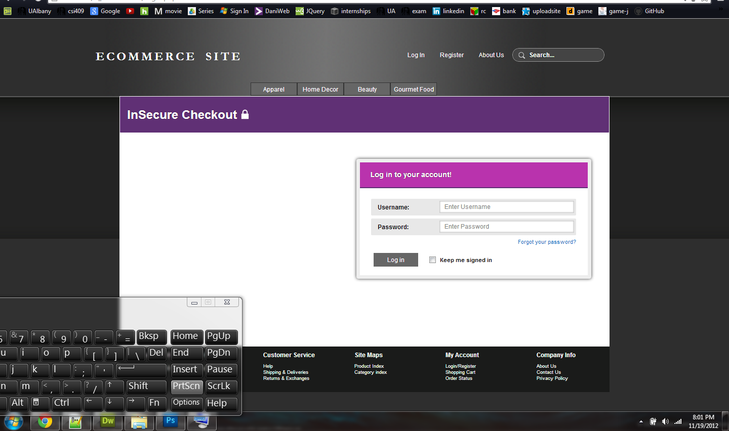
i want to now how can i make my log in page better. let me know if you dont like color, or anything. let me know if you hate it or like it.
also this page is not finish yet. i still have to move my form lil up. and on left of form add stuff.

Jump to PostI noticed two things off the bat (these may be more personal than actual problems but I figured I would point them out.)
1) Next to where it says password and then you have the textbot you are missing a colon. =D
2) I honestly think that you should keep …
We're a friendly, industry-focused community of developers, IT pros, digital marketers, and technology enthusiasts meeting, networking, learning, and sharing knowledge.