So i have a page which layout "fits" to screen, so that users do not have to scroll to view the content in the middle.

It has a header, a container/body area (with its own internal scrollbar) and a footer that supposedly sticks to the bottom.

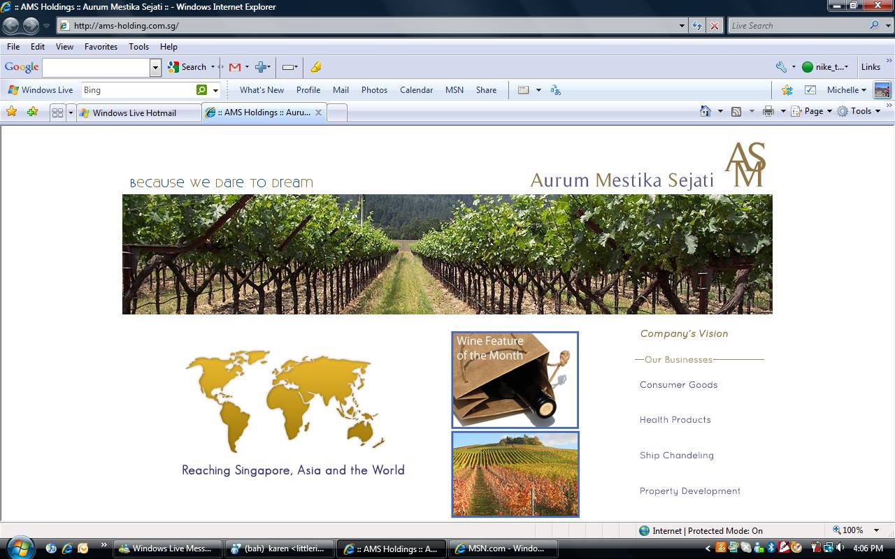
The problem: for IE when many toolbars are installed, the footer goes missing, and since the noscroll is on, the users can't scroll down to see it. (See screenshot "image.jpg" attached for problem of being cut off, see screenshot "image2.jpg" for what it should look like).

What is the best way to work on a site's CSS such that it really calculates the screen space that a user's browser has (according to how much toolbars installed etc) and place the different DIVs neatly, and not force the footer out of the page when screen space is limited (for example, when different number of toolbars are present)? Would like to learn how to best position elements to accomodate to different browsers and all the tricky toolbars.

The site is here: http://ams-holding.com.sg/

Note:
- if you view the page in firefox, you'll get redirected to index-ff.html which roughly has the same code.
- also critique on any thing you feel is not right. the code is extremely messy. :/

Recommended Answers

All 8 Replies

So i have a page which layout "fits" to screen, so that users do not have to scroll to view the content in the middle.

It has a header, a container/body area (with its own internal scrollbar) and a footer that supposedly sticks to the bottom.

The problem: for IE when many toolbars are installed, the footer goes missing, and since the noscroll is on, the users can't scroll down to see it. (See screenshot "image.jpg" attached for problem of being cut off, see screenshot "image2.jpg" for what it should look like).

What is the best way to work on a site's CSS such that it really calculates the screen space that a user's browser has (according to how much toolbars installed etc) and place the different DIVs neatly, and not force the footer out of the page when screen space is limited (for example, when different number of toolbars are present)? Would like to learn how to best position elements to accomodate to different browsers and all the tricky toolbars.

The site is here: http://ams-holding.com.sg/

Note:
- if you view the page in firefox, you'll get redirected to index-ff.html which roughly has the same code.
- also critique on any thing you feel is not right. the code is extremely messy. :/

I found a three reason why it might be giving you this problem. The first reason is that your <!--[if IE 8]> and 7 tags should have the css spreadsheet style page inside of them not the style type code. I will give you a link so that you can understand what I am saying
http://www.dynamicdrive.com/forums/showthread.php?t=46095
this person had the same problem

second thing I notice is that you a clearfloat or clear div tag but no css style tell it a command

Last thing is that you have a footer div tag which is not needed. The footerstart and footerend div should be enough

By the way your page look very nice

Thanks for the reply. The conditional statements for IE seem to work. But i'll have a look at the link you gave.

The footer div tag is needed becaue there is a background image.

And the

.clear{clear:both;}

is declared in the stylesheet.

May i know how do we make the middle content div take up a certain height according to the different screen size of browsers (as the toolbar description above)? Someone suggested making the top header and bottom footer as padding for the content.

So mathematically it would be body height 100% - fixed height for header - fixed height for footer. But how do we write that out in css?

Thanks!

On a cartoon where a car is driving up the vertical face of a cliff, one bystander says to another: "He doesn't know that it can't be done. He never read the instruction book in the glove compartment."

The Internet and html are not designed to make a web page exactly fit the browser display pane. Yet, we keep getting people who keep trying, and trying, and trying.

The system is designed to make the page fit the width of the page, start at the top, and expand downward until all of the content is rendered. The W3C purposely left out the ability to fit a display pane.

A 100% height refers to the height of the content, not the browser window.

What are you going to do when someone views your page on one of the new 16x9 monitors????

Too much time is wasted trying to make a page exactly fit the browser window. But no matter what you do, it won't work on all computers, screen resolutions, monitor aspect ratios, browsers, and restored down window dimensions.

The best advice I can give you is to make the page using percentages, and make it wide, but short vertically.

Hello MidiMagic, thanks for your reply. I hope you were not offended by the... nature of my question. As a chinese proverb goes, a person learns by asking. I haven't read up enough of HTML nor CSS evidently, and didn't know that the W3C intentionally left out the ability to fit a display pane.

Anyway back on the topic. Right now i am trying to work around what i found on another forum:
http://www.ultrashock.com/forums/client-side/div-height-100-header-footer-height-90238.html

Which looks like this:
http://fredvaux.com/mdc/ultrashock/awesome.html

Still trying out though. If i actually get to make what i want, i will update this again. But meanwhile if anyone has any suggestions, i'll be really happy to hear them.

Thanks!

I hope its not against the rule to repeatedly post to the page. I tried to incorporate the example from the above site.

http://www3.ns.sympatico.ca/d.elliott/vertical_center.html

The third one has something that i am looking for. This is the description of the div from the author of that page.

Relative positioning of a box with %age height using top: equal to half the remaining height. Works until content exceeds the box height. Overflow is set to "auto".

I would like to have my central div (pane2, specifically) to have a percentage height. I do know that we need to have a height that is not auto in its parent container for it to work, but it doesn't seem to work. Can anyone look at it and let me know whats wrong? (The site url is at the first post on this page and has been updated)

http://www3.ns.sympatico.ca/d.elliott/vertical_center.html

So according to the site i provided above i have modified the page's structure, and still i cannot figure out a way to make the central div in percentage. Look at the third box on the site (the blue box), it has a percentage height, so i was thinking it could help be used in my case, since i want a flexible height too, according to the screen available.

container is wrapper
logo, header, footer are #head-float, #foot-float
.content is just like the floater class.
left is supposed to work like vertical3 but i don't know how to give it a percentage height.

Below is my CSS with only the necessary bits:

.clear{clear:both;}

html, body {
margin:0;
padding:0;
height:100%;  /* for 100% height layout in all browsers*/

font-family:arial,sans-serif;
font-size:small;
}

#container {
	position:relative; /* needed for footer positioning*/
	margin:0 auto; /* center, not in IE5 */
	width:930px;
	height:auto !important; /* real browsers */
	height:100%; /* IE6: treaded as min-height*/
	min-height:100%; /* real browsers */
	overflow:hidden;	
}

/* header start*/
#logo {
	background-image:url(images/logo.png);
	background-repeat:no-repeat;
	width:930px;
	height:88px;
	top:0px;
	float:left;
	margin-top:10px;
	position: absolute;	
}

#header {
	background-image:url(images/h5.png);
	background-repeat:no-repeat;
	width:930px;
	height:172px;
	top: 98px;
	float:left;
	position: absolute;	
}

/* header end*/
/* main content area start*/
.content {
	float:left;
	padding:0px; /* bottom padding for footer */	
	margin-right:0px;
	position:relative;
	top:286px;
	width:720px;	
}
#left {	
	height:330px;
	float:left;
	overflow:hidden;
	padding-right:10px;
}
#pane2{
	width: 710px;
	position: relative;
	height:90%;
	overflow:auto;
	margin-bottom:13px;
}

.content2 {
	float:left;
	padding:0px; /* bottom padding for footer */
	padding-left:8px;
	position:relative;
	top:280px;
	overflow:hidden;	
	width:198px;
}

#rightmenu div {
	float: left;
	padding-top:10px;
}

/* main content area end*/

/* footer  start*/
#footer {		
	background:transparent url(images/footer.png) no-repeat scroll left top;
	font-size:11px;
	font-family:Tahoma,sans-serif;
	position:absolute;
	width:100%;
	height: 78px;
	bottom:0;	 /*stick to bottom */	
}

Below is the structure of my HTML, also with the necessary bits only:

<body SCROLL=NO>
    <div id="container">
        <!-- page content -->
        <div class="content">            
            <div id="left">                
                    <div id="pane2">
                        <div id="result"></div>
                    </div>
            </div>
        </div>
        
        <!-- menu -->
        <div class="content2">
            <div id="rightmenu" style="overflow: hidden;">                
            </div>
        </div>
        <div style="clear: both;"/>

        <!-- logo + banner graphics section-->
        <div id="logo"></div>        
        <div id="header"></div>
         
        <!-- footer -->
        <div id="footer"></div>
    </div>
</body>
</html>

How do i set the height for content, and pane2 so that it is like the percentage height achieved on the site i gave?

Thanks for any help in advance!

It can't be done in a way that works on all browsers. IE and FF don't even agree on the meaning of height as applied to a body tag container.

Just let the page scroll if it doesn't fit. That is what you are expected to do.

Be a part of the DaniWeb community

We're a friendly, industry-focused community of developers, IT pros, digital marketers, and technology enthusiasts meeting, networking, learning, and sharing knowledge.