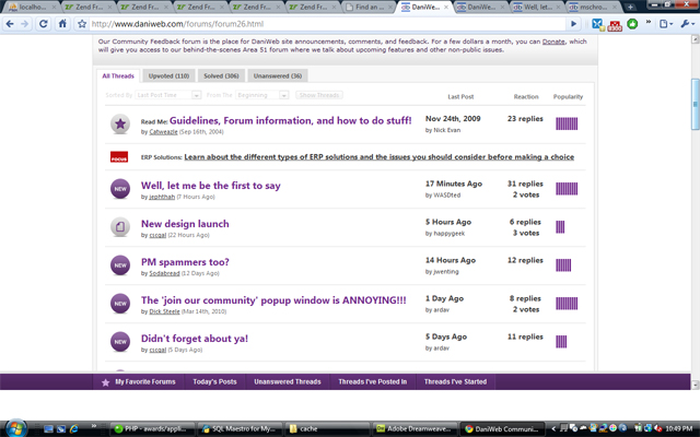
All of the buttons are enormous. My first thought was "looks nice" but then I realized that
1. I liked the old colors and the contrast better. This shade of purple is not appealing.
2. Everything, including threads, buttons, etc, is too big now.
3. I can only navigate one page at a time now (or choose first or last page). Before the range of pages I could jump directly to was larger.
4. Did I mention the threads are too big? I agree with Ezzaral - the size of the threads distracts from the site features, since you can view fewer threads at a time now and it draws attention from the other components on the site.
I do like the forum menus better, they look better and pop down faster. The only thing I feel incredibly strongly about is how big the thread names (and the new button) are .. the purple I don't like but I'll get used to it.