badges badges badges badges mushroom MUSHROOM!

lllllIllIlllI commented: :D:D:D:D:D:D:D:D +0

It's mostly the "largeness" that I'm having trouble with. It's like working on someone's machine who has the res set to 640x480, even though I'm at 1280x1024.

A single post is bigger than my *ENTIRE SCREEN* on a 1024x600 netbook. Even on my 1024x768 thinkpad its still barely usable...

But other than the largeness, i DO like it. And yeah, i want my badges!

Where is the subscribe button???

A single post is bigger than my *ENTIRE SCREEN* on a 1024x600 netbook. Even on my 1024x768 thinkpad its still barely usable...

But other than the largeness, i DO like it. And yeah, i want my badges!

I agree, it's too big. I run Opera on full-screen 1600x1200, and I can only see 1 or 2 small posts at a time (3 if they're all 1-liners). At the listing screens, I can only see maybe 5 thread titles, depending on title length.

Although I agree that there's not many posts on one screen, I personally feel that this is beneficial to the overall "cleanliness" of the new lay-out. The old one was quite cluttered IMO.
On 1280*768 I see 2 posts on 1 screen and 8 thread-titles

It is all an illusion because posts actually take up far less space than in the old design, and there is much less scrolling! Later today I'll take screenshots and show you :)

Although I agree that there's not many posts on one screen, I personally feel that this is beneficial to the overall "cleanliness" of the new lay-out. The old one was quite cluttered IMO.

>>On 1280*768 I see 2 posts on 1 screen and 8 thread-titles
I'll admit the error here, if I scroll down at the listing I can see 10-12. But that just reinforces the argument. The head material and listings are too tall, it takes longer to look through the listing to determine what you want to look at.

A feeling of "cleanliness" is good, but too much cleanliness is not, it causes a strange "sterile" feeling. This is currently trending toward "sterile".

>> This is currently trending toward "sterile".

It looks like an exploded eggplant, so sterile...erm ..no ;)

But serious: I see your point, but I think that you're misleaded by the userinfo which is now on the left of the post instead of on top. The header gave a false impression of supplying useful data, while it was only screenfiller.

A few observations:

  • I must say that I'm pretty much confused with the new layout. Especially the treatment which is given to links. It takes trial and error/time to find out which things can be clicked and which can't be.
  • The font used for the entire forum skin is different from the one which is used for showing post content.
  • The actual content looks small when compared to the padding surrounding each post. The good thing is that we now have an increased content area.
  • The button text for some buttons is *really* large (use advanced editor button)
  • The main forum page text is *really* big. I can barely see the thread titles of 6 threads on my 1024 x 768 screen.
  • The font size used on the 'User infraction' screen is *really* small
  • No way to go to the first unread post for subscribed threads in the CP
  • The first post of a thread gets very little post area; how about placing the 'similar threads' part somewhere else or at least make it hide behind a vertical accordion effect?
  • All the threads use the same font and color, so it becomes difficult to differentiate between read/unread threads.

Good job BTW. I'm pretty sure that the current forum look offered by Daniweb is pretty unique. :)

I'm going to let the post-size/information thing go until I see Dani's screenies. But there is something flat out not right, I just wish I could pinpoint it better.

[edit]
Using the data about the most recent post as a link to the last post is a good idea, I've tried it a couple times. But, I think you still need the "new posts" link. There may be other new posts besides the last post. Right now, you miss those because you jump straight past them.

[edit2]
I think ~s.o.s.~ has gotten to the heart of the size issue. It's the padding.

[edit3]
I think I see why it's so uncomfortable for me to look at as well. Many of the colors are too similar, making the contrasts too subtle, which is physically stressful for my eyes. I actually feel them working harder to make sense of parts of the color scheme. They can't tell which color to focus on.

> Many of the colors are too similar, making the contrasts too subtle, which is physically stressful for my eyes.

Hey guys! Can I get some more feedback about what SPECIFICALLY is hard to read? What is hard to read about it? Is it the actual post content??

I've already provided some comments in my previous post.

The padding used by each post is way too much. Even though the content area has been increased, the post content somehow is lost given the font family and size used. Forums which show a lot of content are usually *compact* but here I'm getting the feel of lot of wasted space. I'm no UI expert so I can't specifically point out things which need to be improved but posting a screenshot of Daniweb when compared with Stackoverflow might help clear things out a bit.

The font color has been made one shade darker than it used to be. Additionally, there is LESS padding surrounding posts now. However, fonts did change from Verdana to Arial, and Arial happens to be a much narrower font at the same font size.

I have always been told not to fix anything that isn't broken. What was wrong with the old site?? I must be honest, there were a few things that could be improved.
But why not improving the old site instead of creating a complete new one that is (at least for now) full of room for improvements.
I'm not going to repeat what all the other before me already posted. But I have lost count about the many things people complain about.

> Many of the colors are too similar, making the contrasts too subtle, which is physically stressful for my eyes.

Hey guys! Can I get some more feedback about what SPECIFICALLY is hard to read? What is hard to read about it? Is it the actual post content??

The subtle purple/lavender, and associated borders, that surround the post body are too light. They are very difficult to discern from the white backgrounds to the point it stresses the eyes. When you are reading a post, they linger around the edges of your FOV and make the eye try to figure out what is over there. Everything is a different shade of what seems to be the same hue, which is fine, a little monotonous, but fine. To be comfortable to view however, it requires a higher level of contrast than differing hues. That's part of what was nice about the yellow/purple and X on White combinations of the old site design.

>>fonts did change from Verdana to Arial, and Arial happens to be a much narrower font at the same font size.
Narrower fonts make things look a little jumbled. Perhaps increase the font size a point or so? Larger posts don't seem to be much of an issue as far as overall post proportions go, it's the more common small posts that are the problem. The overall post size is out of proportion because of all the extra whitespace needed to fill out the rest of the height.

Compare my previous post to this one to see what I mean.

Found a way to get rid of that menu at the bottom of the screen. Click "log out" (is somewhere at the top).
Now I can read postings in the forums without getting pain in my eyes within 3 minutes. Only drawback is that I have to login every time I want to reply and get that to see that menu again.

Found a way to get rid of that menu at the bottom of the screen. Click "log out" (is somewhere at the top).
Now I can read postings in the forums without getting pain in my eyes within 3 minutes. Only drawback is that I have to login every time I want to reply and get that to see that menu again.

Why on earth do you want to get rid of it? It's one of the better new features. Besides its only like 50px high?

Why on earth do you want to get rid of it? It's one of the better new features. Besides its only like 50px high?

On my machine (Slackware Linux 12.1 - KDE 3.5 and Firefox 3.5.9) this menu jumps every time I scroll a page. It isn't the only thing that jumps but the most disturbing. Maybe it's a Slackware thing or KDE thing, but I have this effect on two computers. Beside that, I don't like menu's at the bottom of the screen. It would be a lot better if you could turn if off (and back on when needed). Or even better (see image), place it at the top and let it scroll with the rest of the page. There is plenty of room.

Hey guys ...

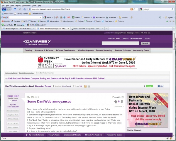
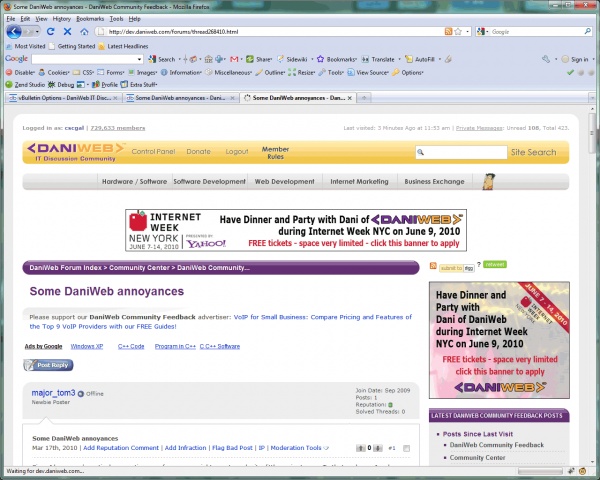
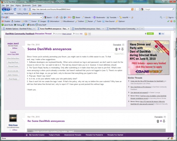
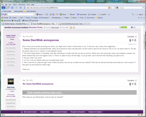
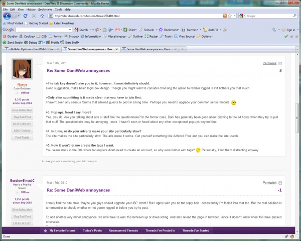
I took a handful of screenshots off of our development server that compare our old and new design side by side. All of the following screenshots were taken at 1280x1024 resolution. Currently, over 80% of DaniWeb visitors use a screen resolution at or larger than 1280x1024.

Because the old design is only live on the test server, some of the button images in the old design are wrong (i.e. default vBulletin blue instead of our old big yellow buttons). Just ignore that :) NOTHING else changed. All screenshots are 1280x1024 resolution.


Comparison 1 = Here is a screenshot comparison of when you first load a forum thread page. You can see that the actual post content is available MUCH sooner in the new version. In fact, in the old version, none of the actual post is available without having to scroll! In the new version, nearly the entire post is visible.

Comparison 2 = Here is a screenshot comparison of the first post in the thread. The new design occupies just as much space as the old design, but has the added benefit of also displaying Similar Threads, which are very useful to people investigating a tech support issue or trying to find out as much information as possible about something, etc. In the old design, Similar Threads were way down at the very bottom of the page.

Comparison 3 = In the new version, we give the user the ability to click on the Expand Post link and completely hide the rectangle ad. The benefit is even more overwhelming when compared to the old version. In the new version, you can now see two complete posts while in the old version you could only see one post!

Comparison 4 = This final comparison just compares two other posts farther down on the page. Once again, you can see how nearly two full posts are visible in the new version while only one post was visible in the old version. Same post. Same thread.

Additionally, the new version offers you quick access to My Favorite Forums, Threads I've Posted In, etc., from anywhere on the page. So there's no need to do any scrolling to check out your MFF if you're farther down in a thread.

Additionally, the new version offers you quick access to My Favorite Forums, Threads I've Posted In, etc., from anywhere on the page. So there's no need to do any scrolling to check out your MFF if you're farther down in a thread.

In the old version you only had to tap home key (19 inch screen) to see them on the right side of the screen. Scrolling on the old version never was a problem, but now it is. (see my previous post).

Oh.. yes you have to open the quote otherwise you might not understand what I'm talking about.

Site navigation feels clunky now. I'm not sure what use cases you were using to design the site, but it's definitely more tedious to get around, in my opinion. I think it's this feeling of rough navigation that makes the whole site seem "bigger" and "harder to read".

I'm not getting the impression that there's a starting point that we can easily work from to get to our desired forums, and there's no easy way to get back (ex. I can't find a way to get to the main forum list without using my browser's bookmark). The whole "here's where I am, here's where I came from, here's where I want to go, and getting between them is easy" feeling just isn't there anymore.

commented: Agree +0

Another Issue.
The button is at the bottom of the thread listing, not the top. It's hard to find and inconvenient.

This screenshot illustrates how large this site is.... 1024x768.

A couple more things:

The post number is missing. That was an important piece of information that takes up little real estate.

The multi-post reply button was very helpful. Please bring it back.

Convert the post icons to a square of icons (below). When more than one icon is appropriate (new, i posted, etc) simply displaying one is not helpful.


Please reconsider the click-for-quote decision. It makes quotes mostly useless with way too much work to view, since we have to click on almost every single quote to understand posts.

You keep trying to convince us space differences are an illusion. Being a magician, I understand illusion very well. If we think so, it is. Stop trying to tell us we're wrong. Consider instead whether the illusion can be corrected.

commented: Agree too +0

> I'm not getting the impression that there's a starting point that we can easily work from to get to our desired forums
The homepage?

> I'm not getting the impression that there's a starting point that we can easily work from to get to our desired forums
The homepage?

Worthless. ;) I never used it before and I'm not likely to start. My starting point has always been the forum list. Note that I can't find a link to the forum list even from the homepage. It's almost as if www.daniweb.com/forums is a hidden feature.

To be perfectly honest, when I joined Daniweb it was a forum. Now I'm not sure what it's trying to be, and the forum is simply an afterthought in terms of presentation of the site (such as the homepage).

I'm still not sure if I like the new design or not.

p.s. I noticed that I couldn't toggle plain text on a code listing from the advanced reply editor. I had to copy/paste the highlighted code and remove #'s manually. Minor annoyance.

I love the new design.

It makes me very happy.

commented: sig spammer +0

Don't bother with a forum list or message list. The icons and fonts are so massive it requires an inordinate amount of scrolling to get anywhere.

If this is an improvement on the previous design (except for the colour) I don't know what your designer considered to be worse than what you had.

<QUOTE>[anonymous alias;1218175]I love the new design.

It makes me very happy.</QUOTE> (now the quote is readable)

Well it seems at least two are happy. (the other? cscgal)

Be a part of the DaniWeb community

We're a friendly, industry-focused community of developers, IT pros, digital marketers, and technology enthusiasts meeting, networking, learning, and sharing knowledge.