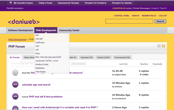
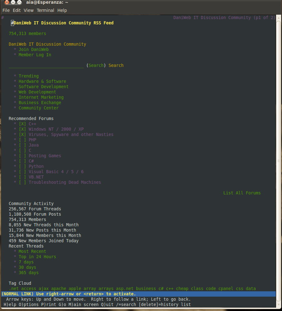
Well, I found a way to use my own css in Chrome - bit of a fiddle, but used .user.js to change some settings and to hide things that don't interest me. All that social bookmarking malarkey, adverts and menu items I never use. In addition, I placed the fixed toolbar at the top instead of the bottom. Good feature, but I hate it at the bottom.
Still working on replacing the icons. Managed to change the fontsizes and weird colours. My colour scheme is sick as a parrot, but I like it. One drawback - coz it's js - it's a bit slow.

diafol
WASDted
commented:
Go LAKERS!!!!
+0
colweb
13
Posting Whiz

Banfa
597
Posting Pro
Featured Poster
Tekmaven
commented:
This is a great point. You should be a usability expert!
+0
diafol
mschroeder
251
Bestower of Knowledge
Team Colleague
diafol

Dani
4,084
The Queen of DaniWeb
Administrator
Featured Poster
Premium Member
NathanOliver
429
Veteran Poster
Featured Poster
iamthwee
WaltP
commented:
As a test perhaps? So we can test BOTH options? Calm down! Jeez
+0
Tekmaven
258
Software Architect
Team Colleague
iamthwee
commented:
Disagree
+0
lllllIllIlllI
178
Veteran Poster
iamthwee
Tekmaven
258
Software Architect
Team Colleague

BestJewSinceJC
700
Posting Maven
BestJewSinceJC
commented:
testing something..
+0
jonsca
commented:
Mad props, is that Lynx? or perhaps I suspect you made your own?
+0
Sodabread
commented:
Awesome =)
+0
BestJewSinceJC
700
Posting Maven

WaltP
2,905
Posting Sage w/ dash of thyme
Team Colleague
BestJewSinceJC
700
Posting Maven
lllllIllIlllI
178
Veteran Poster
jephthah
commented:
that strikes me as a bad idea. user-specified color, font, size, etc is one thing, but to modify content defeats the purpose of hving a discussion in the first place.
+0
colweb
13
Posting Whiz
diafol
jephthah
commented:
sadly, i agree. i've lost my enthusasm to post here much, other than to complain.. the useability and layout changes grate on my nerves.
+0
jephthah
1,888
Posting Maven
Banfa
597
Posting Pro
Featured Poster

~s.o.s~
2,560
Failure as a human
Team Colleague
Featured Poster
Dani
4,084
The Queen of DaniWeb
Administrator
Featured Poster
Premium Member
JamesCherrill
4,733
Most Valuable Poster
Team Colleague
Featured Poster
jephthah
commented:
word
+0
BestJewSinceJC
commented:
agreed
+0

Ancient Dragon
5,243
Achieved Level 70
Team Colleague
Featured Poster
Be a part of the DaniWeb community
We're a friendly, industry-focused community of developers, IT pros, digital marketers, and technology enthusiasts meeting, networking, learning, and sharing knowledge.