As the title says, anyone else noticing the activity on DaniWeb suddenly dropping?

I usually check the Database and Software Developing sections in the morning. The Database one for awhile was getting a few new topics at least a day, but all of a sudden, it seems to have almost gone cold, with little to no new posts. And the Softward Developing is somewhat active, but not a whole lot. For instance in the old design I'd usually see a few new C#s a day, now I'm lucky to see one.

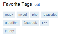
I am starting to wonder if the new grouping design is discouraging people. I mean I realize the point behind it, but I am starting wonder if it's feeling too cluttered or something (I mean I usually scan the tags for C# in them)

Recommended Answers

All 101 Replies

Member Avatar for diafol

I think it's varying wildly at the moment. I saw a pick up in traffic a month or so ago, then a dip, then a surge, then some tumbleweed... Also depends on time of day. It's almost guaranteed that there will be few to no posts in WebDev, 2000 - 0700 GMT.

See I feel I'm seeing an all time low (in fact some people I am used to seeing post have almost gone dark)

Well there are things that distract folk from getting here like, ahem, Fallout 4. Then I'm seeing too many ask for solutions to say "How to play video on jsp..." without so much as a single line of code or what they tried.

Here's what I'm seeing here and on another forum. Folk are expecting fish and not a lesson on fishing. Some of those folk get upset and go away if you talk about where to go fishing rather than give them fish.

I think the redesign of the site is a disaster.

I thought that the first moringing it was up, and still do. Seems it was designed by someone that does not know, and/or understand the Web desing mantra of "Don't make them think." Site navigation here has sort of become like navigating the "The Cube" ('97).

There is still a lot of community and well meaning people here, but they are lost behind a wall of confusion.

Just my 2 cents--worth a dollar in 1913.

Member Avatar for diafol

I certainly agree that some features are a bit "guessy". The blue hamburger dropdown to show the forums does not say "Click me, I'm a shortcut to the forums" It's completely missing from mobile too. Likewise the bell icon in the navbar has no rollover tooltip to say what it is.
The site appeared to be down for some time this morning too, resulting in 2 posts for a huge part of the day in WebDev - one of those was mine!
I sincerely believe that the forum-tag hybrid has to be the way to go, perhaps some aspect of the UI need to change, to make it more intuitive?

I'm currently away for the week so unable to make changes as I don't have easy access to my development environment.

However, the site was unfortunately down for a large chunk of time today (middle of the night, my time). According to James, the sit went down six times throughout the night, and I saw about 2 hours of combined downtime when I awoke.

I will admit I am not a huge fan of the new design. When talking to Dani about it when it first came out, she explained the reasoning behind the grouping of categories and at the time it made sense.

But not I feel it's hurting the site because it's not easy to navigate if you don't know. Instead of a simple click for "C#" type link, we have to search for the tag, and for us that know this, it's fine. But I feel it's not hte same for others, which might help explain the decrease in traffic. It's kind of a double edged sword.

Yes, I guess a lot of users don't feel at "home" anymore. Before, say a Java addict could jump right in into his habitat and feel cosy to ask a question or solve one or get some info by reading. Now he has to do his thing in some globality called "Programming" or "Software development". Personally I don't mind, but some users might get confused.

Member Avatar for misi

Yes, I guess a lot of users don't feel at "home" anymore.

Bullseye.
The staff feel it home, defending the new format.
What happens to a super modern new big shop where the shopper doesn't feel comfortable?
The shopper stops visiting.
The staff can serve the staff...for a while...then the beautiful shop has to close.

Member Avatar for diafol

I hope I'm not defending it blindly. It's based on personal experience and the fact that the format was no longer fit for purpose and that we were haemorraging visitors. However, I do agree that certain aspects of the UI could be improved to encourage greater usage. When you say "staff", DW only has a handful, if that, of hired hands, mainly back office - perhaps just Dani herself by now; the rest of us are volunteers (mods and admins) - no different to you. We are all regular members, just that sme of us have taken on a few additional responsibilites. The last thing any of us want is to see DW close. It's not a case of burying one's head in the sand and insisting things are right when the general membership is saying they are not.

In order to get things to a point where the majority are happy, we need suggestions - which are workable. I know I've asked this question a hundred times already, but what could be done to make it easier to navigate? BTW, "Bring back the old system", isn't, AFAIK on the table. Perhaps we should set up a competition to show mockups of how you would like to see it. But perhaps, I'm overstepping my bounds here. However, nothing wrong with including a visual with a suggestion.

All the good memories have been blown away by the tagging system not to mention a huge spike of people joining BC (BleepingComputer).

I feel this is my home of the forums. :)

Okay, let me share some of a suggestions:

  • Remove the tiny Javascript that block the content when your mouse hover on the ads. It is unneccessary.
  • Combine Shoutout, Inbox, Finder, and "username" into one menu. Make it a tiny icon at the right side of the menu. Why? because shoutout is completely useless and rarely used feature. I don't change my profile everyday, no need to make it so big. Finder is slightly useful, but there is better way to do it.
  • Take tiny category icon menu at the right side of menu in the header. Expand all their main category. When people hover on the main category, show the list of all category. Why? because people come for content and IN THE FACE type of navigation. Hiding it in a NOT so obvious tiny little icon is not great navigation experience.

There are many other points that I want to make but I forget what it is ^^

Yeah that's what I would like to see, some way to more openly say "here's C#", or "here's Java". Make them stick out more and easier to find and access. Maybe have the most common in a sub category, but allow to expand beyond of if needed with the tagging system

Member Avatar for diafol

Good suggestions IMO. Personally I'd have a 'FORUMS' dropdown as the first item after the logo. Kill off the blue hamburger - nobody knows what it's for anyway.

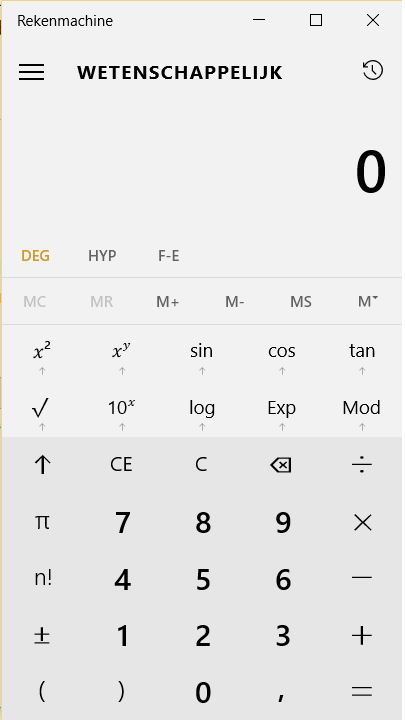
As of Windows 8 I guess, every "modern" app seems to have a hamburger. Don't like the minimalistic design of these apps. Have a look at calculator:
Calculator.png
These things are clearly designed to be used on a smartphone.
I'm never gonna use my smartphone to visit Daniweb. I'd like to see more 3D design, if albeit possible on an website, without too much work.

Finder is slightly useful, but there is better way to do it.

What would a better way be? I was taught that when I go to my boss with a problem I should have a solution in mind.

Hiding it in a NOT so obvious tiny little icon is not great navigation experience.

So many programs are using the hamburger/waffle icon that its function should be obvious by now.

Yeah that's what I would like to see, some way to more openly say "here's C#", or "here's Java".

You can add /tags/vb.net or /tags/java to get direct access via the address bar. I have a shortcut to take me directly to the vb.net tagged articles.

Member Avatar for diafol

I think the message we're getting from the members who are prepared to voice their opinions is that they are not happy with the nav system.
The smartphone default layout won't work with a site like DW - I agree - just try typing some code with a virtual keyboard - commiting suicide with a feather would be easier and more preferrable! However, I do browse DW with my Android phone just to see if anything interesting has cropped up. I am not chained to my PC 24/7 so this small but powerful device allows me to stay in touch. So, for the sake of argument, let me click (tap) on something to take me to all the PHP threads. Don't make me open up the keyboard. The same frustration is creeping into desktop use, where people are happier with click and click and click than interact with a textbox. Something to consider maybe. The previous version allowed me to "snake" through a dropdown to the PHP forum. Easy on mobile and desktop. Now I have to type a letter. This is a retrograde step for many. I have to admit, I rarely restrict myself to PHP or whatever else these days - so the second level forum - Web Programming is great for me. No need to search for a tag. I am aware however, that this is not the case for the majority of users. This is THE issue from the posts I've read that requires urgent attention. Please correct me if I'm wrong. How about some mockups of what you'd like to see instead?

Member Avatar for misi

In order to get things to a point where the majority are happy, we need suggestions - which are workable.

There are none because:

I know I've asked this question a hundred times already, but what could be done to make it easier to navigate? BTW, "Bring back the old system", isn't, AFAIK on the table.

See:

All the good memories have been blown away by the tagging system not to mention a huge spike of people joining BC (BleepingComputer).
6127 users are online (in the past 60 minutes)
70 members, 6054 guests, 3 anonymous users (See full list) (Member Name)

Not to bring back the old system, a struggling server, will not attract the DANIWEB members.

Allow me to share from my experience of running a few websites which probably has more visitor than Daniweb (based on Alexa). The different between my website and Daniweb is that Daniweb aims for tech-kind of guy. My website provides content to everyone in our local language. We are poor country and majority even have hard time knowing how to type a website address and adding a bookmark is like a rocket science to them. So, whenever we make a design, we always follow this principal:

  • Anything that is used often must be big and one or a few click away. Anything that is rarely use should be small. Anything that almost noone use should be removed. We have introduced a lot of features, but also remove a lot of features if not successful. It is a burden to keep maintain something that does not work.

So, here is my response to @Reverend Jim

So many programs are using the hamburger/waffle icon that its function should be obvious by now.

It is obvious for you because you have been loyal to Daniweb for so long. You are very smart person and most of the contributors here are pretty smart so I bet they know how to get thing done. However, Daniweb heavily rely on beginner to ask question so that you smart people can help. These guy usually are not loyal to Daniweb. If they cannot find what they want in 1 minute when they hit the website, they will leave.

You can add /tags/vb.net or /tags/java to get direct access via the address bar. I have a shortcut to take me directly to the vb.net tagged articles.

Why should people that have never used Daniweb before have the motivation to type or bookmark each section or even know how to do it. I think your argument is like this, if you know how to use, you assume every people know how to use it.

What would a better way be? I was taught that when I go to my boss with a problem I should have a solution in mind.

Tell me why and what do you use "Finder" for?

Let have a clear stand. I do not ask Dani to reverse back to the old system and destroy the tag system. We can keep the tag system. I am asking Dani to re-design the whole website. It takes too much time. We can slightly improve the current design bit by bit.

Allow me to share another story. We not only run one of the biggest news website in my country, but also one of the biggest eCommerce. We still struggle to have user to use our platform properly.

  • Our registration has reduced from having 5 fields to have only 2 fields. They can click to login from their favorite social network. Still, people couldn't figure how to do it.
  • The biggest challenge that we have is that to teach people how to add to cart and checkout. We make the add to cart and checkout button 4 times bigger than everything. In case, they still cannot find it, we also put big text of our phone number so that if they still cannot find the big "Add to cart" button, they can call so that we will teach.
  • This may sound silly, but we even give them some money and discount if they know how to add to cart by themselve.

    And this might be extreme, but we would be extremely happy if they even know how to type our website address in their browser leave the ability to use the "add to cart" feature alone.

The moral of this story is simple. People might not as bright as you have thought

It is obvious for you because you have been loyal to Daniweb for so long.

I am familiar with it because chrome and firefox started using it long before it appeared on Daniweb.

If they cannot find what they want in 1 minute when they hit the website, they will leave.

That's a people problem, not a Daniweb problem. I don't think Daniweb should pander to the laziest of the lazy.

Why should people that have never used Daniweb before have the motivation to type or bookmark each section or even know how to do it.

I don't know anyone who hasn't bookmarked a site or two (dozen) in their browser of choice. If a site is important enough to return to then it is usually bookmarked. Again, if you are too lazy to press CTRL-D (or whatever to bookmark) then I suggest you just stop using the internet altogether. Or do you type all of the addresses you visit in by hand every time you go there?

Tell me why and what do you use "Finder" for?

That's irrelevant. You said there was a better way to do it. Since you worded it that specific way I assumed you had a better way in mind. I'd like to hear it.

That's a people problem, not a Daniweb problem. I don't think Daniweb should pander to the laziest of the lazy.

I am speechless. You should know that Daniweb is a business. The greatest asset of business like Daniweb is visitor. If visitor has problem, the website will have problem. Believe it or not, we have more dumb and lazy people than smart people in this world.

I don't know anyone who hasn't bookmarked a site or two (dozen) in their browser of choice. If a site is important enough to return to then it is usually bookmarked. Again, if you are too lazy to press CTRL-D (or whatever to bookmark) then I suggest you just stop using the internet altogether. Or do you type all of the addresses you visit in by hand every time you go there?

There are two problems with your suggestion.

  • What you suggest is not to only bookmark the site, but to bookmark the address of each tag that you frequently use.
  • Maybe they will bookmark the site, if the site is important. But, at first, you need to show them that the site has what they want.

In Stackoverflow, they have option for you to specified which one is your favorite tag and it is in the front page. You can basically click on it to quickly go to your section. Why do I have to bookmark every tag that I want? Why do I have to type "javascript" in the search box to go to the Javascript section?

Stackoverflow.PNG

I am familiar with it because chrome and firefox started using it long before it appeared on Daniweb.

I don't know know how many time do I have to express this. Because you know, you can't assume that most people know.

That's irrelevant. You said there was a better way to do it. Since you worded it that specific way I assumed you had a better way in mind. I'd like to hear it.

Because how I use "Finder" might be different than how you use "Finder" for. So, I want to hear you out first before I throw the suggestion.

I am speechless. You should know that Daniweb is a business.

Daniweb would likely attract a lot more visitors if we turned ourselves into a homework factory. People could just post their homework assignments then come back in a few hours for the solution. That would also be pandering to the laziest of the lazy and regardless of the increase in traffic it would generate, we just won't do it. To make a rather extreme analogy, it is good for busininess for the NRA to ensure that everyone in the US can easily buy guns of any type. We see how well that is working. Good for business is not the same as good.

Because how I use "Finder" might be different than how you use "Finder" for. So, I want to hear you out first before I throw the suggestion.

"Finder" works exactly how I want it to work. Usually I am looking for an old post of mine to post a link in response to a new question. You might take note of the top item which is "My favorite forums" which gives you the quick access you want.

In Stackoverflow, they have option for you to specified which one is your favorite tag and it is in the front page.

You can do that here. My favourite forum is vb.net so my shortcut to Daniweb is Daniweb. It takes me right there.

Member Avatar for misi

Food for thought: https://googleblog.blogspot.co.uk/2015/11/introducing-new-google.html

And so we’ve reimagined Google+ to help them do that. Today, we’re starting to introduce a fully redesigned Google+ that puts Communities and Collections front and center. Now focused around interests, the new Google+ is much simpler.

Note: "much simpler"

I'm not sure if that was sarcasm or not. In the early days of personal computers the "next big thing" was "user friendly" software. Most software companies accomplished this merely by stamping "USER FRIENDLY" on their existing software. My point is that changes do not make a product or service "much simpler" just because the vendor says it is. perhaps Google+ is actually much simpler. I never used it before and I don't plan on using it in the future. Microsoft tried to tell us that windows 8 was a giant step forward in usability. Maybe if your only device was a touch based tablet. Not so much for the rest of us.

commented: I own a Windows 8 tablet. Not a fan. Maybe I should start a thread on why. +0
Member Avatar for misi

I'm not sure if that was sarcasm or not.

It was not.
Its meaning was: SIMPLIFY for the sake of the users.
Your business depends on the users.

Microsoft tried to tell us that windows 8 was a giant step forward in usability.

It was a giant step. Users didn't like its usability.
Look at DW. Are you certain that the current design is a giant step for the usability for the users?
It was certainly a giant step.
Users don't like it? [Sarcasm] Argue with them how good it is and they will accept it. [/Sarcasm]
Maybe not.

One thing is for certain. Daniweb was bleeding users with the old forum based interface. Would you advocate going back to that interface when it was clearly not what the users wanted?

Member Avatar for misi

One thing is for certain. Daniweb was bleeding users with the old forum based interface.

Small edit: One thing is for certain. Daniweb was bleeding users with the old interface.

Would you advocate going back to that interface when it was clearly not what the users wanted?

Not to THAT interface.

One thing is for certain. Daniweb was bleeding users with the old forum based interface

I think this was because the old forum based interface was still very different from the traditional forum based interface offered by many other web sites. The new interface shares the same problem. I had no problems navigating using the old and (now) the new interface but like invisal says, it seems that doesn't apply to a majority of new visitors.

Seems like SO and Reddit also have the same problem; I have seen homework requesters struggle to properly format a post on SO. Even if they do, the post is promptly closed and downvoted to oblivion. But, SO doesn't care because it has an iron grip on a vast majority of users who ask well-framed questions and have an army of professional programmers. Ditto with Reddit.

So to play the devil's advocate, I don't think the design is terrible per-se, it just doesn't seem to be a good fit for the type of crowd we are aiming for...

commented: Spot on. +0
Member Avatar for misi

I think this was because the old forum based interface was still very different from the traditional forum based interface offered by many other web sites. The new interface shares the same problem.

That's why I said:

Not to THAT interface.

Be a part of the DaniWeb community

We're a friendly, industry-focused community of developers, IT pros, digital marketers, and technology enthusiasts meeting, networking, learning, and sharing knowledge.