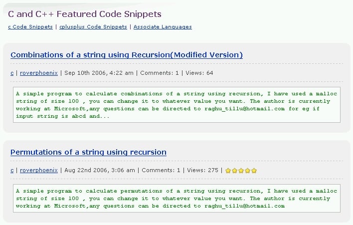
For example,

Recommended Answers

All 5 Replies

Because I thought it looked cool. And hopefully it serves as a subconscious reminder for the DaniWeb newcomer that they're browsing code snippets as opposed to tutorials or blogs or the forums.

Plus on pages like this:

http://www.daniweb.com/techtalkforums/forum17.html

By having either the code snippets, tutorials, or links with a slightly different look, it reinforces the idea that they are different things, and makes the user take a second glance, instead of dismissing the entire second half of the page as one long list.

It it possible to have part of the description "normal" plus a part of the code in the code box? To me text looks out of place in code tags much like code looks out of place as normal text.

I will have to think about that. It would be way too bulky to include both a description and a teaser of some of the atual code. Additionally, a teaser of the actual code would probably just get so far as to display a couple of the includes or header files, which wouldn't be very useful at all.

I'm also hesitant because I really like it :) It breaks up the look of the different elements on the category page I showed you before, to emphasize that it isn't just one long list, and also reinforces the fact that someone is browsing actual code, for all those people who come into the site through the search engines and are disoriented as to what on the site they're just looking at. Besides, it's just good ole Courier New. That font face is used in non-programming and non-code things quite often.

I will have to think about that. It would be way too bulky to include both a description and a teaser of some of the atual code.

If it's only two snippets like I saw, I don't think it would be that bad. But...

Additionally, a teaser of the actual code would probably just get so far as to display a couple of the includes or header files, which wouldn't be very useful at all.

Or worse if folks add a big banner before any actual code.

I'm also hesitant because I really like it :) It breaks up the look of the different elements on the category page I showed you before, to emphasize that it isn't just one long list, and also reinforces the fact that someone is browsing actual code, for all those people who come into the site through the search engines and are disoriented as to what on the site they're just looking at. Besides, it's just good ole Courier New. That font face is used in non-programming and non-code things quite often.

Perhaps. To me it just looks a bit "not right".

Be a part of the DaniWeb community

We're a friendly, industry-focused community of developers, IT pros, digital marketers, and technology enthusiasts meeting, networking, learning, and sharing knowledge.