Dani:

Hi. This isn't permanent. The permanent solution of only allowing members with more than 50 (??) posts to give negative rep will be implemented as soon as I get our new design out (figuring within the day).

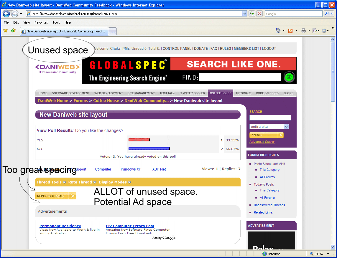
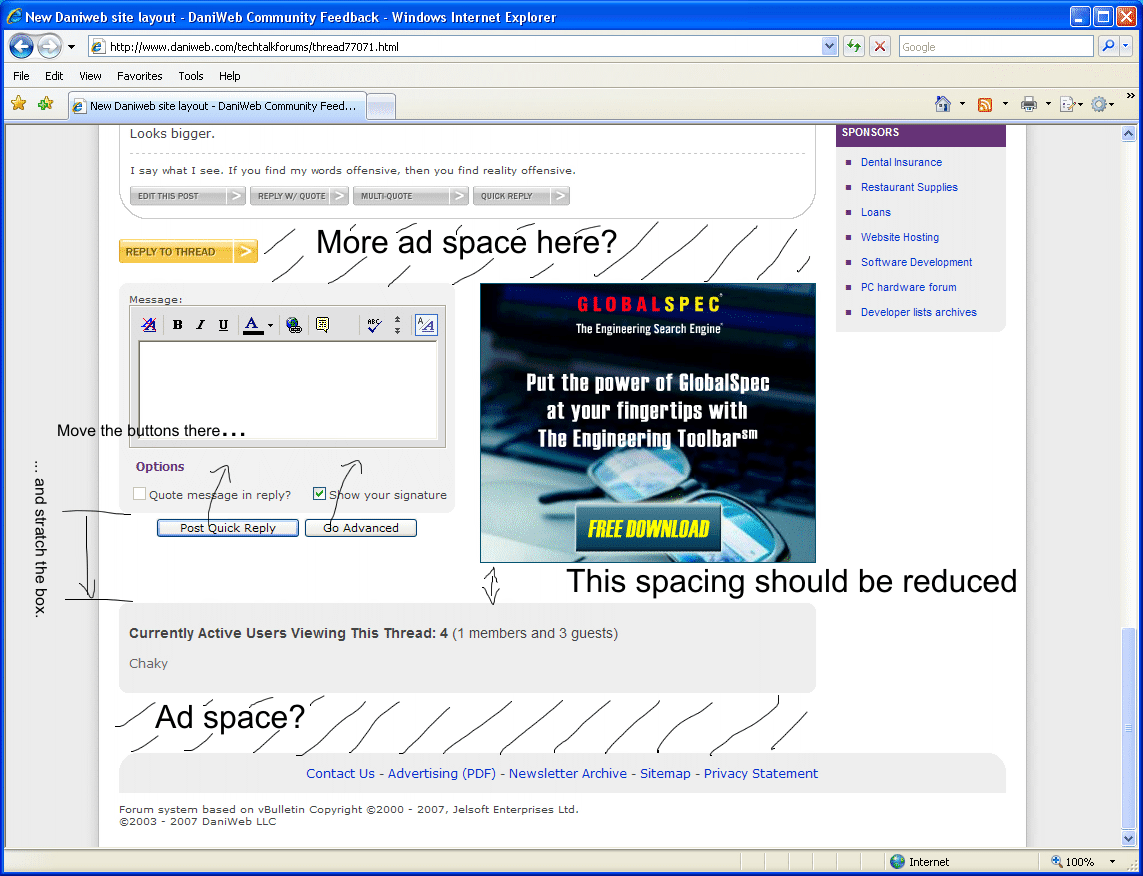
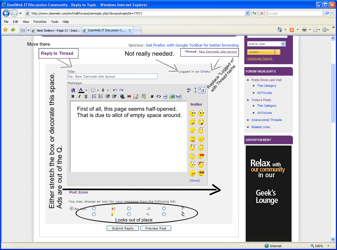
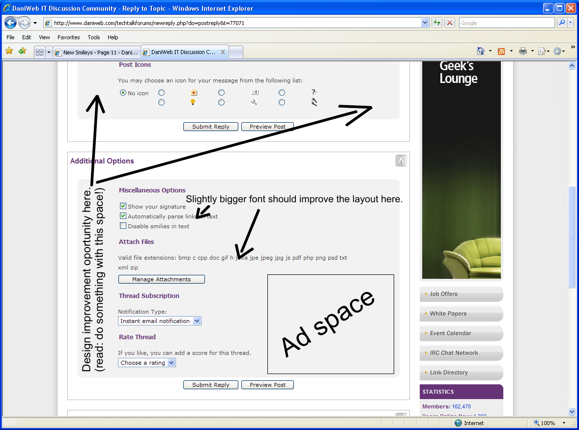
For those of you not privy to Area 51 ... yes, there's a new site design on its way. And I'm not saying anymore (you'll have to beg for more info from Area 51 people).

I'm sure this change is what she was referring to.. What do yal think of the change?

Recommended Answers

All 123 Replies

I'm pretty sure as well that this was what she was talking about. I'm not particularly pleased with it so far. The navigation is huge (the drop down menus don't even all fit on my screen), and the header content is as well (I had to scroll nearly a screen full just to see the thread). Also, the text in the quick reply is a lot smaller. And for some reason, page loads have become quite CPU intensive...

Looks bigger.

Dani, here are some suggestions.


More to come.

Hi,

The places in both screenshots where you say whitespace (and could be used for advertising) is actually where the page navigation links go on long threads.

Still working on changes: I think I may have kinda sorta released wayyyy toooo early.

Some of the changes are good. Some of the changes are bad. I'm not sure if I like this new design; what mostly annoys me is that the forum regulars now have a new site design to get used to.

And by the way, making the text smaller in the quick reply box is NOT a solution to having the box too small in the first place. In my opinion, there's too much contrast between font sizes. (Wasn't the reason you made the fonts bigger to make reading it easier? Great, now those same people won't be able to read what they're typing.)

The text is much smaller both in the quick reply and in the advanced reply boxes.. I like the new way it looks though.. just a few bugs need to be worked out

Also, the 'reply w/ quote' 'multi-quote' and 'quick reply' boxes don't appear to be working unless you point the mouse like directly at the top of these buttons..

The text in the quick reply box was not changed.

The text in the quick reply box was not changed.

really? what about the text in the 'advanced reply' box? Both seem much smaller.. I have to strain my eyes to read what I write..

And as Infarction said, it seems as if Daniweb is using many more resources.. and pages load slower than usual

The advanced reply box too ... no change in font size at all. In fact, the font color was made one shade darker!

DaniWeb does use slightly more resources ... some of the style elements (such as curving the corners of boxes) is now done client-side via JavaScript instead of via CSS. In other words, whereas before there were dozens of little images that needed to be downloaded with each page to give the curved corners effect, now no images are necessary and JavaScript just does the work.

What I found, however, is that once your browser caches the JavaScript file, things get faster quite quickly. Also note that there are all new images throughout the site. Therefore, all of the images you have cached (which you're accustomed to the time it takes to use) will need to be redownloaded. You should definitely give it at least a day or so of use before you start comparing speed differences due to browser caching.

I did put effort into reducing the amount of JavaScript there is. If it is still a problem for a large number of users, I will consider adding an option in the control panel to forfeit curved corners for users with slow CPUs. I really don't think this will be necessary though.

Just to add ... did comparisons on like five different PCs and, upon clearing browser cache, curving corners with JS was faster than curving corners with CSS (because of all the small files that needed to be downloaded one at a time in addition to CSS rendering time). So I'm confident this is the better option. I even tested it out on my five year old mac to make sure that it's not too JS intensive for older computers.

oic. Does the text size not appear different to anyone, though? It really does seem much smaller. It appears like an 8 or 9 text size in Microsoft Word.

Also, why do old 'quotes' not appear in that gray shaded region anymore?

Editor font size was 11px before and it's 11px now. I just need to clear out my post cache to fix the old quotes problem.

More suggestions....

Chaky, stop trying to find more places for ads. Other members are bound to start getting mad at you.

Also ... all of these layouts you're screenshotting are actually vBulletin defaults :)

More suggestions....

hmm.. I think the admins know what they are doing when they design the web layout. Most of what you are 'suggesting' hadn't even been changed by the updated site layout anyway..

Am I the only paranoid individual that thinks the text size in the text editors has become smaller?

oh wow, at least firefox's spell checker actually works without you having to right click in the text area and check 'spell check this field'.

If you don't like my suggestions, discard them.

It is not font size that got changed. It is everything around them. Most of all, the spacings.

I'm sorry Chaky, I didn't mean to sound unappreciative! I also figured out what was wrong with the editor font size ... it appears I accidentally switched it from Verdana to Arial, and Arial I guess looks smaller at the same font size. I've switched it back.

oh wow.. The text appears normal now.. lol, maybe I was delusional

I'm sorry Chaky, I didn't mean to sound unappreciative! I also figured out what was wrong with the editor font size ... it appears I accidentally switched it from Verdana to Arial, and Arial I guess looks smaller at the same font size. I've switched it back.

oh great! :) Much better on the eyes..

I thought I was the one being delusional when I knew I didn't change anything.

I'm sorry Chaky, I didn't mean to sound unappreciative!

Nevermind that. I just don't like empty (unused) spaces.
I've noticed that some of the icons (not smilies) in the "advanced reply" box have white background. Should be gray.

I can no longer see any of the mod threads in Coffee House. Also lost my mod status :(

lol.. I guess you weren't doing a very good job.:twisted:

What happened to "(un)subscribe to this thread" links?

[edit]
Nevermind. Found it.

Is it just me, or the ads in the control panel are missing? IE7, Firefox, Opera... control panel only.

Now that I've been going around a little bit, I think I'll get used to it. I noticed that the "Posts since last visit" is gone, leaving "Today's posts" at the bottom of each category. I prefer using the former, but I'll admit that I don't use it that often anyways.

And the load time is still pretty slow. I can't scroll till it finishes, and I've had Firefox give me warnings twice that a script was not completing. I'm guessing the two are related, but I don't know which script or where in it.

And Chaky, if I didn't have an adblocker, I'd be hating you right now... or handing out -rep :icon_rolleyes: j/k

Be a part of the DaniWeb community

We're a friendly, industry-focused community of developers, IT pros, digital marketers, and technology enthusiasts meeting, networking, learning, and sharing knowledge.