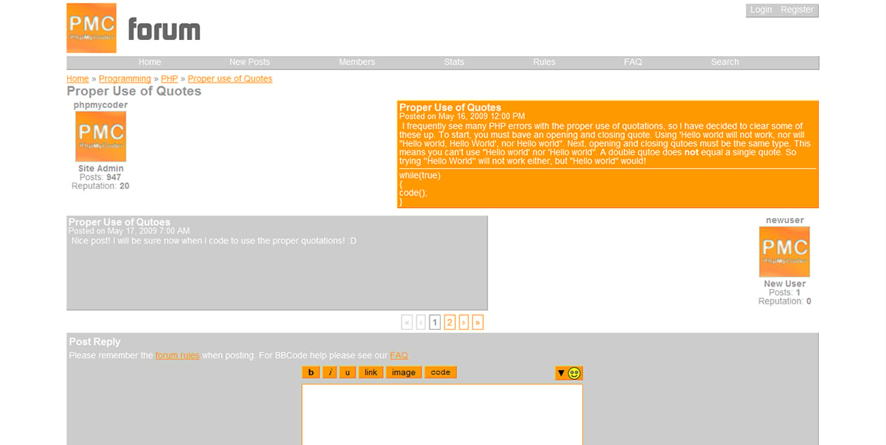
Hello everyone....I've been working on the design for my forum on my website and while everything else has gone to plan...one thing hasn't. On my topic page, the DIV with class greybox and id navigationbox that displays the text Home, New Posts, Members, Stats, Rules, etc. just wont align to the center of my 800px wrapper. I realize that it is set to float to the left and this is because for some reason when I don't float it to the left or right, the DIV's border does not display right in any browser (Well, I know it doesn't work in FF or Chrome, and I think it didn't it IE..). When not floated the border doesn't surround the DIV and instead just stretches across the 800px wrapper. Can anyone help me figure out a way to fix this? (And preferably not a non-standard...I know I could use a table with three columns or add a div before it with width of 33.3%)
Thanks Everyone!
P.S. And while your at it..could you tell me how it looks? I'd love to hear some feedback before I actually start the server side of the forum.
