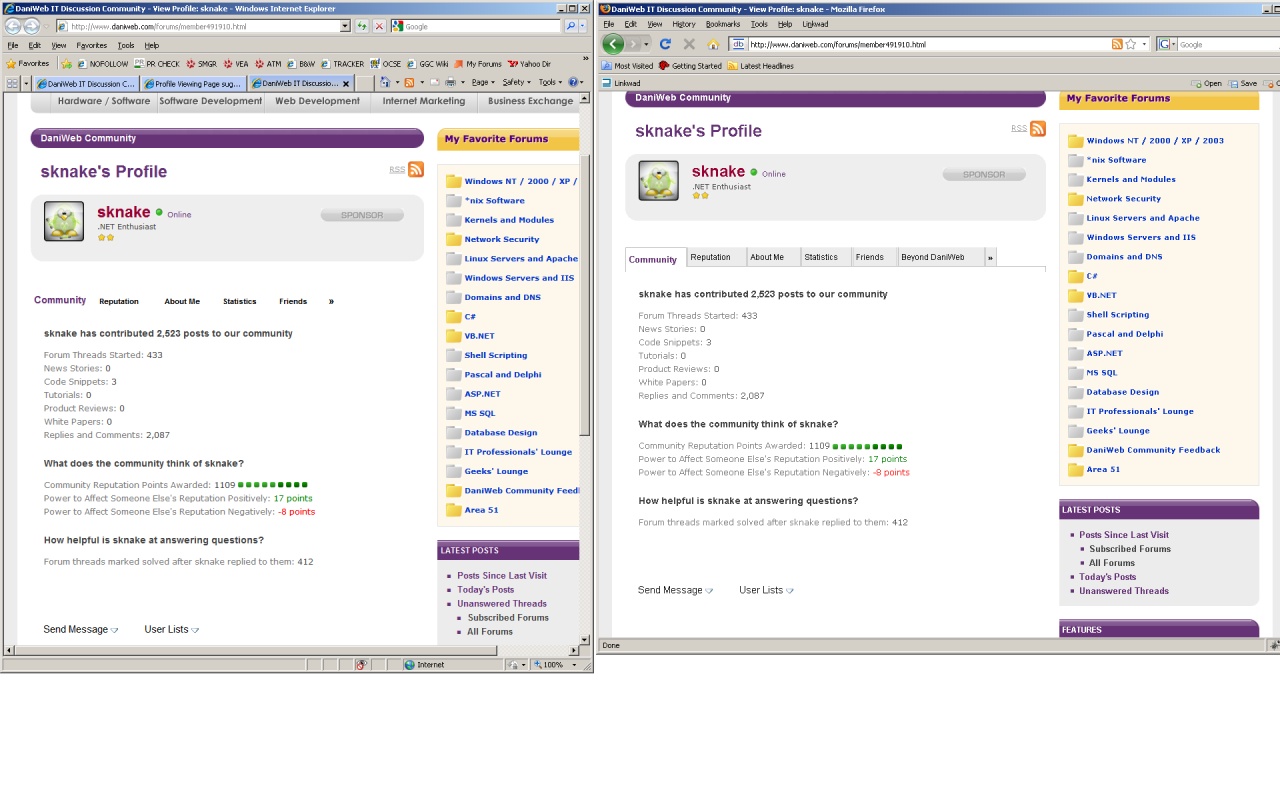
I liked the old profile page better because the text was a lot shorter and you could navigate it easier. When i'm posting and think I read a similar post earlier in another forum I open up the users profile page and hit the "Find all threads started by .." button. This previously was right on the main part of the profile page up top but now you have to scroll down, click on a tab, then click on the find all posts. All of the text is much longer now so you have to actually read it and the "Power to Affect Someone Else's Reputation Negatively" shows red on every users profile page where the only red you used to see was if someone had -REP.

  • "Community Reputation Points Awarded" -> Reputation Points
  • "Power to Affect Someone Else's Reputation Positively" > "Reputation Altering Power"
  • "Power to Affect Someone Else's Reputation Negatively" -> Remove it
    I don't see why you need to see how much a user can ding someone elses rep. Its simple enough math anyway: Floor([Reputation Altering Power]/2)
  • "How helpful is ____ at answering questions?" -> remove
  • Forum threads marked solved after ___ replied to them -> "Solved threads"
    That is more of an FAQ on how you get credit for solved threads, rather than just information

The "Send Message" | "User List" -- move it below the tab control, or remove it

  • "Send Message" -> The "Contact Info" tab has all of these options and more
  • "User List" -> Stick these items in the footer of the "Friends" page next to where you have "Befriend ____"
  • Below those menus you have
    "Last Activity: ___" and the same information is included in the "Statistics" tab

The tab control

  • "About Me" -- I like that page
  • "Statistics" -- I think this page should be done away with. The "Total Posts" and "Posts per day" should be included up top where you have a break down of where all the user posted to. It makes sense to have all the posting information grouped together. The same goes with the two options to "Find all posts" and "Find all Threads started by". This makes it a lot easier to run down duplicate posts!
    >> General Information -- This should probably be included at the very top of the page around the user's
    name
  • Friends - looks good. I like that you can see the avatars now
  • Contact Info - looks good
Dani commented: Reputation test. Please ignore. +36

Recommended Answers

All 14 Replies

Quick response before I head into the office for the day:
When viewing a post, click the user's name and in the dropdown select "Find all posts by X" without having to go into their profile at all.

But I don't want to find all of their posts -- I only want to find threads they started. Typically when someone asks the same question in multiple forms they always create the post, not post on someone elses thread.

This "Find All Posts" has a nice view of the messages with the question so you don't have to read through all of the message details.

Adding the "Find all threads started by" in the user name drop down would be an EXCELLENT enhancement for the site! :)

commented: Another reputation test. :) +36

Well this thread got surprisingly little feedback. I thought of one more idea:

Add the forum name to the "Latest Reputation Received" grid in the profile page.

Well this thread got surprisingly little feedback.

Most people here don't give a damn about profile-pages, rep, stars, titles etc etc, which is why there's little feedback on the topic.

I'll give you my opinion: I don't care :) . I liked the old profile and I also like the new one. The only downside is the whole friends/groups/contacts/social thing IMO. I can't see the point in having difference between friends/contacts etc. I do however think that it'll draw in some of the 'facebook'-generation, which I think is not really a good thing on a IT-discussion forum.

Ahhhh what happened to the profile viewing page now? It renders horrible in IE. I thought it was broken and didn't have profile information until i loaded it in FF and notice the tabs.

My guess is that is has something to do with this

Ahhhh what happened to the profile viewing page now? It renders horrible in IE. I thought it was broken and didn't have profile information until i loaded it in FF and notice the tabs.

It did change, but it looks the same to me in IE as it does in FF?

There are no tabs in IE for the options. I ignore the text in the top part of the screen that is small font like that without tabs because my eyes think it is google adwords.

There isn't a frame around the text either, its all just free hanging text in white space.

There isn't a frame around the text either, its all just free hanging text in white space.

Problem already confirmed for IE, but now Firefox (3.0.14/XP) is also showing the bug.

I think the new design is fine. I think it would be cool if we can filter posts by forum. For example: if I want to see all the posts I contributed to the Java forum I can filter all my posts by "Java". I'm in no way trying to burden Dani with extra work. It's not really important, I just thought it would be cool...unless this feature already exists and I just can find it :)

Member Avatar for diafol

Sorry to join a little belatedly. I think the new design sucks. Sorry Dani. The (very) old version was OK, but then the next version I though was really cool. Then everything went blank. No frames/borders - yuk. It's not a new design, it's no design. Please can we have some visuals back in the area?

Be a part of the DaniWeb community

We're a friendly, industry-focused community of developers, IT pros, digital marketers, and technology enthusiasts meeting, networking, learning, and sharing knowledge.