Member Avatar for ShandyElliott

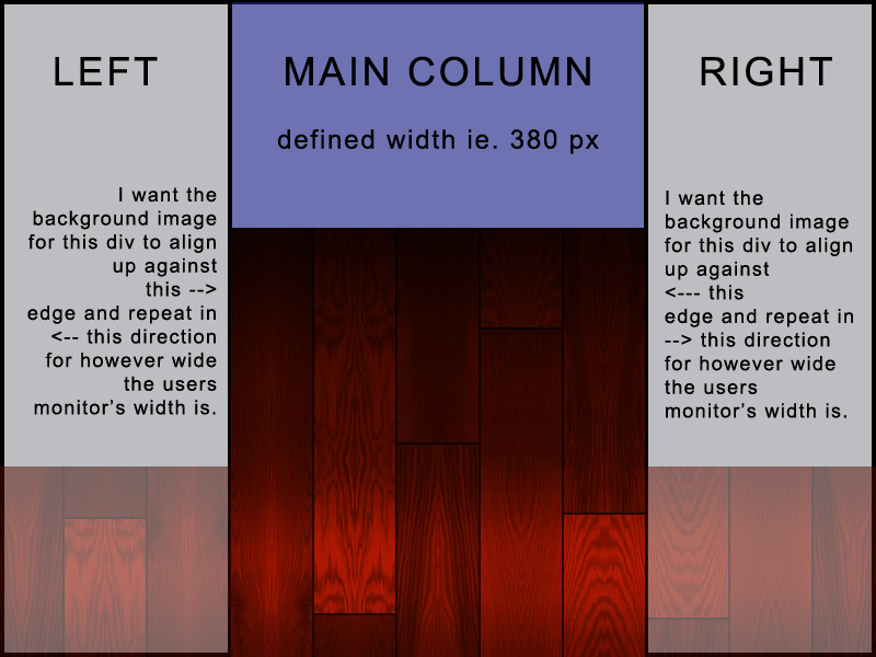
I'm mentally stuck. I'm trying to create 3 divs side-by-side with the 2 outter divs containing a repeating background in opposite directions of each other with a fixed width middle div. The background image for the left div needs to begin its alignment where it meets the middle div and repeat to the left. Same but opposite thing for the right div.

My reasoning is because I have a background image that is (say 380 px wide). The middle div will be exactly 380 px and centered in the browser. For reasons I don't think are important, I need to place an actual image into the middle div, but the other 2 divs will use the same image but used as a repeating background. What I'm trying to accomplish is to create a seamless background image with 2 divs using it as a background image and the middle div using it as an inserted graphic - all the while having the seems of the image line up exactly.

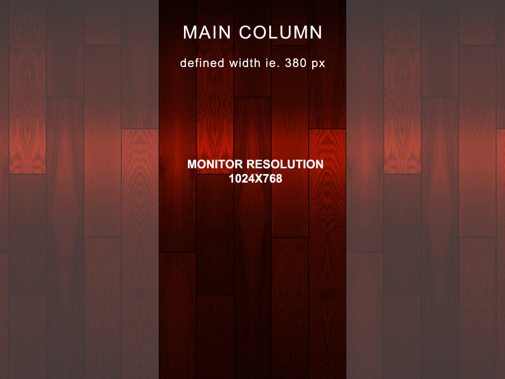
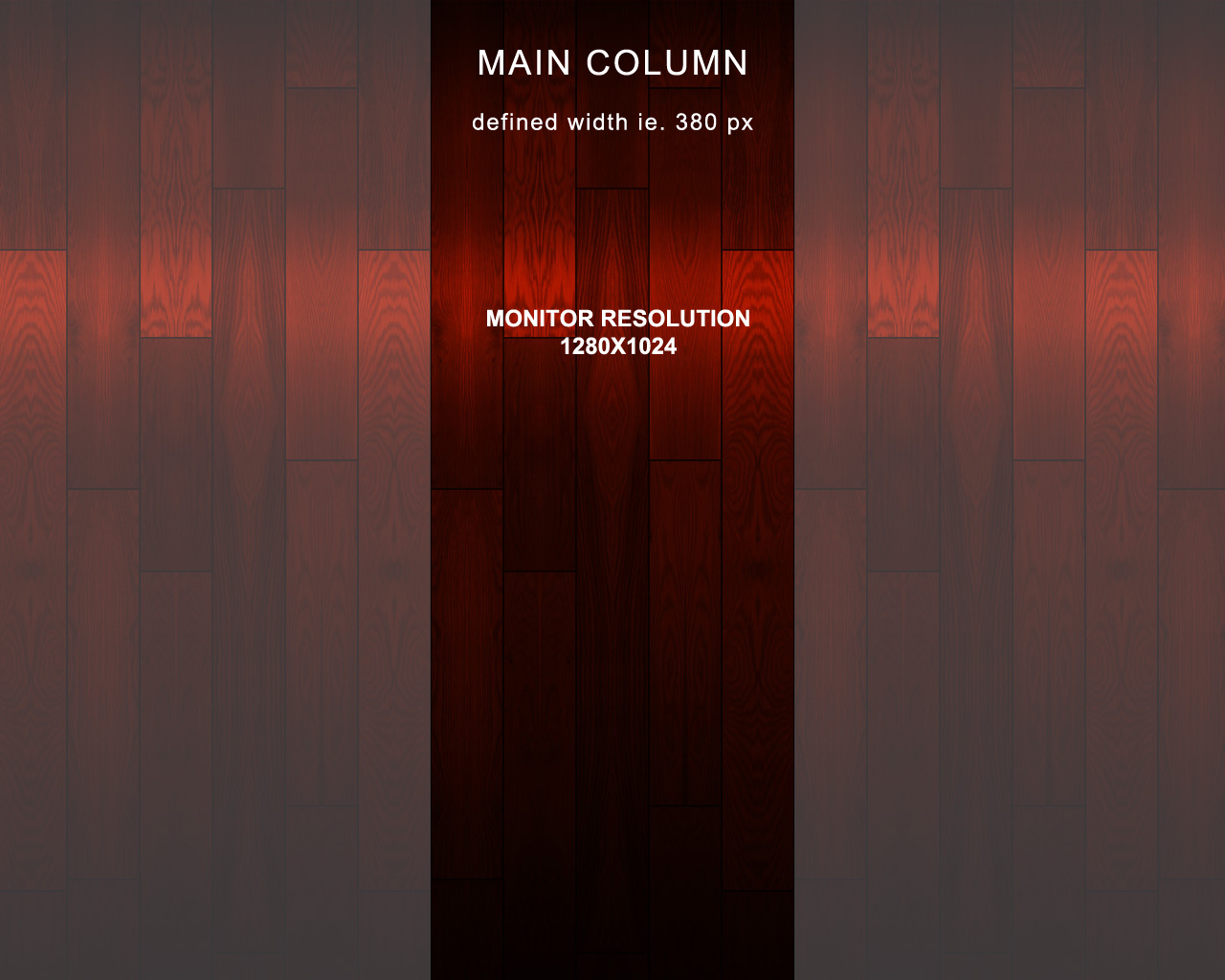
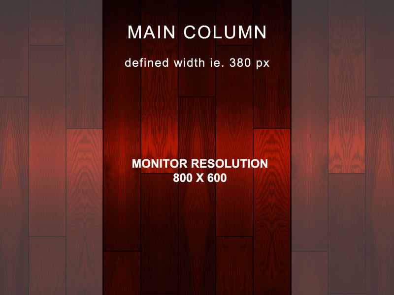
I created a visual to help (hopefully) explain what I'm trying to do. If you look at the image, what I want to happen is the middle content to always remain in the middle, and as the monitor/browser's width changes (per viewer's monitor settings), I want the outter div's to fill up the screen on each side (but the main thing is to make sure they keep their alignment beginning next to the middle div. I've attached my source files for where I am right now... if anyone could turn me in the right direction, I would appreciate it.

Maybe I'm trying something that isn't conventional or maybe there is a different way to do it...

Recommended Answers

All 6 Replies

Wait... so you are having the side columns be a percentage width and then you setting the center to a hard 380px??

That is way backward from a standard 3 column layout that you see on the web today.

Member Avatar for ShandyElliott

Wait... so you are having the side columns be a percentage width and then you setting the center to a hard 380px??

That is way backward from a standard 3 column layout that you see on the web today.

Let me try to explain it in a different way. If you look at the progressively larger images I've attached, per the users monitor resolution (width mainly), the background image (wood pattern) of the left div and the right div will repeat along their x-axis. No matter how wide their resolution is, the outter div backgrounds will repeat accordingly, BUT the middle div will remain centered and 380px. The best way I can explain is through visual examples.

If you look at "example.jpg" and think no matter how wide the user's monitor is, I want the left and right div's to have their backgrounds repeat as necessary AND for the edges circled in white to always align like you see in every graphic attached. Since I have to place a patterned graphic on top of itself, I want their edges to always align.

I know it's hard to interpret "words" when it comes to something visual, but I think my intention is understandable.

In response to your mention of percentages - if the user's monitor width is 1024px, and the middle div is 380px, that leaves 644px to be divided between the left and right div - how can I assign a percentage to those divs based on resolution? I know there is an answer for what I'm going for - maybe I'm not explaining it right...

<!DOCTYPE html PUBLIC "-//W3C DTD XHTML 1.0 Transitional//EN" "http://www.w3.org/TR/xhtml1/DTD/xhtml1-transitional.dtd">
<html xmlns="http://www.w3.org/1999/xhtml" lang="en-us">
<head>
<meta http-equiv="content-type" content="text/html; charset=utf-8" />
<title></title>
<style type="text/css">
<!--
body {
	height: 768px;
	margin: 0;
	padding: 0;
}
h1 {
	font-size: 14pt;
	margin: 0 0 10px;
	padding: 0;
}
#wrapper {
	background: #8a0202;
	height: 100%;
	margin: auto;
	position: relative;
	width: 380px;
}
#main-column {
	margin: auto;
	padding: 10px;
	text-align: center;
}

#left {
	float: left;
	display: block;
	position: relative;
	top: 0;
	width:50%;
}
#left-content {
	margin-right: 190px;
	background: #f54646;
}
#right {
	float: right;
	right: 0;
	display: block;
	position: absolute;
	top: 0;
	width:50%;
}
#right-content {
	margin-left: 190px;
	background: #f54646;
	position: relative;
}
#main {
	color: #ffffff;
	width: 380px;
	margin: auto;
	position: relative;
	z-index: 111111;
	background: #830202;
}
-->
</style>
</head>
<body>
	<div id="left">
		<div id="left-content">
			<h1>Left Column</h1>
		</div>
	</div>
	<div id="main">
		<h1>Main Column</h1>
	</div>
	<div id="right">
		<div id="right-content">
			<h1>Right Column</h1>
		</div>
	</div>
</body>
</html>
Member Avatar for ShandyElliott

Thanks... that seems to work relatively well for the example I gave - now I have to apply it to the final layout. I see that you wrote a #wrapper and #main-column style but didn't use them. Were they meant to be used?

Thanks again...

I see that you wrote a #wrapper and #main-column style but didn't use them

Sorry.. they are code blob. You may need another wrapper to add more styles to the main columns. With my example, the '#main' layer should be the parent container. Cheer...

Member Avatar for ShandyElliott

Now I just need to figure out how to place a footer (I've looked at different methods online) to where the footer will stick to the bottom of the page no matter how much height there is of the three columns above.

Be a part of the DaniWeb community

We're a friendly, industry-focused community of developers, IT pros, digital marketers, and technology enthusiasts meeting, networking, learning, and sharing knowledge.