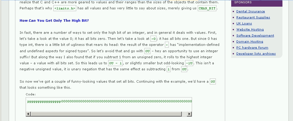
I try to make my code conform to no more than 80 characters per line. It seems that that may be near the chosen maximum number of characters before a horizontal scroller is used.
In this particular example, the line is exactly 80 characters:
pppppppppppppppp0000000000000000000000000000000000000000000000000000000000000000Can the code box width be adjusted to support an 80-character line without adding a horizontal scroller?
And in the Printable Version, the box seems smaller yet. Could this also be made wider?