Hi, after like 2 hours of searching the web I haven't found a solution for this. After spending 30 or 40 minutes trying to code it myself and not finding anything that works, it's time to ask here!
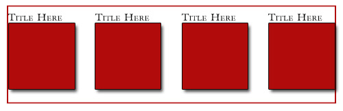
Attached is an image of what I want.
I have a certain width to work within, 928px. I want to create four boxes of content distributed between the left and right edges of that space.
To get a few obvious solutions out of the way consider these:
If I float left, everything squishes to the left, of course.
I can float left and then use a right-margin, but this is imprecise and won't align between left and right edges before the floated boxes stack on each other. In fact floats are weird period because they topple over like that.
A table can be used but I don't want to. If I make four cells that are the same width, and center the content in the cells, they will be spaced evenly, but WON'T be distributed edge to edge of the container space.
I tried using 4 layers of divs and setting all the display: styles to table, table-row, table-cell, but couldn't get that to work either, the behavior is weird.
Note that the red boxes are going to be a strait image, nothing fancy, with a border. The title might be heavily styled or may be an image itself.
If possible the method used needs to be fluid and not hard coded to specifics. In other words, maybe there might be 6 boxes another time, or the boxes may have random widths and not the same width, or the boxes may be dynamically generated and thus need to "pop" into the page and be distributed with the rest.
The worst case scenario is that I have to calculate everything exact and just set margins so that it almost looks like it's evenly across.
Maybe this is simple, or I'm going mad, I would think somewhere in the CSS spec or html markup you can do something as trivial as distribute items horizontally or vertically. Maybe not?
At this point I don't care if the solution is DIVs or a table or UL/LI or some <p>s, I just want to do it!
Here is some code, using DIVs with a table display style, but of course the content is not edge to edge of the container block, it's just distributed. If this code even works for you.
<html>
<head>
<title>Distribute DIVs horizontally and fluid</title>
<style type="text/css">
html, body { margin:auto; text-align:center; }
#cage { width: 900px; height:500px; border:1px solid red; margin:15px auto;display:table; }
#row {border:1px dotted green;display:table-row;}
#feature {border:1px solid blue;display:table-cell;text-align:left;}
#inner {width:200px;height:200px;border:1px dotted black;margin:auto;padding:0px;}
</style>
</head>
<body>
<div id="cage">
  <div id="row">
    <div id="feature">
    	<div id="inner">
      	content<br /><img src="someimage.jpg" width="200" height="200" />
      </div>
		</div>
    <div id="feature">
    <div id="inner">
      	content<br /><img src="someimage.jpg" width="200" height="200" />
      </div>
    </div>
    <div id="feature">
    <div id="inner">
      	content<br /><img src="someimage.jpg" width="200" height="200" />
      </div>
    </div>
    <div id="feature">
    <div id="inner">
      	content<br /><img src="someimage.jpg" width="200" height="200" />
      </div>
    </div>
	</div>
</div>
</body>
</html>