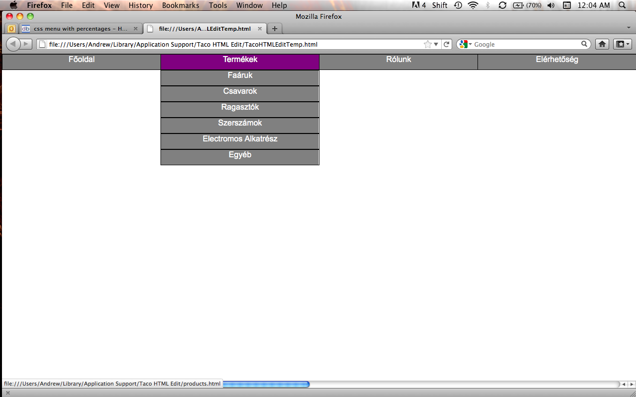
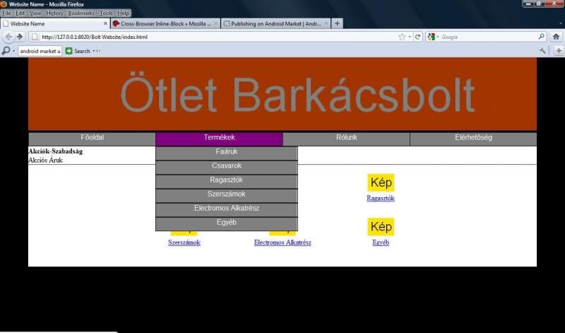
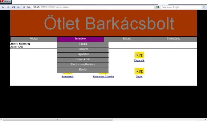
I made a simple menu using css and a tutorial on youtube and now I would like to change px into percentages. I have managed to do most of it, but when I go to products, insted of them being listed under each other 4 of them are beside eachother and then 2 of them are underneath. like so

Main menu
|1|2|3|4|
|5|6|

Here is my css code for the menu

/* Menu Starting*/

#navMenu {
	margin: 0;
	padding: 0;
	width: 100%;
}

#navMenu ul {
	margin: 0;
	padding: 0;
	height: 30px;
}

#navMenu li {
	margin: 0;
	padding: 0;
	list-style: none;
	float: left;
	position: relative;
	background-color: gray;
}
#navMenu ul li {
	width: 25%;
}

#navMenu ul li a{
	text-align:center; 
    height: 30px;
    width: 100%;
    display:block;
    color:#000;
    font-family:"Arial", cursive;
    text-decoration:none;
    color: white;
    border:1px solid black;
	
}

#navMenu ul ul {
	position: absolute;
	visibility: hidden;
	top: 32px;
}

#navMenu ul li:hover ul {
	visibility: visible;
	width: 400%; /*Makes it so that the item takes up as large of a space as the main products area*/
}
/*Change color on hover*/
#navMenu a:hover {
	background: purple;
}

#navMenu li:hover {
	color: white;
	background-color: blue;
}


/* hover for link items */
#navMenu ul li:hover ul li a:hover {
	color: white;
	background-color: red;
}


.clearFloat {
    clear:both; 
    margin: 0;
    padding:0;
 }
 
 /*end of menu*/

and here is the code for the items

<div id="navMenu" align="center">
             <ul> <!-- main ul -->
             	<li><a href="index.html">Főoldal</a></li>
             	<li><a href="products.html">Termékek</a>
             		<ul> 
             			<li><a href="">Faáruk</a></li>	
             			<li><a href="">Csavarok</a></li>	
             			<li><a href="">Ragasztók</a></li>	
             			<li><a href="">Szerszámok</a></li>	
             			<li><a href="">Electromos Alkatrész</a></li>	
             			<li><a href="">Egyéb</a></li>
             		</ul>
             		
             	</li> <!-- end of products -->
             	<li><a href="about.html">Rólunk</a></li> <!-- end of about -->
             	<li><a href="about.html">Elérhetőség</a></li> <!-- end of contact -->
             	
             </ul> <!-- end main ul -->
      	
        </div> <!-- end of Menu divider -->

How could I fix this issue?

Thanks for any help

Recommended Answers

All 26 Replies

Which browser is this happening in? It displays fine in my Firefox 5.

Regards
Arkinder

I have run it in Opera 11.50, Firefox 5.0.1, and IE (can't find version) I dont know why it doesn't glitch for you.

Once again, my apologies. Not my greatest week. The position: relative; here is causing the issue.

#navMenu li {
    background-color: gray;
    float: left;
    list-style: none outside none;
    margin: 0;
    padding: 0;
    position: relative;
}

You could try removing it and using a width with an em unit. I'm just out of creative, or any for that matter, solutions right now. If I think of anything I'll let you know.

Regards
Arkinder

Thanks for helping :)

The reason I changed it to percentage, because (as I understand) if I use a percentage value then the website will resize according to the users screen.

Exactly, it's called a fluid layout. But as you can it has it's fair share of issues. I just made an incredibly strong cup of French Roast. ^_^ So, I'll take another look and get back to you in a few minutes.

Regards
Arkinder

Okay, this isn't possible with position: relative; in there. However, you don't need it. The comments in the CSS explains how this works.

<!DOCTYPE HTML PUBLIC "-//W3C//DTD HTML 4.01//EN" "http://www.w3.org/TR/html4/strict.dtd">
<html>

	<head>
		<title></title>
		<meta http-equiv="Content-Type" content="text/html; charset=utf-8">
		<style type="text/css">

		* { margin: 0; padding: 0;}
		
		#navMenu {
			width: 100%;
		}

		#navMenu ul {
			list-style-type: none;
		}
		
		#navMenu ul li {
			width: 25%;
			background-color: gray;
			float: left;
		}
		
		#navMenu ul ul {
			width: 156.4%;  /* 16% of 156.4% is roughly 25% of 100% of the browser window */
			visibility: hidden;
			position: absolute;
		}
		
		#navMenu ul li>ul li {
			width: 16%;  /* 16% is about the highest width the browser will allow before putting elements on the next line - this overwrites the value inherited from the #navMeny ul li rule */
		}
		
		#navMenu ul li a {
			width: 100%;
			height: 30px;
			text-align: center; 
    		        display: block;
    		        font-family:"Arial", cursive;
    		        text-decoration: none;
    		        color: white;
    		        border: 1px solid black;
		}
		
		#navMenu ul li:hover ul {
			visibility: visible;
		}
		
		/*Change color on hover*/
		#navMenu a:hover {
			background: purple;
		}

		#navMenu li:hover {
			color: white;
			background-color: blue;
		}


		/* hover for link items */
		#navMenu ul li:hover ul li a:hover {
			color: white;
			background-color: red;
		}
		
		.clearFloat {
    		clear:both; 
 		}
		
		</style>
	</head>
	
	<body>
	
	<div id="navMenu">
             <ul> <!-- main ul -->
             	<li><a href="index.html">Főoldal</a></li>
             	<li><a href="products.html">Termékek</a>
             		<ul> 
             			<li><a href="">Faáruk</a></li>	
             			<li><a href="">Csavarok</a></li>	
             			<li><a href="">Ragasztók</a></li>	
             			<li><a href="">Szerszámok</a></li>	
             			<li><a href="">Electromos Alkatrész</a></li>	
             			<li><a href="">Egyéb</a></li>
             		</ul>
             		
             	</li> <!-- end of products -->
             	<li><a href="about.html">Rólunk</a></li> <!-- end of about -->
             	<li><a href="about.html">Elérhetőség</a></li> <!-- end of contact -->
             	
             </ul> <!-- end main ul -->
      	
    </div> <!-- end of Menu divider -->
	
	</body>
	
</html>

If you want to center the navigation, make the following changes.

#navMenu {
    width: 98%;
    margin: 0 auto;
}

#navMenu ul ul {
    width: 153.4%;  /* 16% of 156.4% is roughly 25% of 100% of the browser window */
    visibility: hidden;
    position: absolute;
}

Sorry it took so long. I had to keep stopping to do other things.

Regards
Arkinder

I don't mind a delay. I appreciate your help, but it still doesn't display each object one under another. now it prints them side by side all the objects under the products or Termékek menu.

ROFLMFAO. That's not what you wanted? Geez, I misread your post... again! Wow, just one epic fail after the other. Anyways, use the markup and CSS I just posted with this one addition in green.

#navMenu ul ul {
    position: absolute;
    left: 0;
    visibility: hidden;
    width: 156.4%;
}

Regards
Arkinder

left:0; just shifts the items over to the very left of the screen, but doesn't put them in separate lines.

Edit1:
Edit2: previous edit removed

Okay, it's not me this time. Your post doesn't make sense at all. So you're wanting them to go straight down?

If so:

#navMenu ul li>ul li {
    width: 16%;
    clear: left;
}

Regards
Arkinders

Yes, I would like them straight down. This fixed the issue of them not going down, now I just need to make them move under the products. I added in a margin-right 50%; into the #navMenu ul li>ul li. would there be an easier, or cleaner way of doing this(when I wanted to go from left 25% it positioned it on the right side)? Also the appearing menus are a bit larger then the products section in the main menu. How could I make them the same size?

Edit: when I tried margin-left:50%; (to see it it moves it that percentage over to the left) then the items didn't display

Which word is Products? :P

#navMenu ul ul {
	width: 156;
	visibility: hidden;
	position: absolute;
}

Regards
Arkinder

lol The second one or Termékek is products.

width: 156; is not valid css code. is it in pixels, or percent? also I have that in that block width: 156.4%; that sets the title block. I would like to set the size of the products that drop down when you scroll over the second option.

Oops, it's percent. There's a little confusion from changing the CSS so much. This is what you should have now that does everything you have asked for so far.

<!DOCTYPE HTML PUBLIC "-//W3C//DTD HTML 4.01//EN" "http://www.w3.org/TR/html4/strict.dtd">
<html>

	<head>
		<title></title>
		<meta http-equiv="Content-Type" content="text/html; charset=utf-8">
		<style type="text/css">

		* { margin: 0; padding: 0;}
		
		#navMenu {
			width: 100%;
		}

		#navMenu ul {
			list-style-type: none;
		}
		
		#navMenu ul li {
			width: 25%;
			background-color: gray;
			float: left;
		}
		
		#navMenu ul ul {
			width: 156%;  /* 16% of 156% is roughly 25% of 100% of the browser window */
			visibility: hidden;
			position: absolute;
		}
		
		#navMenu ul li>ul li {
			width: 16%;  /* 16% is about the highest width the browser will allow before putting elements on the next line - this overwrites the value inherited from the #navMeny ul li rule */
			clear: left;
		}
		
		#navMenu ul li a {
			width: 100%;
			height: 30px;
			text-align: center; 
    		        display: block;
    		        font-family:"Arial", cursive;
    		        text-decoration: none;
    		        color: white;
    		        border: 1px solid black;
		}
		
		#navMenu ul li:hover ul {
			visibility: visible;
		}
		
		/*Change color on hover*/
		#navMenu a:hover {
			background: purple;
		}

		#navMenu li:hover {
			color: white;
			background-color: blue;
		}


		/* hover for link items */
		#navMenu ul li:hover ul li a:hover {
			color: white;
			background-color: red;
		}
		
		.clearFloat {
    		clear:both; 
 		}
		
		</style>
	</head>
	
	<body>
	
	<div id="navMenu">
             <ul> <!-- main ul -->
             	<li><a href="index.html">Főoldal</a></li>
             	<li><a href="products.html">Termékek</a>
             		<ul> 
             			<li><a href="">Faáruk</a></li>	
             			<li><a href="">Csavarok</a></li>	
             			<li><a href="">Ragasztók</a></li>	
             			<li><a href="">Szerszámok</a></li>	
             			<li><a href="">Electromos Alkatrész</a></li>	
             			<li><a href="">Egyéb</a></li>
             		</ul>
             		
             	</li> <!-- end of products -->
             	<li><a href="about.html">Rólunk</a></li> <!-- end of about -->
             	<li><a href="about.html">Elérhetőség</a></li> <!-- end of contact -->
             	
             </ul> <!-- end main ul -->
      	
    </div> <!-- end of Menu divider -->
	
	</body>
	
</html>

Regards
Arkinder

it is not exact. I still have width: 156.4%; instead of width: 156%;. I also added in this line of code

#navMenu ul li>ul li {
	width: 16%;  /* 16% is about the highest width the browser will allow before putting elements on the next line - this overwrites the value inherited from the #navMenu ul li rule */
	clear: left;
	margin-right: 50%;
}

to make the beginning of the products that appear line up with the products in the visible menu bar.

If you are still using left: 0; remove it, and then you shouldn't need the margin-right. Attached is a screen shot of what I just posted. What is it not doing that you want it to?

EDIT: If you're talking about the small white space on the right of the links, that's just the default background color. Add this to fix it.

#navMenu ul li a {
    width: 100%;
    height: 30px;
    text-align: center; 
    display: block;
    font-family:"Arial", cursive;
    text-decoration: none;
    color: white;
    border: 1px solid black;
    background-color: gray;
}

Regards
Arkinder

I removed the margin-right: 50%; It still stays in the area by start of the products.

here is my css code for the menu

* { margin: 0; padding: 0;}
 

#navMenu {
	width: 100%;
}
 
#navMenu ul {
	list-style-type: none;
}
 
#navMenu ul li {
	width: 25%;
	background-color: gray;
	float: left;
}
 
#navMenu ul ul {
	position: absolute;
    visibility: hidden;
    width: 156.5%;
}
 
#navMenu ul li>ul li {
	width: 16%;  /* 16% is about the highest width the browser will allow before putting elements on the next line - this overwrites the value inherited from the #navMenu ul li rule */
	clear: left;
}
 
#navMenu ul li a {
	width: 100%;
	height: 30px;
	text-align: center; 
    display: block;
  	font-family:"Arial", cursive;
	text-decoration: none;
	color: white;
	border: 1px solid black;
}
 
#navMenu ul li:hover ul {
	visibility: visible;
}
 
/*Change color on hover*/
#navMenu a:hover {
	background: purple;
}
 
#navMenu li:hover {
	color: white;
	background-color: blue;
}


/* hover for link items */
#navMenu ul li:hover ul li a:hover {
	color: white;
	background-color: red;
}
 
.clearFloat {
   	clear:both; 
}

and I have included a screenshot of the website in Firefox and Opera. It displays fine in your browser, but my hidden products are longer then the products tab in the menu.

Okay, something else is affecting it. Post the CSS for the entire page. Also, see if these changes make a difference.

#navMenu ul ul {
	width: 100%;
	visibility: hidden;
	position: absolute;
}
		
#navMenu ul li>ul li {
	width: 25%;
	clear: left;
}

Regards
Arkinder

Changing my code to that did not make a difference.

Here is my whole css code

style.css:


body {
	background: url('Images/testBackg.jpeg') 50% 50% no-repeat;
}

#headerWrap {
	margin-left: auto;
	margin-right: auto;
	margin-bottom: 0;
	width: 90%; 
	height: 12%;
	background: url('Images/header.gif') no-repeat;
}
img.image {
	width: 100%;
	height: 12%;
}

#footer {
	margin-left: auto;
	margin-right: auto;
	height: 12%;
	width: 90%;
	background: black;
	color: gray;
}
#footer p{
	font-size: 8px;
}

#container {
	margin-left: auto;
	margin-right: auto;
	margin-top: 0px;
	margin-bottom: 0;
	padding-bottom: 30px;
	color: #000000;
	width: 90%;
	background-color: white;

}

#containerNoCol {
	margin-left: auto;
	margin-right: auto;
	margin-top: 0;
	margin-bottom: 0;
	color: #000000;
	width: 90%;
}

#deals {
	margin-top: 2px;
	margin-bottom: 0;
	background-color: white;
	width: 90%;
	margin-left: auto;
	margin-right: auto;
}

#productsMenuFirst{
	display: inline-block;
	padding-top: 20px;
	padding-left: 4%;
	padding-right: 2%;
	width: 15%;
	height: 80px;
	zoom: 1;
    *display: inline;
	
}


#productsMenu {
	display: inline-block;
	padding-top: 20px;
	padding-left: 2%;
	padding-right: 2%;
	width: 15%;
	height: 80px;
	zoom: 1;
    *display: inline;
	
}

#productsMenuLast {
	display: inline-block;
	padding-top: 20px;
	padding-left: 2%;
	padding-right: 4%;
	width: 15%;
	height: 80px;
	zoom: 1;
    *display: inline;
	
	
}


.background {
	background-color: black;
}

#grayCol {
	margin: 0;
	margin-left: auto;
	margin-right: auto;
	background-color: gray; 
}

* { margin: 0; padding: 0;}
 

#navMenu {
	width: 100%;
}
 
#navMenu ul {
	list-style-type: none;
}
 
#navMenu ul li {
	width: 25%;
	background-color: gray;
	float: left;
}
 
#navMenu ul ul {
	width: 100%;
	visibility: hidden;
	position: absolute;
}
 
#navMenu ul li>ul li {
	width: 25%;
	clear: left;
}
 
#navMenu ul li a {
	width: 100%;
	height: 30px;
	text-align: center; 
    display: block;
  	font-family:"Arial", cursive;
	text-decoration: none;
	color: white;
	border: 1px solid black;
}
 
#navMenu ul li:hover ul {
	visibility: visible;
}
 
/*Change color on hover*/
#navMenu a:hover {
	background: purple;
}
 
#navMenu li:hover {
	color: white;
	background-color: blue;
}


/* hover for link items */
#navMenu ul li:hover ul li a:hover {
	color: white;
	background-color: red;
}
 
.clearFloat {
   	clear:both; 
}

/* Menu Starting*/
/*
#navMenu {
	margin: 0;
	padding: 0;
	width: 100%;
}

#navMenu ul {
	margin: 0;
	padding: 0;
	height: 30px;
}

#navMenu li {
	float: left;
	position: relative;
	margin: 0;
	padding: 0;
	list-style: none;
	background-color: gray;
}
#navMenu ul li {
	width: 25%;
}

#navMenu ul li a{
	text-align:center; 
    height: 30px;
    width: 100%;
    display:block;
    color:#000;
    font-family:"Arial", cursive;
    text-decoration:none;
    color: white;
    border:1px solid black;
	
}

#navMenu ul ul {
	position: absolute;
	visibility: hidden;
	
	top: 32px;
}

#navMenu ul li:hover ul {
	visibility: visible;
	width: 400%; /*Makes it so that the item takes up as large of a space as the main products area*/
}
/*Change color on hover*/
/*
#navMenu a:hover {
	background: purple;
}

#navMenu li:hover {
	color: white;
	background-color: blue;
}


/* hover for link items *//*
#navMenu ul li:hover ul li a:hover {
	color: white;
	background-color: red;
}


.clearFloat {
    clear:both; 
    margin: 0;
    padding:0;
}
 
 /*end of menu*/

/*div>div>div { display: inline;}*/

It's definitely being caused by another CSS rule. Do you have a test site that I could view? If not, post your HTML please.

Make sure to ask yourself the question, "Percentage of what?" It can get a little confusing if you don't keep track of them.

Regards
Arkinder

Here is the HTML. It does not have any CSS directly in the HTML

<!DOCTYPE html> 


<html> 
   <head> 
      <title>Website Name</title> 

      <meta http-equiv="Content-Type" content="text/html; charSet=UTF-8"> 
      <link rel="stylesheet" href="style.css" media="screen" />
      <!--CSS--> 

      <!--JS--> 

   </head> 

   <body bgcolor="Black" > 
   
      <!--Content--> 
     
   <div id="headerWrap" align="center"><img src="Images/header.gif" class="image"></img></div>
   
   <div id="containerNoCol" align="center"> <!-- holds menu div>
        <!-- Menu Divider -->
        <div id="navMenu" align="center">
             <ul> <!-- main ul -->
             	<li><a href="index.html">Főoldal</a></li>
             	<li><a href="products.html">Termékek</a>
             		<ul> 
             			<li><a href="">Faáruk</a></li>
             			<li><a href="">Csavarok</a></li>	
             			<li><a href="">Ragasztók</a></li>	
             			<li><a href="">Szerszámok</a></li>	
             			<li><a href="">Electromos Alkatrész</a></li>	
             			<li><a href="">Egyéb</a></li>
             		</ul>
             		
             	</li> <!-- end of products -->
             	<li><a href="about.html">Rólunk</a></li> <!-- end of about -->
             	<li><a href="about.html">Elérhetőség</a></li> <!-- end of contact -->
             	
             </ul> <!-- end main ul -->
      	
        </div> <!-- end of Menu divider -->
   </div> <!-- end of holds menu div -->
   
   <!--<div id="deals">
   	<marquee behavior="scroll" direction="left" class="clearFloat" id="">Where the deals will be written</marquee>
   </div> <!-- end of container holds deals -->
   <div id="container">
   	<h4>Akciók-Szabadság</h4>
   	<p> Akciós Áruk</p>
   	<div id="grayCol"><hr /></div>
   	<!-- Row 1 -->
   	<div align="center">
   		<div id="productsMenuFirst">
   			<div><a href="#"><img src="Images/prodictsImg.gif"></a></div>
   			<div><a href="#">Faáruk</a></div>
    	</div>   
 		<div id="productsMenu">
   			<div><a href="#"><img src="Images/prodictsImg.gif"></a></div>
   			<div><a href="#">Csavarok</a></div>
   		</div>
  		<div id="productsMenuLast">
   			<div><a href="#"><img src="Images/prodictsImg.gif"></a></div>
   			<div><a href="#">Ragasztók</a></div>
   		</div>
	</div>
	<!-- end row 1, row 2 -->
	<div align="center">
   		<div id="productsMenuFirst">
   			<div><a href="#"><img src="Images/prodictsImg.gif"></a></div>
   			<div><a href="#">Szerszámok</a></div>
    	</div>   
 		<div id="productsMenu">
   			<div><a href="#"><img src="Images/prodictsImg.gif"></a></div>
   			<div><a href="#">Electromos Alkatrész</a></div>
   		</div>
  		<div id="productsMenuLast">
   			<div><a href="#"><img src="Images/prodictsImg.gif"></a></div>
   			<div><a href="#">Egyéb</a></div>
   		</div>
   	</div>
	<div align="center">
   	<!-- end row 2, row 3 -->
   	<!-- none in row 3 yet -->
   </div>
   
   <div id="footer"></div>
   
   </body> 
</html>

You're making the navigation 100% of 90% of 90% of the document. Try this.

li > ul li {
    clear: left;
    width: 22.4%;
}

Regards
Arkinder

I added the your code to this block of css

#navMenu ul li>ul li {
	width: 22.4%;
	clear: left;
}

and that made it in line with the Products menu. Thanks.

now just a quick question do you see the reason that the gray background does not quite go all the way to the border?

Yep, I already talked about it. See the edit in this post.

Regards
Arkinder

Thanks.

No problem

Be a part of the DaniWeb community

We're a friendly, industry-focused community of developers, IT pros, digital marketers, and technology enthusiasts meeting, networking, learning, and sharing knowledge.