Hey Everyone,

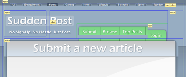
This is probably going to be easy to solve, well at least I hope. I am having problems positioning my main navigational bar. It is supposed to be right on top of the banner div(the banner is the thing that says "Submit a new article", I know it's not a banner). Check out the test website to see for yourself: http://drew-parker.com/SuddenPost/

You can view the source and you should be able to click on the stylesheets. Either way, any help would be appreciated. The issue I am having is when i push down the green navbar it also pushes the banner div below it further and further down....I am a newbie : /

http://drew-parker.com/SuddenPost/

Thank you,

Drew

Recommended Answers

All 9 Replies

Here:

#mainnav ul {
	float: left;
        overflow: hidden;
        margin-left: 140px;
        margin-bottom: 0;
	border: 1px solid blue;
	}

Add 'margin-bottom: 0' to 'ul' which is inside of 'mainnav' div.

commented: Great Input! Thanks Zero - Drew +1

Zero,

It is still not lining up properly, there is a small space in between and when I try to push the nav down it will push the whole banner div down? Although, what you told me kinda helped. Now it is less space between the div and navbar.

Check it out: http://drew-parker.com/SuddenPost/

Any help is appreciated, thank you for your time : )

- Drew

Member Avatar for diafol

There's a *lot* of js going on behind the scenes - I don't understand why you need all that

I will clean up the JS right now, thank you for pointing that out ardav. : )

I forgot to do that, although this is just effecting the right and left margins. I am still unclear what the problem is....it is almost perfect just need to push the navbar like 5-10 pixels down without pushing the div below it down : /

Member Avatar for diafol

Well it's unclear what the JS is doing to your css. When I looked at it in view source and inspect element (Chrome), there was a world of difference. The JS is doing some mean reformatting - I'm not saying that JS is causing a problem with this element - but as I said it's a bit disorientating.

I understand, I removed it completely. I am still not sure what is causing the problem. I have looked through my css way too many times and will continue with trial and error. Well, thank you for your input. If you happen to find the issue please update me if possible, if not no biggie.

Thanks ardav

In need of help, I am soooo confused. The code looks right, but I guess I need another persons perspective...

Any help would be appreciated, thanks again ardav for the input. It is still just acting funny : /

Member Avatar for diafol

OK - looks like your UL is too far up the containing DIV:


I had a look at margins/paddings of the involved elements, but couldn't see anything too obvious. JS is still on the prowl with quite a few margin:1px on the involved elements.

//EDIT - just had a brainwave - your UL/LI heights may be too big and the images are repeating (by default) - this is causing the grey bar below the first set of images. I'll wager that if you cut down the height - it'll work.

//EDIT
Yes - use 59px for the UL height - you've got it set to 78px.

commented: Ardav is always helping me! He is really good at what he does! +1

Ardav, you are a genius! Thanks alot, it is matching up now. Well, at least what I wanted to match up. My buttons were a little too long. I will change that and it should work great!

Thank you again, you are awesome. I downloaded google chrome, the inspect element is pretty damn cool. Wise choice.

Be a part of the DaniWeb community

We're a friendly, industry-focused community of developers, IT pros, digital marketers, and technology enthusiasts meeting, networking, learning, and sharing knowledge.