Hi..
I dont know actually how is the best term i should use to describe my problem..
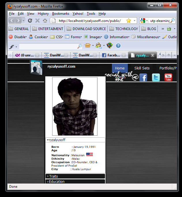
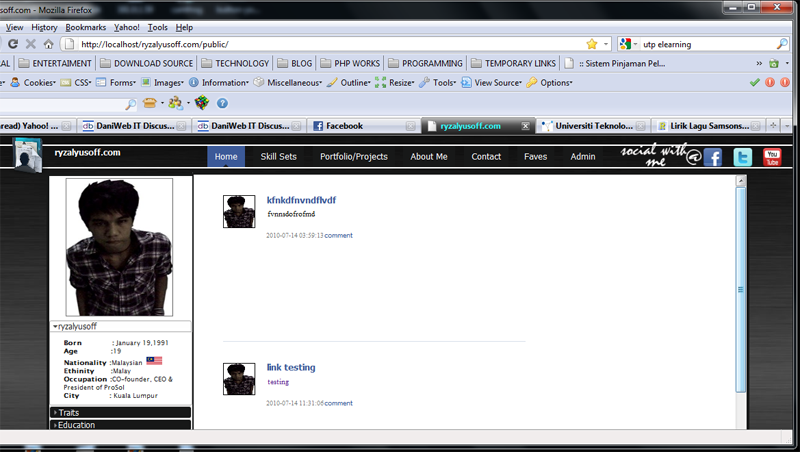
I already code the css,and everything is on their on position seems to look find, but not until I shrunk the browser that i use, then only the items that arrange before became disorder.

Maybe that you not understand me well, but for your clearance,you could refer to the attachment that i provided here
--BEFORE--

--AFTER--

One is about the picture of browser before I shrunk it, and one after I shrunk it.

Hope somebody could helps me out.
and one more thing, I'm not using the position declaration in my css,maybe that the problem i dont know,but please help...

Thank You] :)

Recommended Answers

All 3 Replies

Will need to see your html and css. Could you post it. Live link could also work

stop using pixels

You probably need a wrapper div around the content, set to a width that matches your design and that will work in most viewport sizes. If you are designing for the viewport being at full screen it is very common to run into this sort of problem. But as you are at least testing it by reducing the viewport size, you are thinking of other users, which is a good start.

Be a part of the DaniWeb community

We're a friendly, industry-focused community of developers, IT pros, digital marketers, and technology enthusiasts meeting, networking, learning, and sharing knowledge.