COLUMNS.jpg

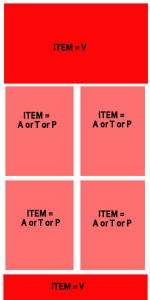
I want to make a grid with different column sizes ('ITEM = V' covers all width 'ITEM A' or 'P' or 'T' cover each 50 percent of the grid width), as shown in the image. Any help?

CSS

.newspaper1 {
   columns: 100% 1;
   border-style:solid
 }
.newspaper1 {
 columns: 2;
  border-style:solid
  }

HTML

  <div *ngFor="let item of items" >
      <ion-card style="border-radius: 20px 5px;" class="outer-grid">
      <div *ngIf="item==='A'" class="newspaper2">
        some content
      </div>
      <div *ngIf="item==='V'"  class="newspaper1">
        some content
      </div>
      <div *ngIf="item==='P'"  class="newspaper2">
        some content
      </div>
      <div *ngIf="item==='T'" class="newspaper2">
      some content
      </div>
    </ion-card
  </div>

Recommended Answers

All 8 Replies

I guess I'm not understanding what you're looking for. Why not do something like this?

<div class="full-width">
  Foo
</div>
<div class="columns">
  <div>
    Foo
  </div>
  <div>
    Bar
  </div>
  <div>
    Baz
  </div>
  <div>
    Bat
  </div>
</div>
<div class="full-width">
  Hello World
</div>

And then for the CSS:

div
{
  margin-bottom: 1rem;
  border: 1px solid black;
  padding: 1rem;
}
.full-width
{
  background-color: pink;
}
.columns
{
  columns: 2;
  border: 0;
  padding: 0;
}
.columns div
{
  background-color: green;

}

Something else that comes to mind, if you want to start involving Javascript, is to use a JS library such as Masonry.

https://masonry.desandro.com/

I tried all of it Dani. No luck. Seems simple but its not. I want the item = v to to be column-count =1 and other three types of items (A,T,P) to display in column-count=2. A,T,P should mix together as results so two. of them (either A,T, P) should cover 100% of width as item =V covers 100% of width as column-count =1

What's the purpose of it being column-count 1 instead of just a regular div above the columns?

commented: what do you mean with div above the columns? +5

this looked lke a good idea but its not

<!DOCTYPE html>
<html>
<head>
<style>

.grid {
    display: grid;
    grid-template-columns: repeat(2, 1fr);
    grid-gap: 2px;
    border-style: solid
}
.span-col-2{grid-column: span 2 / auto;border-style: solid}
.span-col-1{grid-column: span 1 / auto;border-style: solid}
</style>
</head>
<body>

<h1>Grid Layout</h1>

<p>This grid layout contains six columns and three rows:</p>

<div class="grid">
  <div class="span-col-2">Item 1</div>
  <div class="span-col-1">Item 2</div>
  <div class="span-col-1">Item 3</div>
</div>

</body>
</html>

SimonIoa commented: what do you mean with div above the columns? +5

Exactly what I posted in my code snippet. Where the top and bottom divs are not part of columns.

commented: i did that doesnt work +0

You can try something like the below, play around so it works for you. When on mediascreens like smart phones, just change display options from i.e. inline to block etc.

<!DOCTYPE html>
<html>
<head>
<style>
.item1 { grid-area: V; }
.item2 { grid-area: A; }
.item3 { grid-area: T; }
.item4 { grid-area: P; }
.item5 { grid-area: V; }

.grid-container {
  display: grid;
  grid-template-areas:
    'V V V V V V'
    'A T T T P P'
    'A V V V V V';
  grid-gap: 10px;
  background-color: #2196F3;
  padding: 10px;
}

.grid-container > div {
  background-color: rgba(255, 255, 255, 0.8);
  text-align: center;
  padding: 20px 0;
  font-size: 30px;
}
</style>
</head>
<body>

<h1>Grid Layout</h1>

<p>This grid layout contains six columns and three rows:</p>

<div class="grid-container">
  <div class="item1">V</div>
  <div class="item2">A</div>
  <div class="item3">T</div>  
  <div class="item4">P</div>
  <div class="item5">V</div>
</div>

</body>
</html>
commented: Thanks. it does make V as wanted . One pre row. But it show others (T,P,A) one per row it just divides each result (T,P,A) IN TWO COLUMNS - ONE ROW +5

i ve been tryin to solve this for a week now. Really what's wrong with this. (video should take two columns)

<div  class="grid-container">
    <div *ngFor="let media of allMedia">
      <div *ngIf="media.type==='V'" class="item1">
        {{media.title}}
      </div>
      <div *ngIf="media.type==='A'" >
         {{media.title}}
      </div>
      <div *ngIf="media.type==='P'" >**Bold Text Here**
        {{media.title}}
      </div>
      <div *ngIf="media.type==='T'">
        {{media.title}}
      </div>
    </div>
  </div>

 .grid-container {
  display: grid;
  background-color: #2196F3;
  grid-template-columns: 50% 50%;
}

.item1 {
  grid-area:  1 / span 2 / span 2 !important;
   border-style:solid;
  text-align:center
}

Screenshot_2020-06-07-Rovespier.jpg

commented: Not sure what you are asking, you need 2 columns where exactly? +14
Be a part of the DaniWeb community

We're a friendly, industry-focused community of developers, IT pros, digital marketers, and technology enthusiasts meeting, networking, learning, and sharing knowledge.