Introduction
Cards are a common widget for Material 3-themed applications. Expanding a card after the user performs a click action is a very common behavior. While Android can automatically render the new expanded card automatically, we will have to implement our own animation if we want a smooth, animated transition.
Goals
At the end of the tutorial, you would have learned:
- How to animate card expansion animation.
Tools Required
- Android Studio. The version used in this tutorial is Android Studio Dolphin | 2021.3.1.
Prerequisite Knowledge
- Intermediate Android.
- Basic Material 3.
Project Setup
To follow along with the tutorial, perform the steps below:
-
Create a new Android project with the default Empty Activity.
-
Upgrade the Material library version to
1.8.0-alpha01.implementation 'com.google.android.material:material:1.8.0-alpha01' -
Add these two strings into strings.xml.
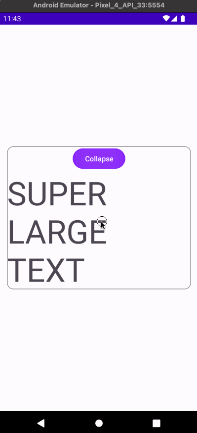
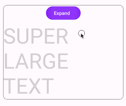
<string name="expand">Expand</string> <string name="collapse">Collapse</string> <string name="super_large_text">SUPER LARGE TEXT</string> -
Open themes.xml and replace the current theme’s parent theme with
Theme.Material3.DayNight.NoActionBar.<style name="Theme.DaniwebMaterial3CardExpandAnimation" parent="Theme.Material3.DayNight.NoActionBar"> -
Replace the content of activity_main.xml with the code below.
<?xml version="1.0" encoding="utf-8"?> <androidx.constraintlayout.widget.ConstraintLayout xmlns:android="http://schemas.android.com/apk/res/android" xmlns:app="http://schemas.android.com/apk/res-auto" xmlns:tools="http://schemas.android.com/tools" android:layout_width="match_parent" android:layout_height="match_parent" tools:context=".MainActivity"> <com.google.android.material.card.MaterialCardView android:id="@+id/cardView" android:layout_width="0dp" android:layout_height="wrap_content" android:layout_marginHorizontal="16dp" app:layout_constraintBottom_toBottomOf="parent" app:layout_constraintEnd_toEndOf="parent" app:layout_constraintStart_toStartOf="parent" app:layout_constraintTop_toTopOf="parent"> <androidx.constraintlayout.widget.ConstraintLayout android:layout_width="match_parent" android:layout_height="match_parent"> <Button android:id="@+id/button_sizeToggle" android:layout_width="wrap_content" android:layout_height="wrap_content" android:text="@string/expand" app:layout_constraintEnd_toEndOf="parent" app:layout_constraintStart_toStartOf="parent" app:layout_constraintTop_toTopOf="parent" /> <TextView android:id="@+id/textView_large" android:layout_width="wrap_content" android:layout_height="wrap_content" android:text="@string/super_large_text" android:textSize="64sp" android:visibility="gone" app:layout_constraintBottom_toBottomOf="parent" app:layout_constraintEnd_toEndOf="parent" app:layout_constraintStart_toStartOf="parent" app:layout_constraintTop_toBottomOf="@id/button_sizeToggle" tools:visibility="visible" /> </androidx.constraintlayout.widget.ConstraintLayout> </com.google.android.material.card.MaterialCardView> </androidx.constraintlayout.widget.ConstraintLayout> -
Replace the content of MainActivity with the code below.
 class MainActivity : AppCompatActivity() {
    override fun onCreate(savedInstanceState: Bundle?) {
        super.onCreate(savedInstanceState)
        setContentView(R.layout.activity_main)

        val card = findViewById<CardView>(R.id.cardView)
        val textView = findViewById<TextView>(R.id.textView_large)
        val button = findViewById<Button>(R.id.button_sizeToggle)

        button.setOnClickListener {
            if (textView.visibility == View.GONE){
                button.text = getString(R.string.collapse)
                textView.visibility = View.VISIBLE
            } else {
                button.text = getString(R.string.expand)
                textView.visibility = View.GONE
            }
        }
    }
 }
Easiest Method To Animate Layout Changes
The easiest method to animate layout changes is by adding android:animateLayoutChanges="true" to a ViewGroup element. In the file activity_main.xml, add this attribute to the ConstraintLayout directly below the MaterialCardView element.
<com.google.android.material.card.MaterialCardView
…

   <androidx.constraintlayout.widget.ConstraintLayout
       android:animateLayoutChanges="true"
…

       <Button
When we run the app, we can see that it has smooth animation.
While adding this attribute is convenient, the animation duration is fixed at 300 ms. In real world scenarios, I have also found it not working on a RecyclerView. This attribute is a shortcut for the setLayoutTransition() method for ViewGroup. RecyclerView’s version of setLayoutTransition() is deprecated, so it will throw an Exception if you attempt to set this attribute on a RecylerView.
java.lang.IllegalArgumentException: Providing a LayoutTransition into RecyclerView is not supported. Please use setItemAnimator() instead for animating changes to the items in this RecyclerViewRemove animateLayoutChanges attribute from the ConstraintLayout before proceeding to the next section.
Animate Using TransitionManager
A second method to animate a card expansion is by using TransitionManager’s beginDelayedTransition() method.
To use this method, call it before you make layout changes. You will also have to provide the parent layout, which is the CardView in our case.
button.setOnClickListener {
   if (textView.visibility == View.GONE){
       TransitionManager.beginDelayedTransition(card)
       button.text = getString(R.string.collapse)
       textView.visibility = View.VISIBLE
   } else {
       TransitionManager.beginDelayedTransition(card)
       button.text = getString(R.string.expand)
       textView.visibility = View.GONE
   }
}
There is a subtle difference between the behavior of this technique and the previous technique. When the card is collapsing, it seems like the animation of the button happens before the resizing. When the card is expanding, the text fades in after the resizing.
This behavior is because beginDelayedTransiton() uses an AutoTransition by default. AutoTransition performs the animation in the order below:
- Fade out disappearing Views, which is what we see with the texts in the Button and the TextView (on collapsing).
- Resizing.
- Fade in appearing Views. We saw this with the expanding animation on the TextView.
I would not go as far as to say that this sequential behavior is undesirable. It somewhat looks cool. It is also so subtle that it would not make a difference in most use cases. You can customize a Transition and use an overloaded version of beginDelayedTransition() or use a TransitionSet if you want to change this behavior.
Summary
Congratulations! We have learned how to animate the card expanding animation in this tutorial. The full project code can be found at https://github.com/dmitrilc/DaniwebMaterial3CardExpandAnimation.