
I am trying to make an expandable div that has a background image. Below is the code I am using. I am just trying to make a quick example of this.
Attached is a screenshot. In the bottom right corner of the div you see that white is outside the box. Thanks for the help
<html>
<head>
<title>Something</title>
<style type="text/css">
body {background-color: #fff; background-color: blue;}
#rBox {width: 735px; margin: 0px;}
#rBox h3 {background-image: url('rBoxTop.gif'); background-repeat: no-repeat;
background-position: left top; margin: 0px; padding: 15px 0px 0px 15px;}
#rBoxMiddle {background-image: url('rBoxMiddle.png'); background-repeat: repeat-y;
background-position: right; margin: 0px; padding: 0px;}
p {margin: 0px; padding: 0px 5px 15px 5px; width: 650px;}
#bottom {width: 735px; background-image: url('rBoxBottom.png');
background-repeat: no-repeat; background-position: left bottom;}
</style>
</head>
<body>
<div id="rBox">
<h3>Something Goes here</h3>
<div id="rBoxMiddle">
<p>
All my terst All my terst All my terst All my terst All my terst All my terst All my terst All my terst All my terst All my terst All my terst All my terst All my terst All my terst All my terst All my terst All my terst All my terst All my terst All my terst All my terst All my terst All my terst All my terst All my terst All my terst All my terst All my terst All my terst All my terst All my terst All my terst All my terst All my terst All my terst All my terst All my terst All my terst All my terst All my terst All my terst All my
</p>
</div>
<div id="bottom">
</div>
</div>
</body>
</html>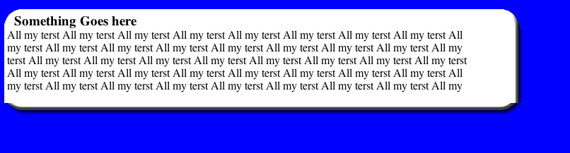