Not sure why there is obviously something wrong with this but my two of my divs username and #passwordrow are turning out twice the length of the parent #loginbox don't worry ablut the wierd backgroound and text colours I did that so I can see how they are acting, the first two divs #loginboxheading and #loginboxclose are the perfect sizes and are positioned fine its just the two below them.

The font colours and everything show up fine in them not text-align: centered though and twice the width can anyone see where I have gone wrong????

css

#loginbox { 
 position: absolute;
 top: 33%;
 left: 33%;
 z-index:3;
 visibility: hidden;
 width: 400px;
 height: 200px;
 display: block;
 background: #fff;
 border: 1px solid #000;
}
#loginboxheading{
 float: left;
 width: 330px;
 height: 30px;
 line-height: 30px;
 display: inline;
 text-align: center;
 color: #000;
 vertical-align:middle;
 font-size: 13px;
 font-family: arial,tahoma;
 font-weight: bold;
 border: 1px solid #ff0000;
 padding: 3px 0px 0px 30px;
}
#loginboxclose{
 float: right;
 width: 31px;
 height: 30px;
 text-align: center;
 background: transparent;
 border: 1px solid #ff0000;
 margin: 0px 0px 0px 0px;
 padding: 3px 5px 0px 0px;
}
#usernamerow{
 float: right;
 width: 390px;
 height: 30px;
 line-height: 30px;
 display: inline;
 vertical-align:middle;
 text-align: center;
 color: #ff0000;
 font-size: 13px;
 font-family: arial,tahoma;
 font-weight: bold;
 background: #000;
 border: 1px solid #ff0000;
 margin: 0px 0px 0px 0px;
 padding: 0px 0px 0px 0px;
}
#passwordrow{
 float: right;
 width: 390px;
 height: 30px;
 line-height: 30px;
 display: inline;
 vertical-align:middle;
 text-align: center;
 color: #ff0000;
 font-size: 13px;
 font-family: arial,tahoma;
 font-weight: bold;
 background: #ffff00;
 border: 1px solid #ff0000;
 margin: 0px 0px 0px 0px;
 padding: 0px 0px 0px 30px;
}

html

<div id="loginbox">
<div id="loginboxheading">Login Area</div>
<div id="loginboxclose"><a href="#" onclick="endlogin()"><img src="../pix/close.png" width="16" height="16" border="0" /></a></div>
<div id="usernamerow">Username</div>
<div id="passwordrow">Password</div>
</div>
Dani AI

Generated

Quick, practical follow-up for and thanks to for the hands-on fix. The behavior you saw is common when child boxes end up larger than the parent because of how widths are calculated (padding, borders and floats all change the visible size) and how floats are taken out of normal flow. The safest way to diagnose is to inspect the computed box model in your browser DevTools (look at content / padding / border sizes and the computed width), and to toggle float/display rules there to see immediate effects.

Checklist to find the cause

  • Inspect the computed width and box model in DevTools for each child element.
  • Look for added padding, borders or margins that push a child past the parent width.
  • Check whether float is being used; floated elements can behave differently than block-level boxes.
  • See whether your stylesheet uses the default box model where width excludes padding and border.

Reliable fixes to try (non-destructive)

  • Use box-sizing: border-box so width includes padding and borders; this simplifies math across layouts.
  • Contain floats with a clearfix or by setting overflow:auto (or overflow:hidden) on the parent so the parent wraps floated children.
  • Replace float-based layout with modern layout tools such as Flexbox for predictable sizing and alignment.
  • Use DevTools to adjust widths to percentages or to a calc() expression while testing.

Examples and references

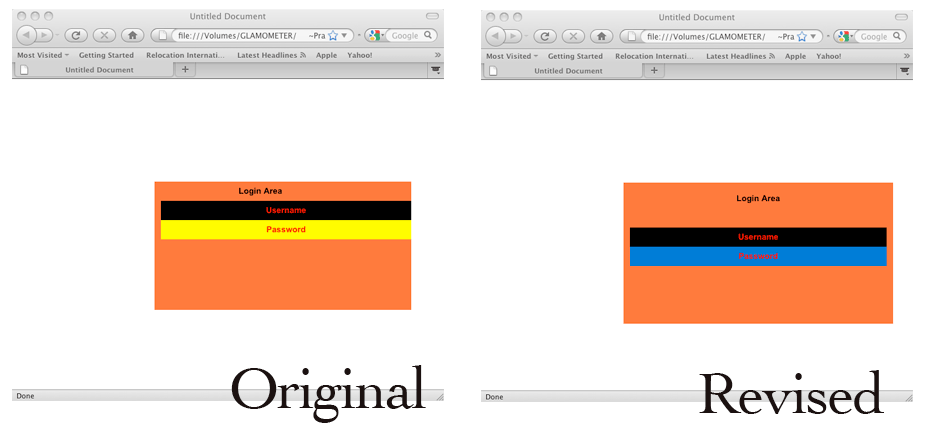
Ok, looked at the code (go go insomnia) and did make changes to your original.

Below is the updated code with comments (easier for me instead of posting both codes side by side)

/* Took out the "display:block" in the #loginbox. Not needed if you want it to show initially */
/* Also removed the z-index. I have never had much luck with that statement */
#loginbox{
position:absolute;
top:33%;
left:33%;
width:400px;
height:200px;
background-color:#FF6633;
border:1pxsolid#000;
padding:10px;
}

/* removed the float:left, display:inline, vertical-align:middle. The float:left and display:inline are specifications I have only used with unordered lists when creating horizontal menus*/ 
/* changed the width from a number to a percentage. I have had better luck with it giving me an even "border" on either side */
#loginboxheading{
width:100%;
height:30px;
line-height:30px;
text-align:center;
color:#000;
font-size:13px;
font-family:arial,tahoma;
font-weight:bold;
border:1pxsolid#ff0000;
padding:3px0px0px30px;
}

/*removed the float:right, changed the width from a number to a percentage, removed the background:transparent since they have always been that way for me unless I specify a certain color or image. */
/*took out the padding */
#loginboxclose{
width:31px;
height:30px;
text-align:center;
background:transparent;
border:1pxsolid#ff0000;
}


/*removed the float:right and display:inline - once again something I have only used when creating horizonal menus with an unordered list. */
/* changed the width from a number to a percentage, took out the vertical-align:middle, removed the margin and the padding */
/*changed the background to background-color. just using background puts the color only behind the text. */
#usernamerow{
width:100%;
height:30px;
line-height:30px;
text-align:center;
color:#ff0000;
font-size:13px;
font-family:arial,tahoma;
font-weight:bold;
background:#000;
border:1pxsolid#ff0000;
}


/* removed float:right, display:inline, vertical-align:middle, the margin and padding */
/* changed the width to a percentage, changed background to background-color */
#passwordrow{
width:100%;
height:30px;
line-height:30px;
text-align:center;
color:#ff0000;
font-size:13px;
font-family:arial,tahoma;
font-weight:bold;
background-color:#0066CC;
border:1pxsolid#ff0000;
}

I have also attached two screen shots - one before (original code) and one after (updated code). I gave the main div a color to see what size it was and see how the other divs fit into it. You were close - and had them within the div. The alignment was off on them which made them appear they were out of the main box when there was no color to check the overall layout.

and saw this was solved after posting, my apologies.

I blame lack of coffee - or lack of sleep.

Be a part of the DaniWeb community

We're a friendly, industry-focused community of developers, IT pros, digital marketers, and technology enthusiasts meeting, networking, learning, and sharing knowledge.