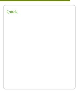
I want an div inside div.
The code of html is

<!DOCTYPE HTML PUBLIC "-//W3C//DTD XHTML 1.0 Transitional//EN" "http://www.w3.org/TR/xhtml1/DTD/xhtml1-transitional.dtd">
<html xmlns="http://www.w3.org/1999/xhtml"  lang="en-US">
<head>
<link rel="stylesheet" href="style.css" type="text/css" media="screen">
<title>
</title>
</head>
<body class="body">
<div id="container">
	<div id="masthead">
	</div>
	<div id="right-upper-navigation">
	</div>
	<div id="right-navigation">
	</div>
	
</div>
<div id="footer">
	</div>
</body>
</html>

CSS is

html, body, div, span, applet, object, iframe,
h1, h2, h3, h4, h5, h6, p, blockquote, pre,
a, abbr, acronym, address, big, cite, code,
del, dfn, em, font, img, ins, kbd, q, s, samp,
small, strike, strong, tt, var,
b, u, i, center,
dl, dt, dd, ol, ul, li,
fieldset, form, label, legend,
table, caption, tbody, tfoot, thead, tr, th, td {
	margin: 0;
	padding: 0;
	border: 0;
	outline: 0;
	font-size: 100%;
	vertical-align: baseline;
	background: transparent;
}
body {
		width: 1024px;
		height:968px;
		border: 1px solid black;
		background: white;
		
		
	}
#container{
		width: 984px;
		height:748px;
		margin-left:20px;
		margin-right:20px;
		margin-top:20px;
		/*margin-bottom:20px;*/
		background:orange;
		border: 1px solid black;
		}

#right-navigation{
		width:290px;
		height:658px;
		/*margin-top:90px;/*this space is for right upper navigation*/
		margin-left:694px;/*694 px margin beccause to set the div on to right side 694+290=984 which is total width of the container div */
		background:#E9E9E9;/*light blue colour*/
		border: 1px solid black;
		}
#right-upper-navigation{
		width:290px;
		height:90px;
		margin-left:694px;
		background:#968B79;
		border: 1px solid black;
}

#masthead{
		margin-top:40px;
		width:690px;
		height:90px;
		/*margin-right:90px;*/
		background:green;
		border: 1px solid blue;
}
#footer{
		width:1024px;
		height:200px;
		background:#968B79;/*footer with dark grey colour*/
		}

I am trying to get output like in first screenshot but it is displaying as shown in second screenshot.
Let me know how to set right this problem.
thanks
Dani AI

Generated

A concise expert note that pulls the useful points from the thread and gives modern, practical next steps.

The main layout issue is that block elements stack by default. and were correct to point at floats as a fix, and ’s absolute-position solution explains why the white box overlapped (absolute takes an element out of flow). and ’s comments about stacking order are relevant too: overlapping requires an explicit stacking context and z-index, not reliance on document order.

Steps to convert the rigid design into a fluid, maintainable layout:

  • Make the page use a centered wrapper with a flexible width (max-width + percentage) instead of hard pixel body width. Use a global box-sizing so borders and padding don’t break percentage math.
  • { box-sizing: border-box; }
    .wrapper { max-width: 1100px; width: 94%; margin: 20px auto; }
    img { max-width: 100%; height: auto; display: block; }
  • Convert pixel sizes to percentages with the formula: percent = (elementWidth / containerWidth) * 100. Use min-width or max-width to protect very small screens.

Prefer modern layout primitives over floats for responsive results:

/* Flexbox: main + sidebar */
.layout { display: flex; gap: 16px; align-items: start; }
.main { flex: 1 1 0; min-width: 0; }
.sidebar { flex: 0 0 300px; }

Or use CSS Grid to allow an element to span both columns (instead of absolute positioning):

.grid { display: grid; grid-template-columns: 1fr 300px; gap: 16px; }
.overlay { grid-column: 1 / -1; position: relative; z-index: 10; }

Practical housekeeping and accessibility:

  • Contain floats with a simple clearfix:
    .clearfix::after { content: ""; display: table; clear: both; }
  • Avoid removing focus outlines (see ). Provide a visible, attractive focus style instead:
    :focus { outline: 3px solid #2a6fbf; outline-offset: 2px; }
  • For the rounded-corner problem, prefer CSS3 border-radius and background-clip: padding-box as a progressive enhancement; keep an image fallback only for very old browsers.

Testing on multiple viewports and using the browser dev tools to toggle layout modes will quickly reveal which approach (floats, flexbox, or grid) fits the intended responsive behavior best.

Recommended Answers

All 8 Replies

You should be using floats for this layout! Otherwise each div will automatically appear below the previous one, which is what you are getting with your current code.

#right-navigation{
		width:290px;
		height:658px;
		/*margin-top:90px;/*this space is for right upper navigation*/

		background:#E9E9E9;/*light blue colour*/
		border: 1px solid black;
float:right;
		}
#right-upper-navigation{
		width:290px;
		height:90px;
		
		background:#968B79;
		border: 1px solid black;
float:right;
}

#masthead{
		margin-top:40px;
		width:690px;
		height:90px;
		/*margin-right:90px;*/
		background:green;
		border: 1px solid blue;
float:left;
}

So I've deleted your margins on the right hand divs and floated them right, and floated the masthead left.


PS this bit is silly
<body class="body">.....
it is just <body>

Apply any body styles directly to the body tag itself in the css, as you have actually done. But drop that height you have given the body, it will lead to problems later.

PPS and setting margin:auto for the body will center the design in the browser window - not everyone works with a viewport of 1024px, some users have it wider.

thank you very much.

the width and height I had specified so later in css I can specify height and width in percentage, rather than pixels. Even if I change the dimension the layout should hold good, Is there any other way.

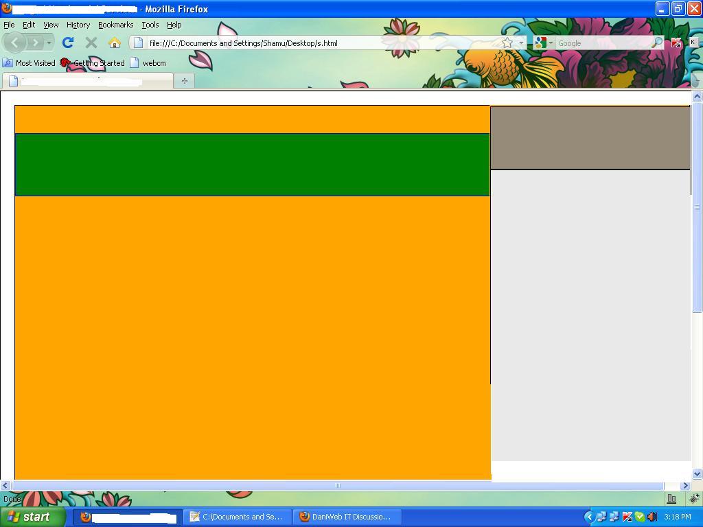
Also what needs to be done if an div is to be made to sit on two other divs as attached in the screenshot.

I tried but the white div as posted on screenshot is not coming over to the right side div.
thanks.

solved, adding position:absolute; will render one div on two other divs.
But can I know the steps if I want to convert into fluid layout than rigid layout.
thanks.

Please just add the float left in masthead.

#masthead{
margin-top:40px;
width:690px;
height:90px;
/*margin-right:90px;*/
background:green;
border: 1px solid blue;
float:left;
}

You will get solution.....

Hi

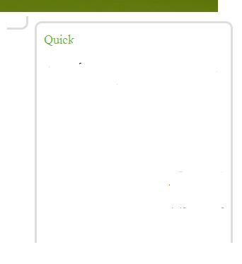
encountering rendering problems for IE for rounded corners.

Images attached.

We can clearly see in IE the part of below rounded corner appears next to Search caption in image.
But in Firefox it renders properly.


quick-search.gif is used for getting rounded corners.

#quick_search .top{
width:280px;
height:9px;
overflow:hidden;
background:url(../Images/quick-search.gif) no-repeat 0 0;
}


#quick_search .bottom{
width:280px;
height:9px;
overflow:hidden;
background:url(../Images/quick-search.gif) no-repeat 0 -9px;
float:right;
}

Any help would be appreciated.

thanks

The thread is kinda-sorta jumbled so I can't tell if its solved or not but you might consider using the z-index tag. Pretty much you can use that to layer everything one after the other. 1 is the lowest layer and the higher the number the higher in the stack it is.

For a reference look at the layout of the layers used in my website

The thread is kinda-sorta jumbled so I can't tell if its solved or not but you might consider using the z-index tag. Pretty much you can use that to layer everything one after the other. 1 is the lowest layer and the higher the number the higher in the stack it is.

For a reference look at the layout of the layers used in my website

-infinity < z-index < +infinity, default 0
much broader range than expressed, with an appropriate number of discrepancies in IE handling (as always)

Also, remove outline: 0; . It serves no purpose other than making your site less user friendly.

Be a part of the DaniWeb community

We're a friendly, industry-focused community of developers, IT pros, digital marketers, and technology enthusiasts meeting, networking, learning, and sharing knowledge.