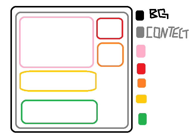
hi i need help with div. i upload a pick to give you idea what i want to do . but i dont know how to do in css part.
note i will be puting image and text in these divs so we dont know the height.

<div id='bg'>
    <div id ='contect'>
        <div id='left_contect'>
        </div>
        <div id='right_contect'>
        </div>
        <div id='right_contect2''>
        </div>
        <div id='middle>
        </div>
        <div id='bottom'>
        </div>
    </div>
</div>


cSs part
#bg{
    width:1500px;                            //has to be this
} 
#context {
    width: 1202px;                            //width has to be this
}
#left_contect
{
    float: left; ?                           
}
Dani AI

Generated

Small corrections first: has a few small markup issues (misspelled IDs and a missing quote) and several repeated layout blocks — use classes for repeatable panels and keep IDs unique. is right that floats can work, but they force manual clearing and make unknown-height content awkward. A simpler, more robust approach is Flexbox or Grid: they let columns stretch to the tallest item automatically and handle images/text of unknown height without hacks.

Example (structure and Flexbox rules):

<div class="wrap">
  <div class="panel panel-left">...</div>
  <div class="panel panel-middle">...</div>
  <div class="panel panel-right">...</div>
  <div class="panel panel-full">...</div>
</div>
.wrap {
  display: flex;
  flex-wrap: wrap;
  gap: 16px;
  box-sizing: border-box;
}
.panel { box-sizing: border-box; }
.panel-left, .panel-right { flex: 0 1 220px; }
.panel-middle { flex: 1 1 400px; }
.panel-full { flex-basis: 100%; }
.panel img { width: 100%; height: auto; display: block; }

Troubleshooting notes: use max-width on the outer container for responsiveness rather than fixed pixels. For image cropping, object-fit can help. If floats are required (legacy browsers), add a clearfix or use display: flow-root on the container to avoid collapse. For concise guidance and browser support, see the Flexbox references from MDN and the practical guide at CSS-Tricks: Flexbox basics and A Complete Guide to Flexbox.

You can start with this and keep working on it. You'll need to also add width's so that the divs fill in the gaps between the elements.

#left_contect{float:left;}
#right_contect{float:right;}
#right_contect2{float:right;clear:right;}
#middle{float:left;clear:both;}
Be a part of the DaniWeb community

We're a friendly, industry-focused community of developers, IT pros, digital marketers, and technology enthusiasts meeting, networking, learning, and sharing knowledge.