Member Avatar for Member #1106124

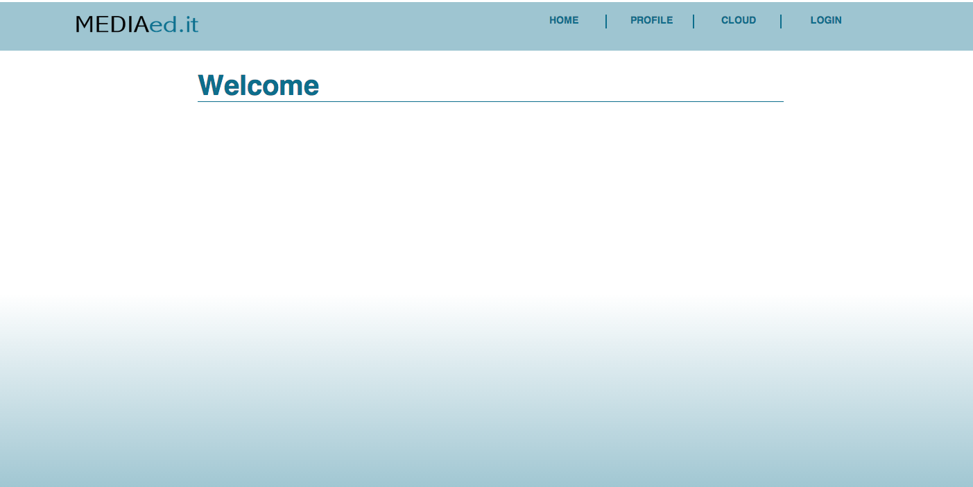
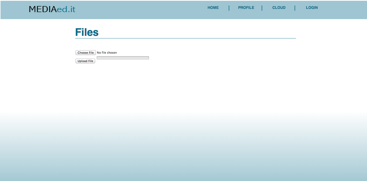
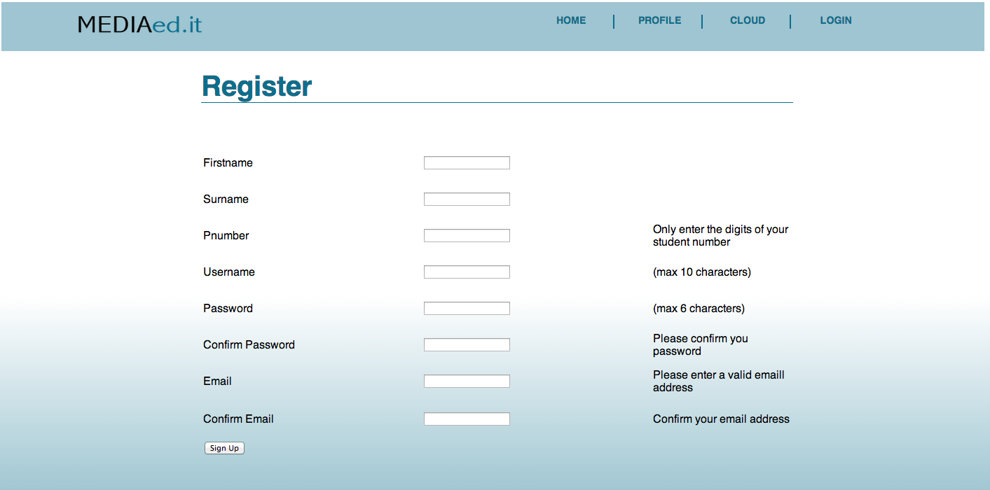
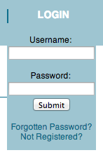
hi so im working on this school project (developing a website), im not be best front end designer and was hoping if you could all give me feedback on the design, colours and layout in order for improvement, i would really appreciate this thanks
4321c7b71e0e04339105d210faa3c8b7

Dani AI

Generated

Solid, minimal starting point from . Comments from , , and point toward useful directions (more content, cleaner controls, and live testing). The items below fill gaps the thread didn’t fully cover: practical, low-effort changes that improve responsiveness, accessibility, and perceived polish.

Layout: replace any table-like structure with CSS Grid/Flexbox so content wraps predictably across widths. A compact responsive form layout example:

.form-row {
  display: grid;
  grid-template-columns: 1fr 340px;
  gap: 12px;
  align-items: start;
}
@media (max-width: 640px) {
  .form-row { grid-template-columns: 1fr; }
}

Controls and accessibility: centralize colors/spacing with CSS variables, ensure labels are programmatically tied to inputs, and add visible focus styles for keyboard users. Small, reusable button styling:

:root { --brand: #2c7be5; --radius: 4px; }

.button {
  background: var(--brand);
  color: #fff;
  padding: 10px 14px;
  border-radius: var(--radius);
  border: 0;
}
.button:focus { box-shadow: 0 0 0 3px rgba(44,123,229,0.2); }

Images and performance: include images for richer content (as suggested earlier) but serve responsive sizes, add descriptive alt text, and lazy-load. Example markup:

<img src="img/hero-800.jpg"
     srcset="img/hero-400.jpg 400w, img/hero-800.jpg 800w, img/hero-1600.jpg 1600w"
     sizes="(max-width:600px) 100vw, 800px"
     alt="Brief descriptive text" loading="lazy">

Testing checklist: host a live preview (makes feedback actionable), inspect interactive states in browser devtools, verify keyboard navigation, and test common breakpoints (320, 480, 768, 1024 px). Aim for sufficient color contrast (WCAG guidance) and iterate in small, measurable steps so each change can be reviewed by contributors such as and .

Recommended Answers

All 7 Replies

Nothing wrong with it. Simple. Maybe you could add some more details :).

Member Avatar for Member #1106124

thanks for your feedback

Hey roxanne,

I think you should add some more Pics. It still looks great.

This post should be in the 'website review' section.

But as you're here, I'll just say that you have a simple grounding for what looks like a very simple theme. Try styling your forms and buttons to give some flavour to your page. Maybe something like Bootstrap?

where content the application that doing feedback ?

Member Avatar for Member #120589

Hosting your site remotely could give people access to your current iteration. Using cutouts like this doesn't give critics much to go on. In addition styling is not static - there are interactive elements in these pages - we can't see how these work - e.g. hover colours for links.

You could also benefit from a contributor having a look at your performance and css via their web browser inspect tools.

With regard to Bootstrap - it's great for getting a site up quickly, but it has meant that there are thousands of similar looking sites plastered all over the web. If part of your brief is to be original and to concentrate on design, then Twitter Bootstrap has great ideas, but please don't produce just another clone.

A few things though:

the word 'you' on the sign up form should be 'your'
the top navigation is not centered vertically in the strip - this looks more pronounced due to the use of separator pipes.
It's not clear how 'responsive' this site would be on a smaller screen - the form looks as though it may be in a table, although I may be wrong. Tables don't scale well and may protrude beyond the width of the page on smaller screen - which looks really unprofessional. The use of css to control layout and possibly the use of CSS media queries with break points should ensure an decent layout at most resolutions.

Your designs are all good, simple but clear. Just one more suggestion, I think you can add more contents or descriotion to your designs to make them look more professional.

Be a part of the DaniWeb community

We're a friendly, industry-focused community of developers, IT pros, digital marketers, and technology enthusiasts meeting, networking, learning, and sharing knowledge.