Hi there,
I have a set of values and I know that some of them are good and some are not... but I cannot find the ratio.
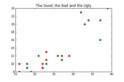
I know it souns strange but let me explain. Here is the list of values

37 - 16 - good
21 - 12 - good
18 - 10 - good
19 - 8 - bad
26 - 12 - good
18 - 9 - good
23 - 13 - bad
22 - 9 - bad
27 - 12 - good
23 - 10 - good
16 - 8 - bad
29 - 12 - bad
27 - 11 - bad
22 - 10 - bad
16 - 10 - bad
22 - 9 - bad
23 - 11 - bad
33 - 20 - good
32 - 23 - good
39 - 24 - bad
34 - 21 - bad
37 - 21 - bad

(I can provide more data if needed).

The above values are the results of python - opencv - SIFT matching: total matching - inlier - resulting homography.
I couldn't find a ratio in the values. I tried the following

if value2/value1 > 0.4 then good

but it doesn't work all the times. I know that when value2 is lower then 10, usually the homography is bad (but you can see above that sometimes this doesn't work too).

Can you help me finding a good ratio for the above values? I can accept some errors but not as the above (on 22 results, only 9 are good).
Thanks,
G.

Recommended Answers

All 3 Replies

I dont think there is a good ratio. I used this code

import numpy as np
import matplotlib
import matplotlib.pyplot as plt

data = """
37 - 16 - good
21 - 12 - good
18 - 10 - good
19 - 8 - bad
26 - 12 - good
18 - 9 - good
23 - 13 - bad
22 - 9 - bad
27 - 12 - good
23 - 10 - good
16 - 8 - bad
29 - 12 - bad
27 - 11 - bad
22 - 10 - bad
16 - 10 - bad
22 - 9 - bad
23 - 11 - bad
33 - 20 - good
32 - 23 - good
39 - 24 - bad
34 - 21 - bad
37 - 21 - bad
""".strip().split('\n')
data = [x.split('-') for x in data]
def conv(t):
    x, y, v = t
    return (float(x), float(y), (v.strip() == 'good'))
data = [conv(t) for t in data]
print(data)
good = [t for t in data if t[2]]
bad = [t for t in data if not t[2]]
Xg, Yg, tmp = list(zip(*good))
Xb, Yb, tmp = list(zip(*bad))


fig = plt.figure()
ax = fig.add_subplot(111)
ax.plot(Xg, Yg, 'og')
ax.plot(Xb, Yb, 'or')
ax.set_title('The Good, the Bad and the Ugly')
pylab.savefig('goodbad.png')
plt.show()

The result is this plot, where the red dots are bad data and green dots are good data. If there was anything like a good ratio, the two sets of points would be separated by an oblique line.

Interesting! Thanks Gribouillis.
I'm not good in maths, but I was wondering if other formulas may produce different results (such as the logarithm or whatever else... if it makes sense).
I will see if it changes anything by adding larger dataset.
Thanks,
Gianluca

The general idea is that there exists a reasonably simple mathematical formula if you can draw simple regions in the plane containing only points with a given color.

Be a part of the DaniWeb community

We're a friendly, industry-focused community of developers, IT pros, digital marketers, and technology enthusiasts meeting, networking, learning, and sharing knowledge.