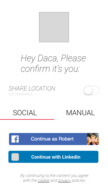
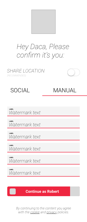
Hi there!

I am creating a toggle in pure css without jquery or javascript and its look like it hasn’t work yet. The problem is Css div alignment. Its not perfectly aligned.
I am trying to achieve are in the attachment kindly look:

HERE IS DEMO: https://jsfiddle.net/navjot789/2fcLvmrj/

and its seems like its not working as I want. If anyone who have a deep knowledge is css helps thats would be a great.
any input is apprecheated.

Recommended Answers

All 3 Replies

The only "secret" to JS-Less toggles is an input type="checkbox" and use a label to toggle the checkbox's state

from there, you use your css "+" and :checked pseudo selector to modify your visual state

ex:

.myWrapperElement .input[type="checkbox"]
{
  height: 0;
  width: 0;
  overflow: hidden;
  padding: 0;
  margin: 0;
  opacity: 0; //just really really hide the thing
}
input[type="checkbox"] + .myElementThatNeedsStyle
{
  //generic styling
}
input[type="checkbox"]:checked + .myElementThatNeedsStyle
{
  //styling for checked state
}

edit:

if the design itself is your issue, take note that the reason your "toggles" at the bottom break are because you used floats to position them. They are for all rendering purposes, "out of the page flow" and will not look quite right without a relative parent container to contain them. Even then, you will have to do hacky things like put overflow:hidden on the parent to make sure it always encompasses them.

There are many ways to create a "toggle" or mutually exclusive ,buttons with radio inputs allows for not only semantic code, but also fast loading and degrading sites as we don't have to rely on a piece of JavaScript.

Hey man, I think that this tutorial wil help you big time, because there are many ways to create a toggle without relying on JS ;)
https://www.youtube.com/watch?v=obn5qxb6ukY

Be a part of the DaniWeb community

We're a friendly, industry-focused community of developers, IT pros, digital marketers, and technology enthusiasts meeting, networking, learning, and sharing knowledge.