Hey everyone,

I have a site that has a customer account, right now it looks like crap and i need an idea on how to style it. Right now I am using Bootstrap, but I want to move away from it and try something else. My issue is, I have no CSS expierence. I can PHP code, but I cannot CSS for the life of me.

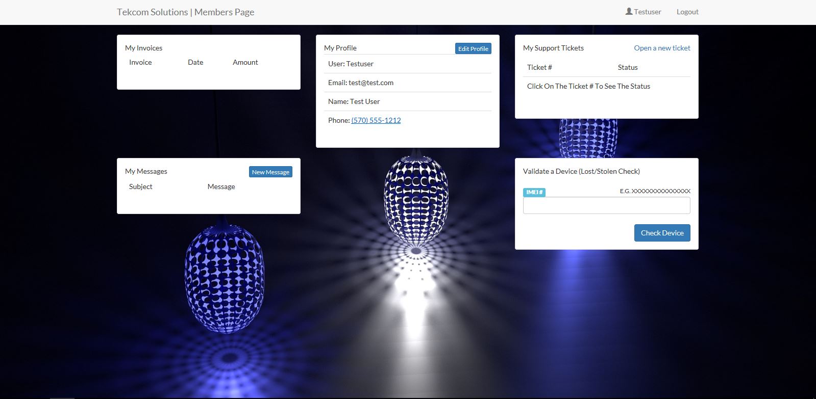
Attached is how my site looks now.

I would like to have a very nice looking "My Account" section. Any suggestions would be nice or maybe some layout options.
Dani AI

Generated

If the goal is a quick, polished "My Account" without learning a lot of CSS, focus on integration and layout decisions rather than inventing a visual style from scratch. As suggested, a ready-made UI kit or an "account / dashboard" template will give you sensible spacing, typography and components you can copy. Since you already know PHP, treat the template as HTML you inject via small partials (account-nav.php, account-header.php, account-main.php) and swap in server-side data — that reduces design work to simple tweaking.

Suggested workflow:

  1. Pick one account/dashboard template or a small component kit (not an entire theme) so you only bring what you need.
  2. Break the page into PHP partials so changes are easy.
  3. Replace Bootstrap layout with a minimal grid (CSS Grid/Flexbox) or a lightweight framework like Bulma/Tailwind if you want utility classes. Use CSS variables for color and spacing so a few edits change the whole look.
  4. Iterate: start with the core tasks users need (summary cards, recent orders, profile edit, billing) and polish one area at a time.

A tiny starter layout you can drop in and tweak:

<div class="account">
  <aside class="account-nav">...</aside>
  <main class="account-main">...</main>
</div>

:root{
  --accent:#2b6cb0; --muted:#f5f7fa; --radius:8px;
}
.account{ display:grid; grid-template-columns:240px 1fr; gap:20px; }
.account-nav{ background:var(--muted); padding:16px; border-radius:var(--radius); }
.card{ background:#fff; padding:16px; border-radius:var(--radius); box-shadow:0 1px 6px rgba(0,0,0,.06); }
@media(max-width:768px){ .account{ grid-template-columns:1fr } }

Practical tips: keep 1-2 accent colors, use readable fonts, group related actions into cards, and prioritize the most-used task at the top. Before removing Bootstrap, search your project for Bootstrap-dependent JS or classes and remove them gradually. Test mobile, keyboard navigation and performance as you refactor. Small, consistent spacing and clear CTAs will make the page feel professional with surprisingly little CSS.

Recommended Answers

All 2 Replies

Thats not bad, but Like i said, I am not a stylist when it come to these things. I am the kind that kinds a nice template and just from there and makes a few tweaks. I am going to look at the UI kits. and see what i can come up with.

Be a part of the DaniWeb community

We're a friendly, industry-focused community of developers, IT pros, digital marketers, and technology enthusiasts meeting, networking, learning, and sharing knowledge.