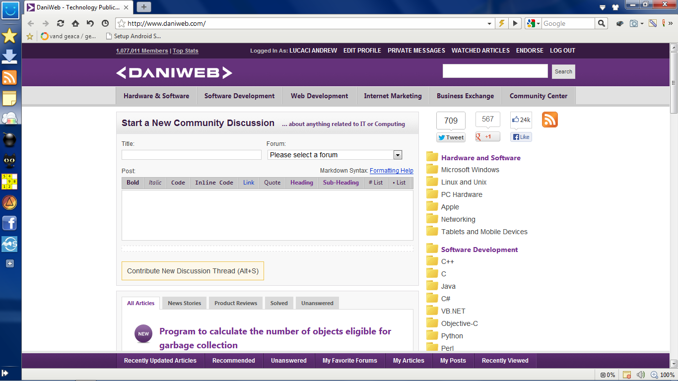
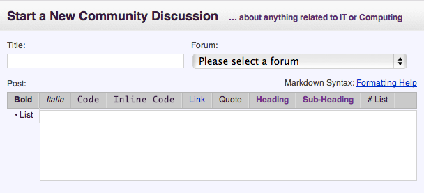
So, I've opened DW's main page this morning, and I see this:
Is this the normal way? Or have I been gone that long...
Lucaci Andrew 140 Za s|n
Recommended Answers
Jump to PostIt just changed a few hours ago. I added the ability to start a discussion thread right from the homepage. What do you think?
Jump to PostIncidentally, did you happen to use the new feature to ask this question? :)
Jump to PostGiven the choice between making the experience for new members worse, and asking mods to move a few threads every now and then from a well defined and consistent drop location, I'd favor the latter. The Community Center is a good spot too, because regardless of our individual favorite forums, …
Jump to PostLook at this please.
Are you talking about the purple bar or the grey bar on the bottom?
Jump to PostNo I haven't I first noticed those today.
All 32 Replies
Dani 4,675 The Queen of DaniWeb Administrator Featured Poster Premium Member
Lucaci Andrew 140 Za s|n
happygeek 2,411 Most Valuable Poster Team Colleague Featured Poster
Dani 4,675 The Queen of DaniWeb Administrator Featured Poster Premium Member
Lucaci Andrew 140 Za s|n
Dani 4,675 The Queen of DaniWeb Administrator Featured Poster Premium Member
happygeek 2,411 Most Valuable Poster Team Colleague Featured Poster
Lucaci Andrew 140 Za s|n
pritaeas 2,211 ¯\_(ツ)_/¯ Moderator Featured Poster
Dani 4,675 The Queen of DaniWeb Administrator Featured Poster Premium Member
pritaeas 2,211 ¯\_(ツ)_/¯ Moderator Featured Poster
Dani 4,675 The Queen of DaniWeb Administrator Featured Poster Premium Member
NardCake 30 Posting Pro in Training
Dani 4,675 The Queen of DaniWeb Administrator Featured Poster Premium Member
Dani 4,675 The Queen of DaniWeb Administrator Featured Poster Premium Member
ndeniche 402 Posting Virtuoso Featured Poster
Dani 4,675 The Queen of DaniWeb Administrator Featured Poster Premium Member
NardCake 30 Posting Pro in Training
Dani 4,675 The Queen of DaniWeb Administrator Featured Poster Premium Member
pritaeas 2,211 ¯\_(ツ)_/¯ Moderator Featured Poster
Dani 4,675 The Queen of DaniWeb Administrator Featured Poster Premium Member
pritaeas 2,211 ¯\_(ツ)_/¯ Moderator Featured Poster
deceptikon 1,790 Code Sniper Team Colleague Featured Poster
pritaeas commented: Exactly. +0
NardCake 30 Posting Pro in Training
ndeniche 402 Posting Virtuoso Featured Poster
Dani 4,675 The Queen of DaniWeb Administrator Featured Poster Premium Member
Dani 4,675 The Queen of DaniWeb Administrator Featured Poster Premium Member
NardCake 30 Posting Pro in Training
Dani 4,675 The Queen of DaniWeb Administrator Featured Poster Premium Member
Be a part of the DaniWeb community
We're a friendly, industry-focused community of developers, IT pros, digital marketers, and technology enthusiasts meeting, networking, learning, and sharing knowledge.

