Hi guys,

Please refer to my attachment, I am really facing problems trying to make this layout tableless.

1. The top of the right content box will overlap the Banner Picture
2. Te Left Content will have shading on top and shading at the bottom as background
3. The footer will automatically append to the bottom of the Left and Right Content box.

Currently, I am facing problem due to the fact that, i do absolute positioning on the main divs such as banner, header, right container, left container, so when i place a separate div as the footer after loading the left and right container, the footer appears at the top of the page instead of below the left and right container i think it's because i do absolute positioning.

If I dont do absolute positioning, how can I perform the effect of overlapping of right content box over the banner?

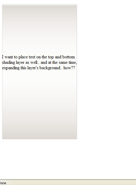
Lastly how should I design the left container to always have the shading background at the top and bottom of the contents, without hardcoding per page. I want the Left container to populate as long as possible when contents are entered into it with the middle parts as white background and as it is ending, insert the bottom shadow.

Please help me out on this, Thank you very much.

Recommended Answers

All 7 Replies

I never do spoon feeding, but since i'm in a good mood i'll just give you the idea... on your layout request..

i provided the comments so you'll easily glide through... just adjust the styles ok??

p.s.
take note of the width.. goodluck... ^__^

*{padding:0
    margin:0;
}

body{text-align:center;}

#wrap{
           width:800px; 
           margin:auto;
}

#left{float:left;
         width:300px;
}

#right{
         width:500px;
}
<div id="wrapper">

     <div id="head">
     </div><!--end of head --->

      <div id="imagehere">
      </div><!--end of imagehere --->

       <div id="content">

               <div id="left">
               </div><!--end of left --->

               <div id="right">
               </div><!--end of right --->

        <div><!--end of content --->


         <div id="footer">
         </div><!--end of footer--->

</div><!--end of wrapper --->
commented: As the mod I will say I like the idea ;) +8

thanks for your reply,

however, this is just the basic setup which i already have.

the problem i am really facing is the overlapping of the right box on top of the image and the left box having expandable content with top background and bottom background as the shadow..

It's never going to work with absolute settings. Different browsers will render it differently. Different screen resolutions and window sizes also cause trouble with absolute settings. Use percentage of page settings instead.

You may also be seeing the IE/FF incompatibility. Placing both size styles (width, height) and surrounding styles (margin, border, padding) in the same tag or style causes all kinds of strange fit problems.

It is the nature of a div structure to fall apart if it won't fit. You will never create a div structure that holds its shape under all conditions. The reason it doesn't work is that there is no equivalent to the tr tag in div structures. Browsers float div tags wherever they will fit.

If you absolutely need the same structure to hold together for all window sizes and screen resolutions, use a table. It is not deprecated. There is a misconception about what is good web practice and what is not.

What is discouraged is using table tags to create borders, margins, and padding around website objects. At one time, this was the only way to put margins around pages.

The reason some people don't want tables used for page structuring is that it is confusing to people using a speaking reader for the blind. But if the table is used for just the two parallel columns, and not the rest of the page, it works well, and is not too confusing, since it is a table of sorts.

MidiMagic, thanks for reading my post again..

Just giving a last try to see if you could help me out..

please see attached on what i have done and also my code to see if you could help..

<style>

#wrapper
{
	background-color: White;
	position: relative;
}

#content
{

}

#top
{
	background-image: url("Untitled-2.png");
	background-repeat: no-repeat;
	position: relative;
	height:175px;
}

#bottom
{
	background-image: url("Untitled-3.png");
	background-repeat: no-repeat;
	position: relative;
	height: 203px;
}

#middle
{
	background-image: url("Untitled-4.png");
	background-repeat: repeat-y;
	position: relative;
	width: 263px;
}


</style>

<div id="wrapper">
	<div id="top"></div>
	<div id="middle">
		I want to place text on the top and bottom shading layer as well.. and at the same time, expanding this layer's background.. how??
		<br><br><br>
	</div>
	<div id="bottom"></div>
</div>

Make sure the styles for the top, middle, and bottom have widths of 100 percent in them, and margins and paddings of 0. If you want margins or paddings on any of these, nest more divs inside them with the padding and margin styles wanted.

<div id="wrapper">
  <div id="top">
    Top content.
  </div>
  <div id="middle">
    <img src="fid.jpg" />
  </div>
  <table>
    <tr>
      <td>
        Left content.
      </td>
      <td>
        Right content.
      <td>
    </tr>
  </table>
  <div id="bottom">
    Bottom content.
  </div>
</div>
Be a part of the DaniWeb community

We're a friendly, industry-focused community of developers, IT pros, digital marketers, and technology enthusiasts meeting, networking, learning, and sharing knowledge.