Member Avatar for Member #361407

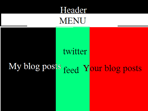
hi, i have been working on a log with my friend and we want it to look like the attachment, i currently have a basic css part and html:

#index_blog{
	float:left;
}

and html:

<!DOCTYPE HTML PUBLIC "-//W3C//DTD HTML 4.01//EN" "http://www.w3.org/TR/html4/strict.dtd">
<html>
	<head>
		<meta http-equiv="Content-Type" content="text/html; charset=iso-8859-1">
		<title>Welcome to CTech</title>
		<link type="text/css"
		rel="stylesheet"
		src="CTech.css"/>
	</head>
	<body>
		<div id="index_blog">
			This is some text
		</div>
		<div id="twtr-profile-widget"></div>
		<script src=""></script>
		<link href="" type="text/css" rel="stylesheet">
		<script >
			new TWTR.Widget({
  				profile: true,
  				id: 'twtr-profile-widget',
  				loop: true,
  				width: 250,
 	 			height: 300,
  				theme: {
    				shell: {
      				background: '#000000',
      				color: '#00fcfc'
    				},
   	 			tweets: {
    				background: '#7f7bfa',
      				color: '#00fcfc',
      				links: '#fff200'
    				}
  				}
			}).render().setProfile('CadetTech').start();
		</script>
	</body>
</html>

what can i do to have it like the attachment?
Dani AI

Generated

Two quick, practical fixes explain the vertical stacking and get the layout to match the mockup.

The stylesheet link in the original markup uses the wrong attribute. The stylesheet must be linked with href (not src), otherwise the browser will not load the CSS and floats will have no effect. Confirm the CSS file is actually loading in the browser Network/Resources panel.

was correct to suggest separate DIVs for each section. The important follow‑ups are explicit widths and a way to contain/clear the floats (or use a modern layout). Use box‑sizing so padding does not push columns past the container width, then either clear floats with a simple clearfix or switch to flexbox for a simpler responsive layout:

<link rel="stylesheet" href="CTech.css" type="text/css">

/* sizing */
*, *::before, *::after { box-sizing: border-box; }

/* clearfix option */
.container::after {
  content: "";
  display: table;
  clear: both;
}

/* flexbox alternative */
.wrapper { display: flex; gap: 12px; align-items: flex-start; }
.column { flex: 0 0 250px; }

Troubleshooting checklist: verify the corrected stylesheet link loads; inspect computed widths in DevTools to ensure column widths plus padding/margins do not exceed the parent; confirm the Twitter widget does not inject a full‑width element that forces a line break (give the widget container a fixed width or include it as one of the floated/flex columns); and use a clearfix or an overflow/new block formatting context on the wrapper so subsequent content does not wrap under floated columns. These steps complete ’s approach and resolve the vertical stacking reported by .

might help if you ask something specific first

Member Avatar for Member #361407

well, currently with that code, the it all aligns vertically, as in:
text
----------
twitter
---------
text

what can i do about it?

use a DIV for each section "myBlogPosts", "twitterFeed", "yourBlogPosts", and float each DIV left.

#yourBlogPosts {
      float: left;

}
Member Avatar for Member #361407

thanks, i tried that and it seemed to work.

Be a part of the DaniWeb community

We're a friendly, industry-focused community of developers, IT pros, digital marketers, and technology enthusiasts meeting, networking, learning, and sharing knowledge.