Hello Everyone.

I am currently enrolled in the IT program at BCIT in Vancouver, BC, Canada. One of my programs courses has given us the responsibility of creating an online portfolio that showcases our skills and abilities. Clearly my skills are not as great as they need to be if I'm here begging for help. I need help because Safari has single handily destroyed my portfolio. Check it out on Safari at: . The only page that works is the "Artifacts" page... strange huh! Feel free to view the source and post any changes that you think would fix this issue. Also my CSS can be seen below.

body, 
    html
    {
        background-color: #7c99a4;
        background-image: url('../Images/background_pattern.png');
        background-position: bottom;
        background-repeat: repeat-x;
        color: #000;
        font-family: Verdana, Georgia;
        font-size: 14px;
        margin: 0;
        padding: 0;
    }
    A:link
    {
        color: #000;
    }
    A:visited
    {
        color: #000;
    }
    #content-container
    {
        margin: 0 auto;
        overflow: hidden;
        padding-top: 15px;
        width: 900px;
    }
    #header
    {
        background-image: url('../Images/logo_mazdak.png');
        background-repeat: no-repeat;
        color: #446a77;
        display: table-cell;
        font-size: 25px;
        font-weight: bold;
        height: 73px;
        text-align: right;
        vertical-align: bottom;
        width: 900px;
    }
    #nav
    {
        background-color: #FFF;
        background-image: url('../Images/logo_mohammadi.png');
        background-position: 4% 0%;
        background-repeat: no-repeat;
        height: 61px;
        padding-bottom: 35px;
        padding-left: 5px;
        padding-right: 5px;
        padding-top: 5px;
        text-align: right;
        vertical-align: top;
        width: 900px;
    }
    #nav img
    {
        border: 0px;
        padding-right: 7px;
    }
    #content-main
    {
        background-image: url('../Images/content_background.png');
        background-repeat: repeat-x;
        float: left;
        padding: 10px;
        width: 650px;
    }
    #content-seperator
    {
        background-image: url('../Images/content_background.png');
        background-position: top;
        background-repeat: repeat-x;
        float: left;
        height: 257px;
        margin-bottom: -2000px;
        padding-bottom: 2000px;
        padding-top: 38px;
        width: 2px;
    }
    #content-sideBar
    {
        background-image: url('../Images/content_background.png');
        background-repeat: repeat-x;
        float: right;
        font-size: 9px;
        margin-bottom: -2000px;
        padding-bottom: 2000px;
        padding-left: 6px;
        text-align: center;
        width: 222px;
    }
    #content-sideBar img
    {
        height: 37px;
        padding-top: 0px;
        width: 58px;
    }
    #sideBar-thumbNail
    {
        float: left;
        padding-left: 3px;
        padding-right: 6px;
        text-align: center;
        width: 65px;
    }
    #sideBar-description
    {
        float: right;
        text-align: left;
        vertical-align: top;
        width: 148px;
    }
    #footer
    {
        background-image: url('../Images/footer_background.png');
        clear: both;
        font-size: 9px;
        font-weight: bold;
        text-align: center;
    }
    * html #footer
    {
        height: 1px;
    }
    hr
    {
        clear: both;
        display: block;
        visibility: hidden;
    }
    ul
    {
        list-style-image: url('../Images/content_bullet.png');
    }
    .artifacts-thumbnail
    {
        border: 0px;
        height: 150px;
        left: 0px;
        position: relative;
        top: 0px;
        width: 150px;
        z-index: 0;
    }
    .artifacts-thumbnailCover
    {
        border: 0px;
        height: 150px;
        left: 0px;
        padding-left: 3px;
        position: absolute;
        top: 0px;
        width: 150px;
        z-index: 10;
    }
    .artifacts-Content
    {
        background-image: url('../Images/artifacts_background.png');
        float: left;
        font-size: 12px;
        height: 153px;
        margin-left: 0px;
        width: 724px;
    }
    .artifacts-Content span
    {
        padding-left: 3px;
    }

All help is greatly appreciated. Thanks again.

Maz M.

Dani AI

Generated

Good progress so far: tracked the Safari break down to an extra closing tag, and correctly called out the gradient/readability and background-cutoff concerns. With the HTML validity issue already fixed, the remaining work is to make the background and the two-column layout robust across browsers without brittle hacks.

Practical steps to apply (in order of safety and impact):

  1. Validate the page markup with the W3C validator to catch stray tags or nesting problems: https://validator.w3.org/.
  2. Put the page-level background on the root (body/html) so it always reaches the viewport bottom, and use a viewport-aware min-height on the main wrapper. A minimal example:
html, body {
  height: 100%;
  margin: 0;
}

body {
  background-image: url('/images/bg-pattern.png');
  background-repeat: repeat-x;
  background-position: bottom center;
  background-color: #7c99a4; /* fallback */
}
  1. Replace float-clearing hacks or overflow clipping with a proper clearfix or a modern layout. Clearfix example:
.clearfix::after {
  content: "";
  display: table;
  clear: both;
}

Or switch the container to flexbox for equal-height columns and simpler alignment (modern and resilient).

Avoid extreme negative-margin/padding tricks to force column heights: those techniques are fragile across engines and often cause the “cutoff” effect observed. For alternatives and background-based faux-column approaches see the CSS-Tricks writeup: .

A few final notes: absolute-positioned overlays can be clipped by overflow settings on parents, so keep absolute children inside a non-clipping container or change the containing strategy. Also simplify or soften the hatched gradient (high-frequency patterns reduce legibility); test contrast with a checker such as https://webaim.org/resources/contrastchecker/ and use Safari’s Web Inspector for live debugging.

Recommended Answers

All 4 Replies

Not to be a party pooper here but it's not looking so hot in FireFox either... the gradient used for the background/foreground gets dark enough to make the text difficult to read near the bottom and the hatching actually makes my screen get that ever so wonderful 'vibrating' look to it when viewed on my computer.

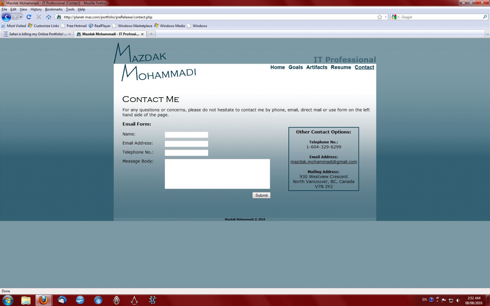
Another thing to note is that on any page that is not working out to "full length" of the screen it is being viewed on, your gradient background is stopping just below your main content area and leaving a plain background colour for the remainder of the screen. I've included a screenshot so you can see what I mean by this.

Aside from that, as I'm not about to install Safari on my PC to try to view the other issue you're posting about could you maybe go into a bit more detail on what exactly is happening in Safari so those who read your thread might be able to help even if they don't specifically have Safari?

Don't worry as you're not pooping on my party at all. Thank you for bringing this new FireFox issue to my attention. Yikes... more issues than I originally thought.

Also, thank you for taking the time to take a screen shot and replying as quickly as you did. I would also like to apologize for not being more clear with the issue at hand.

All input is great and will ultimately lead to much greater online portfolio. The problem I am having with my portfolio in Safari can be viewed in the screen shot below:

I think it might have something to do with the "overflow:hidden;" attribute for the content-container CSS class because it just chops everything after my navigation. It seems to me like my CSS could use some serious help right now haha. I don't understand why the background won't position itself to the bottom of the browser window but that is another issue altogether. I hope I communicated my issue a little better this time.

Thanks again,

Maz M.

Well the issue with the background not flowing to the bottom of the screen is probably related to it being within a sub-div. A common issue with DIVs (more specifically with dynamically positioned DIVs) is that they tend to only extend as far as the content they hold... the side-effect being that if the background is contained within the DIV it also gets chopped. This has come up a couple of times here at DaniWeb but I've yet to see a solid solution as there is no real way to force a contained (non-absolute) DIV to full screen length that I'm aware of.

Edit: Some other threads with similar DIV height issues:
thread 1
thread 2

Hm, I found a fix for the Safari issue... an extra </div> tag on the messed up pages seemed to mess everything up. Gosh those silly mistakes are frustrating to deal with.

Check it out:

The background still seems to be causing issues. In your opinion, what do you think would be the best way to go about this. Scratch the background-image altogether and stick to a solid color or do a single pattern all the way through.

Thank you for the quick responses, you've been very helpful.

Be a part of the DaniWeb community

We're a friendly, industry-focused community of developers, IT pros, digital marketers, and technology enthusiasts meeting, networking, learning, and sharing knowledge.