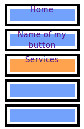
I want words on my buttons but the words won't center. And left to right isn't the issue it's up and down. Well, here's the HTML:

<ul id="navbutton">
<li id="onpage"><a href="index.html">Home</a></li>
<li style="margin-top:5px"><a href="another.html">Name of my button<span></span></a></li>
<li style="margin-top:5px"><a href="services.html">Services</a></li>
<li style="margin-top:5px"><a href="another.html"></a></li>
</ul>

And here's the external css:

#navbutton a {   
display: block;   
background:  url(button.gif); 
text-decoration: none;
text-align: center;
font: 0.7em Tahoma, sans-serif;
font-size: 16px;
font-padding:5px 5px 5px 10px;
font-weight: bold;
width: 150px;
height: 45px;
}

#navbutton a:hover {   
background:  url(buttonn.gif);   
width: 150px;   
height: 45px;   
}

#onpage a {
display: block;
background: url(buttonn.gif);
width: 150px;
height: 45px;
}

And I'll add a screenshot pic as an attachment. (It's not aesthetically pleasing yet. I'll change that once I can get it to work.)

Thanks all!
Dani AI

Generated

Nice catch by — setting the inline line-height to match the button height is a simple, common way to vertically center a single line of text. It works because line-height controls the height of the inline box; when that equals the container height the text sits centered vertically.

A couple of caveats. That trick only reliably centers single-line text. If the label wraps, if font-size changes across devices, or if accessibility zoom is used, the text can overflow or become misaligned. Also watch for small CSS issues in the original rules (for example, font-padding is not a real property; use padding).

Safer, more flexible approaches:

  • Use vertical padding (and optionally min-height) instead of a fixed height so multi-line labels are handled gracefully.
  • Use a modern layout: flexbox centers on both axes and adapts to content changes.

Example: flexbox centering (modern browsers)

.selector {
  display: inline-flex;
  align-items: center;
  justify-content: center;
  padding: 0 0.6em;
  min-height: 3em;
  box-sizing: border-box;
}

Fallback for older browsers: make the button a table-cell and use vertical-align: middle as a robust alternative.

Other quick cleanups and tips: replace repeated inline style with CSS (use a combinator like li + li for spacing), avoid mixing redundant font shorthand and font-size declarations, and use a class (e.g., .current) rather than relying on IDs for state. Finally, ensure the button text remains accessible (sufficient contrast and visible text rather than image-only labels).

Further reading: MDN has concise references on line-height and flexbox.

Never mind. I added

line-height: 45px;

into my css and it works!

Be a part of the DaniWeb community

We're a friendly, industry-focused community of developers, IT pros, digital marketers, and technology enthusiasts meeting, networking, learning, and sharing knowledge.