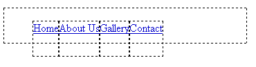
I am having a problem coding my web site, Please see attached screenshot for a visual.

Here is the css and HTML code

<html xmlns="http://www.w3.org/1999/xhtml">
<head>
<meta http-equiv="Content-Type" content="text/html; charset=utf-8" />
<title>Untitled Document</title>
<style type="text/css">
<!--
#nav_bar {
	height: 50px;
	width: 350px;
	margin: 0px;
	padding: 0px;
}
#nav_bar li {
	margin: 0px;
	padding: 0px;
	list-style-type: none;
	display: inline;
	text-align: center;
	float: left;
	height: 50px;
}
#nav_bar a {
	display: block;
	height: 50px;
}
#nav_bar a:hover {
	background-color: #CCC;
}
-->
</style>
</head>

<body>
<div id="nav_bar">
<ul>
<li id="home"><a href="#">Home</a></li>
<li id="about"><a href="#">About Us</a></li>
<li id="gallery"><a href="#">Gallery</a></li>
<li id="contact"><a href="#">Contact</a></li>
</ul>
</div>
</body>
</html>

If you can see by the pic the boxes are not lining up and are throwing the whole navigation system off..... Any help would be appreciated...


Tim

Dani AI

Generated

The misalignment you saw is the classic interaction between browser-default UL spacing and floated list items: the UL can keep its own margins/padding while its LI children are taken out of the normal flow by floats, so the parent can collapse and the hover/background boxes shift. was right to call out the UL sizing, and 's warning about float quirks is spot on.

A simple, robust fix is to make the nav container clear the floats so it actually contains its children. Add a lightweight clearfix to the parent; that prevents the parent height from collapsing when its LIs are floated.

/* clearfix so parent contains floated children */
#nav_bar::after {
  content: "";
  display: table;
  clear: both;
}

A cleaner modern alternative is to avoid floats entirely and use Flexbox on the UL — it makes horizontal layout, spacing, and vertical centering much easier across screen sizes.

/* minimal Flexbox approach */
#nav_bar ul {
  display: flex;
  align-items: center;
  gap: 0.5rem;
}

Small additional tips: reset the UL defaults (margin/padding and list-style) so rendering is predictable, ensure focus outlines remain for keyboard users, and test in older browsers if you must support legacy IE (Flexbox is not suitable there). For background reading on floats and modern layout methods see the MDN float reference and the MDN Flexbox guide. Glad to see it worked for — these two approaches cover both quick fixes and a forward-looking refactor.

Recommended Answers

All 3 Replies

This should help

ul{display:block; height: 50px; margin: 0px; padding: 0px;}

The problem is that your list element ul is the only one with no exact size so he plays on different rules :)
There are different approaches when styling but mixing ways leads to unwanted results.


Also I see that you're applying same code for parent and children elements which makes it obvious that you are not quite familiar with the css behaviour.
Here are some sites for you:

http://css.maxdesign.com.au/listamatic/
http://css-tricks.com/video-screencasts-2/

Just explore the behavior of the different values when applying and don't rush adding more more code makes it difficult to separate behaviors :)

I used the method and it worked great.. Thanks for the help..

Tim

Be a part of the DaniWeb community

We're a friendly, industry-focused community of developers, IT pros, digital marketers, and technology enthusiasts meeting, networking, learning, and sharing knowledge.