Hello this is my first post here, Google has led me to this site a few times and I made an account today to ask a question about CSS Floats.

I have Django code to generate a DIV for each srvr object in my database. Here is my HTML:

{% for srvr in server_list %}
    <div class="server">
    <p>
    <h3 {% if srvr.dead %}class="dead"{% endif %}>{{ srvr }}</h3>
    Working: {% if srvr.dead %}No{% else %}Yes{% endif %}<br />
    Backed Up: {{ srvr.backed_up }}<br />
    Updated: {{ srvr.last_updated }}<br />
    </p>
    </div>
{% endfor %}

And here is my CSS:

html {
background: black;
}

.server {
background: #ABCDEF;
float: left;
padding: 5px;
margin: 20px;
width: 20%;
text-align: center;
}

.dead {
color: red;
text-decoration: blink;
}

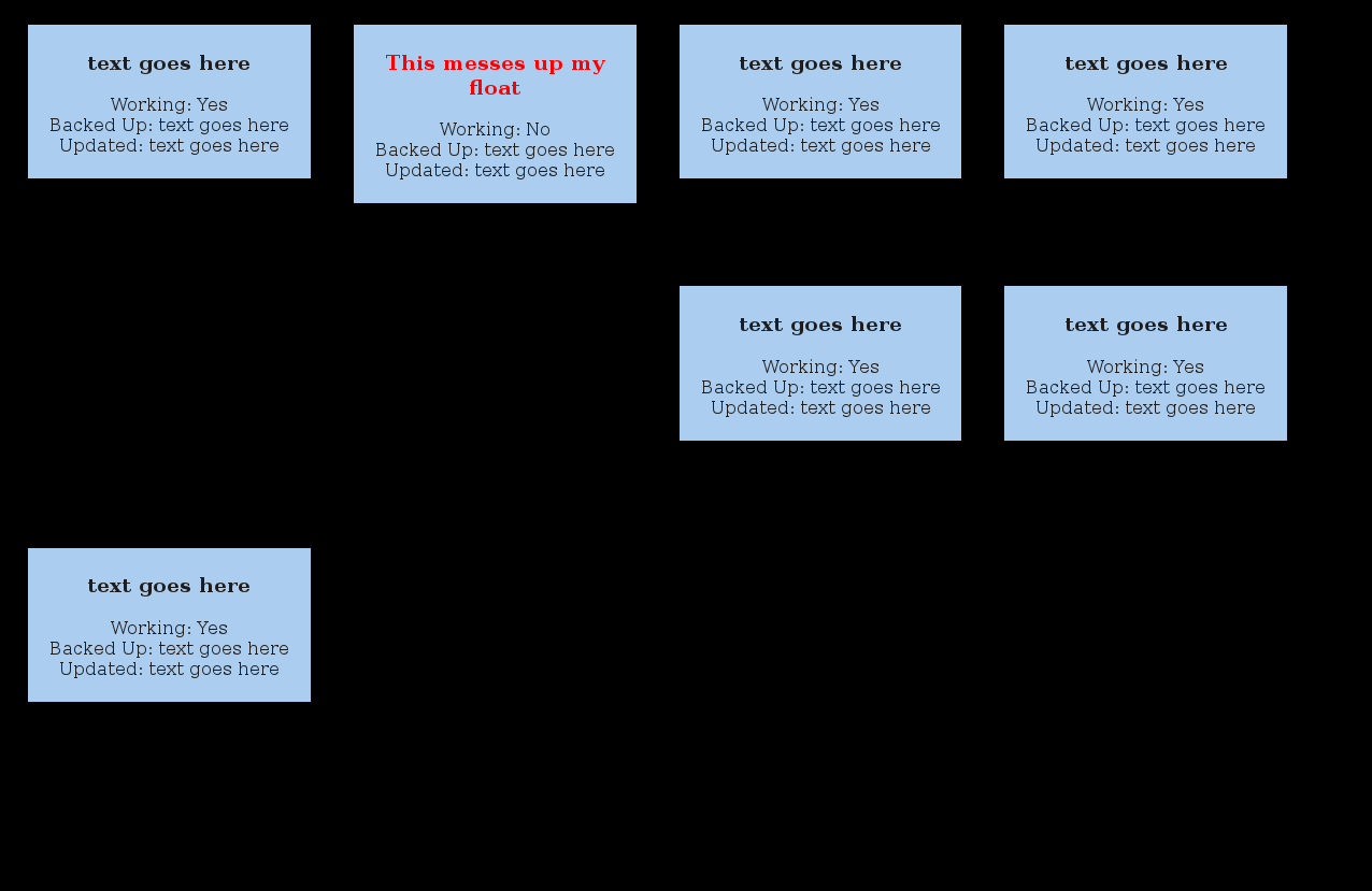
Before the content in the div with red text "This messes up my float" made it take more space on the bottom the other divs were in the next row like the ones in the first row, but now they are pushed to the right of my red div and replaced with blackspace. The 3rd div in that row was pushed into the third row.

Why is this happening and how I can prevent it, thanks.
Dani AI

Generated

This is the classic float behavior that described: floats don’t form neat “rows” the way a table does, so a single taller .server will affect how subsequent floats are positioned and can leave gaps. Two practical directions address it: make the boxes the same height (min-height) or switch to a layout model that aligns tops reliably (inline-block, Flexbox, Grid).

A few quick fixes often overlooked in examples from 2012: the HTML shown wraps an <h3> inside a <p> (that’s invalid — browsers auto-close the <p> and that can produce extra spacing). Default heading margins can also add unexpected height. Reset the heading margin inside the box and remove nonstandard rules like text-decoration: blink to eliminate margin/spacing surprises.

Small CSS approaches (examples):

.server h3 {
  margin: 0 0 0.5em 0;
}

As suggested, min-height is the simplest cross-browser fix when a fixed maximum height is acceptable. For flexible, top-aligned rows without gaps, display:inline-block with vertical-align: top is a lightweight alternative:

.server {
  display: inline-block;
  vertical-align: top;
  box-sizing: border-box;
  width: 20%;
  margin: 20px;
}

For the most robust and responsive solution, wrap the items and use Flexbox or Grid so rows naturally align to the top and wrap cleanly:

.wrap { display: flex; flex-wrap: wrap; gap: 20px; }
.server { flex: 0 0 20%; box-sizing: border-box; }

Troubleshooting checklist: inspect computed heights/margins in DevTools, confirm there are no stray block-level tags inside <p>, check for margin collapse (padding/overflow on the parent avoids that), and pick min-height for simplicity or Flexbox/Grid for a modern, responsive grid.

Recommended Answers

All 2 Replies

That's normal with floats.

When you have a set of floats that have to line up, you discover that the next line hits the bottom of the tallest item in the previous line and stops there.

The solution is simple - set a min-height based on the tallest item expected in those divs.

Yay! It works. Thanks :)

Be a part of the DaniWeb community

We're a friendly, industry-focused community of developers, IT pros, digital marketers, and technology enthusiasts meeting, networking, learning, and sharing knowledge.