
Hi all, I'm trying to create a search box that is located in the far right of the menu bar, and i want to remove the hover effect of the search box.
Sorry for my bad english, to know what i mean, you can see the picture below :D
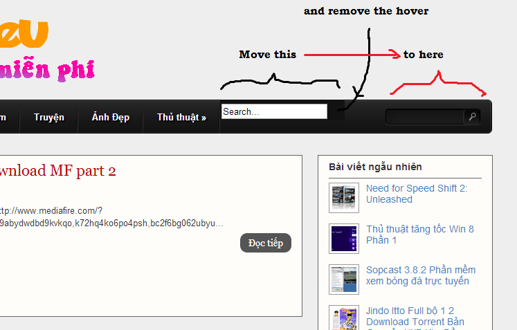
Myblog: Click Here
** menu bar: HTML**
<ul id="nav">
<li><a href=" http://thegioidulieu.blogspot.com/">Trang chủ</a></li>
<li><a href=" http://thegioidulieu.blogspot.com/search/label/Game?&max-results=10">Game</a></li>
<li><a href=" http://thegioidulieu.blogspot.com/search/label/Phim?&max-results=10">Phim</a></li>
<li><a href=" http://thegioidulieu.blogspot.com/search/label/Ph%E1%BA%A7n%20m%E1%BB%81m?&max-results=10">Phần mềm</a></li>
<li><a href=" http://thegioidulieu.blogspot.com/search/label/Truy%E1%BB%87n?&max-results=10">Truyện</a></li>
<li><a href="http://thegioidulieu.blogspot.com/search/label/%E1%BA%A2nh%20%C4%91%E1%BA%B9p?&max-results=10">Ảnh Đẹp</a></li>
<li><a class="hsubs" href=" http://thegioidulieu.blogspot.com/search/label/Th%E1%BB%A7%20thu%E1%BA%ADt?&max-results=10">Thủ thuật »</a>
<ul class="subs">
<li><a href="http://thegioidulieu.blogspot.com/search/label/Windows?&max-results=10">Windows</a></li>
<li><a href="http://thegioidulieu.blogspot.com/search/label/Hack-CSO?&max-results=10">Hack CSO</a></li>
</ul>
</li>
<li class=”last-nav-list-item nav-list-item”>
<div>
<form id="search-blog" method="get" action="/search">
<input type="text" id="s" name="q" value="Search..." onfocus='if (this.value == "Search...") {this.value = ""}' onblur='if (this.value == "") {this.value = "Search...";}'/>
<input type="image" src="" id="sbutton" />
</form>
</div>
</li></ul>
** menu bar: CSS**
#nav,#nav ul {
    list-style: none outside none;
    margin: 0;
    padding: 0;
}
#nav {
    background: url('background.png') no-repeat scroll 0 0 transparent;
    clear: both;
    font-size: 12px;
    height: 50px;
    padding: 0 0 0 9px;
    position: relative;
    width: 1100px;
}
#nav ul {
    background-color: #222;
    border:1px solid #222;
    border-width: 0 1px 1px;
    box-shadow: 0 5px 5px rgba(0, 0, 0, 0.5);
    left: -9999px;
    position: absolute;
    top: -9999px;
    z-index: 2;

    -moz-transform: scaleY(0);
    -ms-transform: scaleY(0);
    -o-transform: scaleY(0);
    -webkit-transform: scaleY(0);
    transform: scaleY(0);

    -moz-transform-origin: 0 0;
    -ms-transform-origin: 0 0;
    -o-transform-origin: 0 0;
    -webkit-transform-origin: 0 0;
    transform-origin: 0 0;

    -moz-transition: -moz-transform 0.1s linear;
    -ms-transition: -ms-transform 0.1s linear;
    -o-transition: -o-transform 0.1s linear;
    -webkit-transition: -webkit-transform 0.1s linear;
    transition: transform 0.1s linear;
}
#nav li {
    background: url('menu_line.png') no-repeat scroll right 5px transparent;
    float: left;
    position: relative;
padding-top: 2px;
}
#nav li a {
    color: #FFFFFF;
    display: block;
    float: left;
    font-weight: bold;
    height: 32px;
    padding: 15px 20px 0;
    position: relative;
    text-decoration: none;
    text-shadow: 2px 2px 2px #000000;
}
#nav li:hover > a {
    color: #00B4FF;
}
#nav li:hover, #nav a:focus, #nav a:hover, #nav a:active {
    background: none repeat scroll 0 0 #121212;
    outline: 0 none;
}
#nav li:hover ul.subs {
    left: 0;
    top: 48px;
    width: 180px;

    -moz-transform: scaleY(1);
    -ms-transform: scaleY(1);
    -o-transform: scaleY(1);
    -webkit-transform: scaleY(1);
    transform: scaleY(1);
}
#nav ul li {
    background: none;
    width: 100%;
}
#nav ul li a {
    float: none;
}
#nav ul li:hover > a {
    background-color: #121212;
    color: #00B4FF;
}
Thanks you in advance :D


