Hello folks,

Running into a little confusing thing over here. I am building this web page for press release:

But as you can see, the 3rd paragraph somehow gets blocked by the image, and i have no idea why. I tried overflow, index, floating, etc but nothing changes.

Anyone who could clear this up?

Dani AI

Generated

Short diagnosis and practical fix

As observed, the layout problem comes from an element being forced into the image area by an explicit negative horizontal offset. That pushes the paragraph out of the normal flow so the text sits under the image instead of beside it. 's suggestion to validate and tidy the markup is also spot-on — fixing stray tags and removing inline styles makes these bugs much easier to find.

What to do (step-by-step)

  1. Open DevTools, inspect the offending paragraph and look at the computed styles to find any negative margins, absolute positioning or unexpected z-index.
  2. Remove the inline style from the <p> and give the image and copy semantic classes. Move layout rules to a stylesheet.
  3. Replace the "negative-margin" hack with a simple layout pattern. Example using flexbox:
<div class="press">
  <img class="press-thumb" src="..." alt="">
  <div class="press-text">
    <p>First paragraph...</p>
    <p>Second paragraph...</p>
    <p>Third paragraph...</p>
  </div>
</div>
.press { display: flex; gap: 20px; align-items: flex-start; }
.press-thumb { flex: 0 0 210px; max-width: 100%; height: auto; }
.press-text p { margin: 0 0 1rem 0; }

If you need legacy support, float the image and use a clearfix (or overflow:auto on the container) instead.

Extra checks and cautions

  • Only use z-index when an element is positioned; otherwise stacking surprises happen.
  • Avoid percent paddings/margins used as vertical offsets (they behave relative to container width).
  • Keep layout CSS in external stylesheet so future debugging is straightforward.

Following those steps will remove the overlap and make the press page responsive and maintainable — which is what , and were warning toward when they advised getting rid of inline styling.

Recommended Answers

All 5 Replies

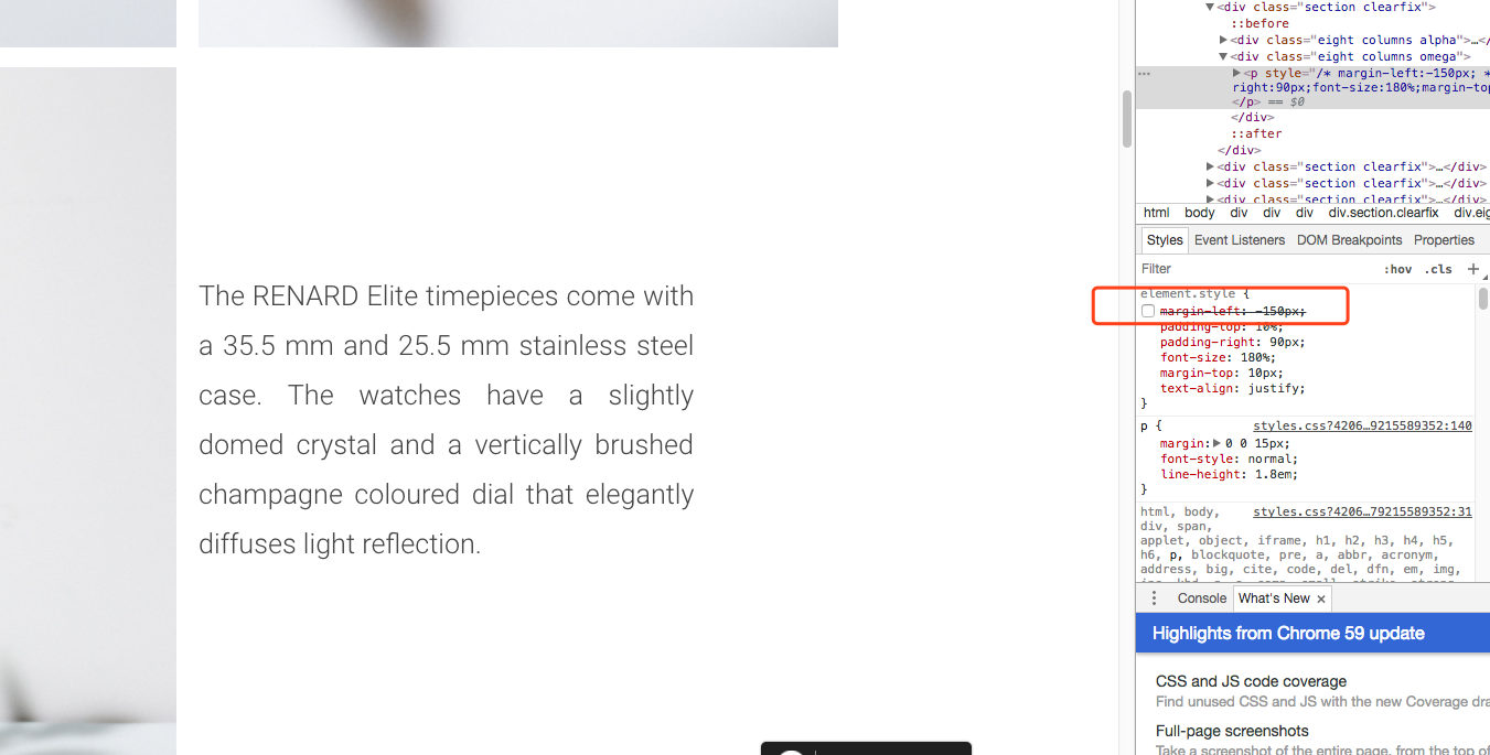
I see some nasty inline styles on that p tag and the negative margin-left of 210px is the culprit here.

<p style="margin-left:-210px;padding-top:10%;padding-right:130px;font-size:180%;margin-top:10px;text-align:justify;">
    The RENARD Elite timepieces come with a 35.5 mm and 25.5 mm stainless steel case. The watches have a slightly domed crystal and a vertically brushed champagne coloured dial that elegantly diffuses light reflection. 
</p>

WX20170711-094317.png

get rid of that margin-left:-210px for all content sit on the right side will slove the issue. And please dont use inline to <p>, that's the reason you cant find where the problem is.

Never use inline styling for <p>. It can make the whole page messed up

Format the code and in-line styling do not help everytime.

Hope your issue is solved!!

Be a part of the DaniWeb community

We're a friendly, industry-focused community of developers, IT pros, digital marketers, and technology enthusiasts meeting, networking, learning, and sharing knowledge.