Hi people,

I'd very much appreciate some help with my issue here....

i have

<div id='container'>
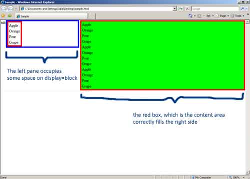
<div id='left_pane_tab' style="float: left;" onclick='toggle(left_pane)'><img src="tab.gif" /></div>
<div id='left_pane' style="float: left; display: none"><table style="width: 200px"> ... </table></div>
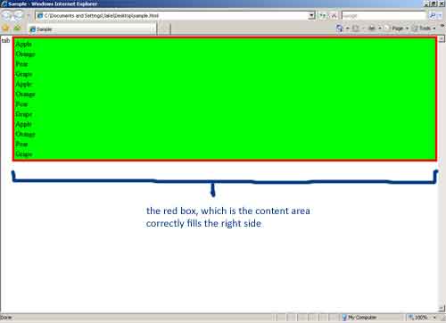
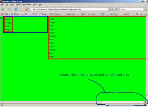
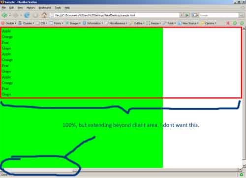
<div id='content_area' style='width: 100%'></div>
</div>

currently, the content_area extends beyond the browser's right bounds and a horizontal scroll bar is created by the browser to scroll.

how can I make the content_area stretches and occupy just up to the edge of the browser's viewable client area? (ie, the rest of the empty space to the right. of the left_pane.)


Thanks in advance!

Recommended Answers

All 17 Replies

without style sheet how can i edit ...

First of all, if you want it to be 100 percent wide, don't float it. Instead, you need a style:

.wfl {width: 100%;}

To make an interior tag full width, all tags containing it must be 100% wide, all the way up to the body tag.

Otherwise, it takes 100% of the width of its container, but does not make the container any wider.

To make an interior tag full width, all tags containing it must be 100% wide, all the way up to the body tag.

Still doesn't work.

With the following code, the behaviour in IE7 is what I want: The content area stretches to fill the remaining area on the right. The green background correctly fills that area.

In FF, which is not working, the content area takes the entire client area and the data_table extends beyond the right edge causing a horizontal scroll bar to appear at the bottom.

How do I write it such that it works in FF as well?

<html>
<head>
<title>Sample</title>

<style>
body { margin: 0px; padding: 0px; width: 100%;}
div { border: 1px solid #EEEEEE; }
table { border: 5px solid #FF0000; }

#container {
	 width: 100%;	
}

#left_pane_tab {
	float: left;
}

#left_pane {
	float: left;
	display: block;
	width: 300px;
	border: 5px solid #0000FF;
}

#content_area {
	background: #00FF00;
	width: 100%;
	height: 100%;
}

.data_table {
	width: 100%;	
}
	

</style>

<script>
function toggle(id)
{
	var pane = document.getElementById(id);
	if(pane.style.display == "block")
		pane.style.display = "none";
	else
		pane.style.display = "block";
}
</script>

</head>

<body>
<div id='container'>

<div id='left_pane_tab'>
<a href"#" onclick="toggle('left_pane'); return false;" />tab</a>
</div>


<div id='left_pane'>
<table>
<tr><td>Apple</td></tr>
<tr><td>Orange</td></tr>
<tr><td>Pear</td></tr>
<tr><td>Grape</td></tr>
</table>
</div>


<div id='content_area'>
<table class="data_table">
<tr><td>Apple</td></tr>
<tr><td>Orange</td></tr>
<tr><td>Pear</td></tr>
<tr><td>Grape</td></tr>
<tr><td>Apple</td></tr>
<tr><td>Orange</td></tr>
<tr><td>Pear</td></tr>
<tr><td>Grape</td></tr>
<tr><td>Apple</td></tr>
<tr><td>Orange</td></tr>
<tr><td>Pear</td></tr>
<tr><td>Grape</td></tr>
</table>
</div>


</div>

</body>
</html>

can u provide the screen shot of how it is looking in ie7, i just cant understand what u want it to look like, i think the cold here in SA has frozen my brain.

can u provide the screen shot of how it is looking in ie7, i just cant understand what u want it to look like, i think the cold here in SA has frozen my brain.

In case you also need FF screenshots, here it is:

It looks like your script is turning some styles on and off. The others might or might not be switched on and off.

Also, you have surrounding styles (margin, border, padding) and size styles (height, width) assigned to the same tag. This causes incompatibilities between IE and FF.

Height of 100% can cause unpredictable results. It isn't really defined for anything except an object inside another container with a defined height.

Height of 100% can cause unpredictable results. It isn't really defined for anything except an object inside another container with a defined height.

ok.. then how shoud it be done properly ?

What are you TRYING to do. It is not clear.

Height is not normally intended to be defined. The entire idea of a web page is to fit the width of the current browser window, and then expand downward as needed until all of the content can be rendered.

The one thing you can NOT do is make a page that exactly fills the browser window. Too many people are pulling their hair out trying to do this. But as long as computers and monitors exist with different screen resolutions, and as long as people can resize their browser windows, and add toolbars to browsers, you are not going to exactly fit your page on one screen.

So you compromise. You let your text expand downward, to flow around your other objects. You use percentage widths or floats to place things. You leave enough whitespace between objects, so the extra space can shrink if a smaller browser window is used. And you don't get mad if your page needs to be scrolled to be read.

@MidiMagic

Thanks for your response, but it wasn't really what I am asking.

Height of 100% can cause unpredictable results. It isn't really defined for anything except an object inside another container with a defined height.

OK i'm sorry for pulling the height issue in. I misread the "height" for "width" so let's forget about that because it's not what I am asking for.

What are you TRYING to do. It is not clear.

Sorry, but i don't see why it is so difficult to see the problem. If you could kindly copy and paste the code provided into an HTML file and open it in IE7 and FF2 you will see what I mean. Unless, my browsers are behaving differently from yours. From my first post:

currently, the content_area extends beyond the browser's right bounds and a horizontal scroll bar is created by the browser to scroll.

how can I make the content_area stretches and occupy just up to the RIGHT edge of the browser's viewable client area? (ie, the rest of the empty space to the right. of the left_pane.)

If you see the IE screenshots, the content_area does what I expect: fills to the RIGHT horizontally without going beyond te client area.

In the FF screenshots, the content_area goes beyond the client area and makes horizontal scroll possible. I do not want this FF behaviour.

First of all, if you want it to be 100 percent wide, don't float it. Instead, you need a style

I did not float it.

It looks like your script is turning some styles on and off. The others might or might not be switched on and off.

The other javascript stuff changing display styles is not of concern. They are working fine. This post is about div, floats and 100% width.

Also, you have surrounding styles (margin, border, padding) and size styles (height, width) assigned to the same tag. This causes incompatibilities between IE and FF.

These styles are also not the problem here. You can remove them if you think they cause imcompatibilities. I used them just to illustrate the divs in the screenshots.

I think I see the problem.

You are using the display attribute in html (not xhtml). This causes some troubles.

One thing that definitely causes trouble with display in html is starting off with a none display. The object is not rendered at the time. Then your script changes the display attribute. This causes a wide range of strange effects that are browser-dependent.

Another thing is that you have the green color in a div. Divs are extremely fluid, and often do what you didn't expect to happen.

How do you know the surrounding styles are not causing problems? Your 300px width is wider in FF than in IE, because surrounding styles are outside that 300px in FF, but inside the 300px in IE.

I think I see the problem.

Sorry, I think you still don't

One thing that definitely causes trouble with display in html is starting off with a none display. The object is not rendered at the time.

/* I started out with BLOCK and IT IS rendered */
#left_pane {
	float: left;
	display: block;
	width: 300px;
	border: 5px solid #0000FF;
}

Another thing is that you have the green color in a div. Divs are extremely fluid, and often do what you didn't expect to happen.

That's not the point.... it's for illustrative purposes, its to illustrate the problem!

How do you know the surrounding styles are not causing problems? Your 300px width is wider in FF than in IE, because surrounding styles are outside that 300px in FF, but inside the 300px in IE.

I know because I removed it, check, place it back, check, still the same. And you definitely do not understand and probably did not see the code in action in a browser because it's out by 300px, not a difference of an inner border outer border margin.

I appreciate your effort in trying to help really... but it seems that you seriously have trouble seeing the problem. I thought the screen shots plus the code already tell everything about it!!

I see your problem, but I can't read the screen shots (the text is itty bitty). It took a lot of scrutiny to finally see that the page is wider than the window. I couldn't ee that before.

Why can't you put the green background color in a style to be applied to the table, instead of to the div?

I think the 100 percent width applied to the content div is confusing the browser, since it is not intended to be 100 percent of the container of that div when the other div is to the left of it. I have seen divs do some really weird things when given contradictory information. You are saying 100% without always meaning it.

FF is rendering the object as 100% of its container - the width of the page. IE is rendering it as 100% of the available space. These two have a LOT of differences in how they render widths and heights.

You are trying to do something the system was not really designed to do, so there is no agreement on how to do it. Making elements appear and disappear, and changing the sizes of other elements when those elements appear and disappear (but after they are rendered), also does strange things. Different browsers choose to do different things in this case. It is obvious that FF is choosing to make the page wider, rather than change the size of the object. IE is changing the size of the object.

One suggestion is to make your sizes relative (not absolute), and use the JS routine to set the sizes:

When the content panel is shown alone, make its size 100%. When both panels are shown together, make the left one a fixed 30% and tell JS to change the right one to 70% (assuming there are no surrounding styles defined in the same tag)..

I would have made two pages, one for each wanted display, and used the link you used to call the JS to load the other page.

I spotted another error. The 0px style entries cause FF to throw out the entire style statement containing them (everything between the curly brackets is thrown out).

The standard calls for 0 entries to not have dimensions, and FF adheres to this standard, calling the 0px an error. Use the FF error console to find these.

Also, when you have nonzero surrounding styles on a 100% width, it causes an error in FF, but not in IE. This is because IE (wrongly) puts the surrounding styles inside the defined width, while FF puts them outside. Thus, FF has to kitbash the page to make it render. It usually makes the page wider than defined.

I see your problem, but I can't read the screen shots (the text is itty bitty). It took a lot of scrutiny to finally see that the page is wider than the window. I couldn't ee that before.

I thought you could have clicked on the images to see the enlarged versions...

FF is rendering the object as 100% of its container - the width of the page. IE is rendering it as 100% of the available space. These two have a LOT of differences in how they render widths and heights.

!!! FINALLY YOU UNDERSTAND ME :icon_cheesygrin:

One suggestion is to make your sizes relative (not absolute), and use the JS routine to set the sizes:

So is there no way to fix the size of the side panel and only make the content panel (right) size according to the window size? I've seen it work before somewhere I just couldn't find the link back.... and that is really what I want to acheive.

I spotted another error. The 0px style entries cause FF to throw out the entire style statement containing them (everything between the curly brackets is thrown out).

I don't understand this part: I changed the body margin and padding styles to 1px instead of 0px and nothing drastic happens except the expected 1px margin and padding around it.

Still doesn't work.

With the following code, the behaviour in IE7 is what I want: The content area stretches to fill the remaining area on the right. The green background correctly fills that area.

In FF, which is not working, the content area takes the entire client area and the data_table extends beyond the right edge causing a horizontal scroll bar to appear at the bottom.

How do I write it such that it works in FF as well?

<html>
<head>
<title>Sample</title>

<style>
body { margin: 0px; padding: 0px; width: 100%;}
div { border: 1px solid #EEEEEE; }
table { border: 5px solid #FF0000; }

#container {
	 width: 100%;	
}

------------------------------ 8< -------------------------------------
</style>

<script>
function toggle(id)
{
	var pane = document.getElementById(id);
	if(pane.style.display == "block")
		pane.style.display = "none";
	else
		pane.style.display = "block";
}
</script>

</head>

<body>
<div id='container'>

------------------------------ 8< -------------------------------------

</div>


</div>

</body>
</html>

I've just tested this code, and there's absolutely no error in FX2 console (costumized to report even the slightest css problems.

I think you are dealling here with the old Netscape content-bleeding problem.

I thought you could have clicked on the images to see the enlarged versions...

I did, but the text is illegible in the enlarged version at my screen resolution.

So is there no way to fix the size of the side panel and only make the content panel (right) size according to the window size? I've seen it work before somewhere I just couldn't find the link back.... and that is really what I want to acheive.

It can be done, but not by using width: 100%;

You need a container that can change size. But don't expect all browsers to be able to render a page with elements that change size the same way.

I would take the easy way out:

Assume the page is named wally.htm .
1. Make a copy of the page called wally2.htm .
2. Configure the wally.htm file to display without the added part. Leave it out entirely
3. Configure the wally2.htm file to display with the added part.
4. Change the link in each page that was formerly used to make the added part change visibility so it instead links to the other page.

I don't understand this part: I changed the body margin and padding styles to 1px instead of 0px and nothing drastic happens except the expected 1px margin and padding around it.

You need to change it to 0, not 0px. Take off the unit of measurement if the value is 0. The problem is not that the value is 0, but that you attached a unit of measurement to a 0 value.

0px 0em 0cm 0in, 0% and 0pt cause Firefox to totally throw out the style containing them. The browser throws an error into the error console, and acts as though that style statement isn't even there. Change it to just 0, and it works.

I didn't know if this would cause a change in your display or not. I just know that it causes a lot of hard-to-find grief. The style refuses to render in Firefox, and a lot of people pull out their hair trying to find out why.

Be a part of the DaniWeb community

We're a friendly, industry-focused community of developers, IT pros, digital marketers, and technology enthusiasts meeting, networking, learning, and sharing knowledge.