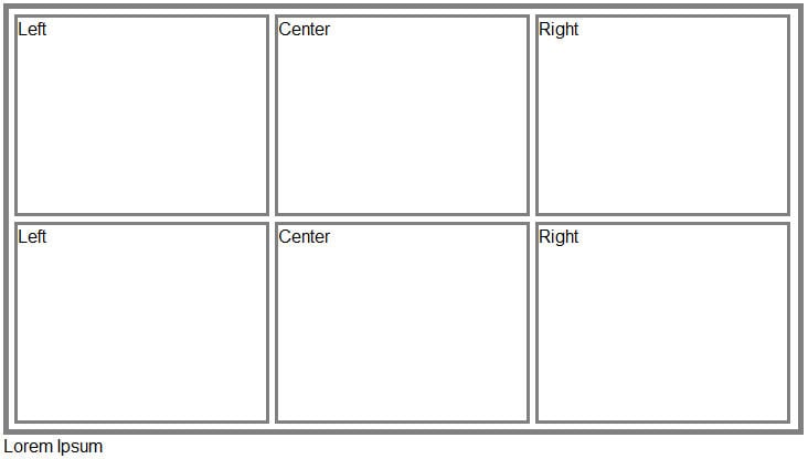
My script displays two rows of boxes three boxes wide. Why is the center box of the second row high? I need it to be even with the left and right box.

<html>
<head>
<style type="text/css">
div.ex
{
width:720px;
height:985px;
margin-bottom:0px;
padding:0px;
border:5px solid gray;
}
div.adv_topleft
{
float:left;
width:224px;
height:177px;
margin:10px 5px 5px 10px;
border:3px solid gray;
}
div.adv_topcenter
{
text-align:center;
overflow:hidden;
width:226px;
height:177px;
margin:10px 5px 5px 5px;
border:3px solid gray;
}
div.adv_topright
{
float:right;
width:225px;
height:177px;
margin:10px 10px 5px 5px;
border:3px solid gray;
}
div.adv_nextleft
{
float:left;
width:224px;
height:177px;
margin:5px 5px 5px 10px;
border:3px solid gray;
}
div.adv_nextcenter
{
text-align:center;
overflow:hidden;
width:226px;
height:177px;
margin:5px 5px 5px 5px;
border:3px solid gray;
}
div.adv_nextright
{
float:right;
width:225px;
height:177px;
margin:5px 10px 5px 5px;
border:3px solid gray;
}

</style>
</head>

<body>

<div class="ex">
<div class="adv_topleft">
</div>

<div class="adv_topright">
</div>

<div class="adv_topcenter">
</div>
<div class="adv_nextleft">
</div>

<div class="adv_nextright">
</div>

<div class="adv_nextcenter">
</div>

</div>

<div class="ex2">
</div

</body>
</html>

Recommended Answers

All 4 Replies

I'm not quite sure I understand your issue; I've attached a screenshot of your code as rendered in Firefox, and I'm not seeing a "center box of the second row", and I'm not sure what "high" means in reference to that. Could you please provide a bit more detail, including your browser info, and perhaps a screenshot?

Something to be aware of is when using margins with floated elements, that there is a double margin bug in old MSIE versions (IE5/6, just in case you're concerned about IE6): http://www.positioniseverything.net/explorer/doubled-margin.html

My wrapper was too narrow. So, I increased the width from 720 to 820. That put the divs in roughly the right place. Now, I just need to deal with the uneven margins some seem to have collapsed. Any ideas?

It's still not super clear to me what you're trying to achieve, so I'm going to guess - please see attached comp (as my below code is rendered in FF) - I'm hopeful this is what you're essentially trying to achieve. Below is the code.

<html>
<head>
<style type="text/css">
div.ex {
	width:715px;
	margin-bottom:0px;
	padding:0px;
	border:5px solid gray;
}

.exRow {
	overflow: hidden;
	margin: 5px;
}

.exRow div {
	float: left;
	width: 225px;
	height: 177px;
	border: 3px solid gray;
	margin: 0 5px 0 0;
}

.exRow .last {
	margin-right: 0;
}
</style>
</head>
<body>
<div class="ex">
    <div class="exRow">
        <div>Left</div>
        <div>Center</div>        
        <div class="last">Right</div>
    </div>
    <div class="exRow rowLast">
        <div>Left</div>
        <div>Center</div>        
        <div class="last">Right</div>
    </div>
</div>
<div class="ex2">Lorem Ipsum</div>
</body>
</html>

I took some liberties with class naming and such, but simplified things quite a bit, and believe you'll find much more consistent cross browser handling. Lots of things to note here, so let me know if you have specific questions about this code, or if I'm not resolving what you're trying to accomplish.

Perfect. Thanks for your help scottloway!

Be a part of the DaniWeb community

We're a friendly, industry-focused community of developers, IT pros, digital marketers, and technology enthusiasts meeting, networking, learning, and sharing knowledge.