Hi everyone, i'm having a problem with my menu bar in my blog, it runs fine in a screen resolution of 1366x768, or 1980x1080, but it doesn't look good in 1024x768 resolution, or any resolution have a width is less than 1024px, you can see the problem in the picture below:

When i run it in 1366x768 resolution, the menu bar is normal

1bbafe3475c69cc18e61b0f4fda63bb5

in 1024x768 resolution, there is one problem, you can see that
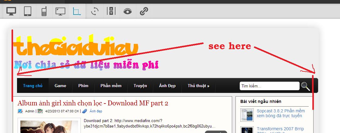
c63c2948e56516167ff0897a79dee93b

Tool to test website in different screen resolution:
My site: http://thegioidulieu.blogspot.com

Can anyone help me fix this problem?
Thank in advance

Dani AI

Generated

Short summary: the navigation fits at large widths but overflows or shifts when the viewport is narrower than ~1024px. correctly pointed to extra inner padding on the menu wrapper as the immediate cause — that padding increases the element's effective width and makes the bar exceed the available space. Two practical approaches follow: a quick override and a more robust responsive pattern.

Quick override (small change to fix the break): set border-box so padding is included in width calculations, then reduce the inner padding for narrow viewports. Place this after the widget stylesheet so it overrides the default.

/* include padding in width calculations */
.tabs-inner, .tabs-inner * {
  box-sizing: border-box;
}

/* reduce inner padding on narrower screens */
@media (max-width: 1024px) {
  .tabs-inner {
    padding-left: 6px !important;
    padding-right: 6px !important;
  }
}

More robust responsive solution: switch the nav to a flexible layout that wraps or collapses instead of overflowing. Flexbox + wrap keeps items inside the container; overflow-x:auto is a graceful fallback for very small viewports.

/* flexible nav that wraps rather than overflowing */
.navbar, .navbar ul {
  display: flex;
  flex-wrap: wrap;
  gap: 8px;
  margin: 0;
  padding: 0;
  list-style: none;
}

.navbar {
  overflow-x: auto;        /* allows horizontal scroll on tiny screens */
  -webkit-overflow-scrolling: touch;
}

.navbar li { white-space: nowrap; }

Troubleshooting checklist: inspect computed widths in DevTools (check box-sizing, padding, margins, and any fixed widths on anchors or list items), ensure overrides load after the Blogger widget CSS, and consider converting to a stacked/collapsible menu (hamburger) below a breakpoint if there are many items. Credit to for the diagnosis — the snippets above provide a quick fix and a more future-proof responsive approach for 's layout.

Recommended Answers

All 2 Replies

your tabs-inner class has a 15px padding that causes the navbar to slide to the left when the browser winow is resized. The class is set in this file, which I assume you are importing into your project.

Well, This works excellent.
Thank thank thank you very much
Big thumbs up for you.
//This forum helped me a lot
//BTW,How to mark threads SOLVED?

Be a part of the DaniWeb community

We're a friendly, industry-focused community of developers, IT pros, digital marketers, and technology enthusiasts meeting, networking, learning, and sharing knowledge.