I'v got this code to make a bootstrap navbar

<div class="navbar  navbar-fixed-top">
    <div class="navbar-inner">
        <div class="container">
       <a class="brand" id="logo" href="#">picturecamel</a>
        <ul class="nav pull-left">
                <li><a href="/">Home</a></li>
                <li class="dropdown">
                    <a href="#" class="dropdown-toggle" data-toggle="dropdown">Account <b class="caret"></b></a>
                    <ul class="dropdown-menu">
                        <li><a href="change-password">Change password</a></li>
                        <li><a href="update-email-address">Change Email</a></li>
                    </ul>
                </li>
                <li><a href="logout">Logout</a></li>
                <li><a href="help">Help</a></li>

        </ul>

      </div>
    </div>
    </div>
 </div>

I want to make the help link on the right hand side of the navbar. I've tried applying the class of pull right but that doesn't work.
Any suggestions?


Dani AI

Generated

If you are on Bootstrap 2.x (as in fheppell’s original markup), the reliable pattern is to keep right-aligned items in their own list inside the collapse container and use the framework’s built-in alignment utilities. In 2.3.x, alignment is float-based, so mixing left- and right-floated items in the same <ul> tends to cause brittle collapse behavior; splitting them avoids that. The v2.3.2 docs show using .pull-right for component alignment and dropdowns. (getbootstrap.com)

For readers landing here with Bootstrap 3, BMXDad’s note about odd collapse behavior lines up with an official caveat: multiple right-aligned navbar components can conflict due to negative margins. If you see spacing glitches when collapsing, group the right-side items into a single list, or move one group to the left side. The 3.3 docs call out this limitation explicitly. (getbootstrap.com)

Using a newer Bootstrap? Flex utilities make this simpler:

  • Bootstrap 4 (flexbox): push the Help item to the far right by giving its list margin-left: auto with the spacing utility.

    <!-- Bootstrap 4 -->
    <ul class="navbar-nav ml-auto">
      <li class="nav-item"><a class="nav-link" href="/help">Help</a></li>
    </ul>

    The v4 docs recommend using flex and spacing utilities for alignment; ml-auto is provided by the spacing utilities. (getbootstrap.com)

  • Bootstrap 5 (RTL-aware): the class changed; use ms-auto instead of ml-auto.

    <!-- Bootstrap 5 -->
    <ul class="navbar-nav ms-auto">
      <li class="nav-item"><a class="nav-link" href="/help">Help</a></li>
    </ul>

    In v5, spacing uses start/end notation (ms-*/me-*) and supports auto. (getbootstrap.com)

Re: HAOND’s flags idea for a language switcher, a lightweight approach is to add SVG flags via the flag-icons set, then keep the text label for accessibility:

<span class="fi fi-us" aria-label="English (US)"></span>

See usage and class names in the project’s docs. (flagicons.lipis.dev)

Recommended Answers

All 10 Replies

Member Avatar for Member #120589

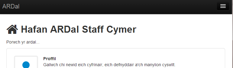
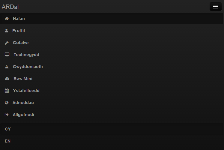
Here's a version of one I'm using:

<div class="navbar navbar-inverse navbar-fixed-top">
  <div class="navbar-inner">
    <div class="container">
      <button type="button" class="btn btn-navbar" data-toggle="collapse" data-target=".nav-collapse">
      <span class="icon-bar"></span>
      <span class="icon-bar"></span>
      <span class="icon-bar"></span>
      </button>
      <a class="brand" href="/cy/hafan/">ARDal</a>
      <div class="nav-collapse collapse">
        <ul class="nav">
          <li class="active"><a href="/cy/hafan/" title="Hafan yr ardal"><i class="icon-home icon-white"></i> <span class="small-menu">Hafan</span></a></li>
          <li class=""><a href="/cy/proffil/" title="Eich proffil personol"><i class="icon-user icon-white"></i> <span class="small-menu">Proffil</span></a></li>
          <li class=""><a href="/cy/gofalwr/" title="Gwiriwch ac archebwch waith y gofalwr"><i class="icon-wrench icon-white"></i> <span class="small-menu">Gofalwr</span></a></li>
          <!-- ok you get the idea - that's the left-aligned stuff -->  
        </ul>
        <!-- now for right-aligned stuff -->
        <ul class="nav pull-right">
            <li class="active"><a href="/cy/hafan/">CY</a></li>
            <li class=""><a href="/en/hafan/">EN</a></li>
        </ul>
      </div>
    </div>
  </div>
</div>

I like to separate the language switcher from the regular nav. Also my markup is based on a variant (but should be identical to original Bootstrap) from:

Here's a screen shot of the look:

Full screen

c900f166935634fe995e2fe9985a84c3

Breakpoint

90f1d9b5cbdefc7868fcf521d8491b3d

Expand menu in breakpoint

d04688d4aeb1c9e2fd4a6bf2b68d90db

commented: sorry i completely mis-read the op's questions +14

It needs to be a seperate list. You could also set a style:

style="float:right;"
Member Avatar for Member #120589

It needs to be a seperate list. You could also set a style:
style="float:right;"

THis is taken care of by the built-in:

class="nav pull-right"

Thanks for all your help

Not in the same list ... you get strange behaviour on collapse.

Member Avatar for Member #120589

Not in the same list ... you get strange behaviour on collapse.

In which browser? Are all your css/js files loaded properly?

thanks it helped me

Member Avatar for Member #120589

@new_user1

Be aware that this is an old post and that Bootstrap3:

<ul class="nav navbar-nav navbar-right">

uses that. See here: http://getbootstrap.com/components/#navbar

Much helpful for language switcher.
But is there a way to have different country flags icons... ?

Be a part of the DaniWeb community

We're a friendly, industry-focused community of developers, IT pros, digital marketers, and technology enthusiasts meeting, networking, learning, and sharing knowledge.