So will someone help me this my website Please

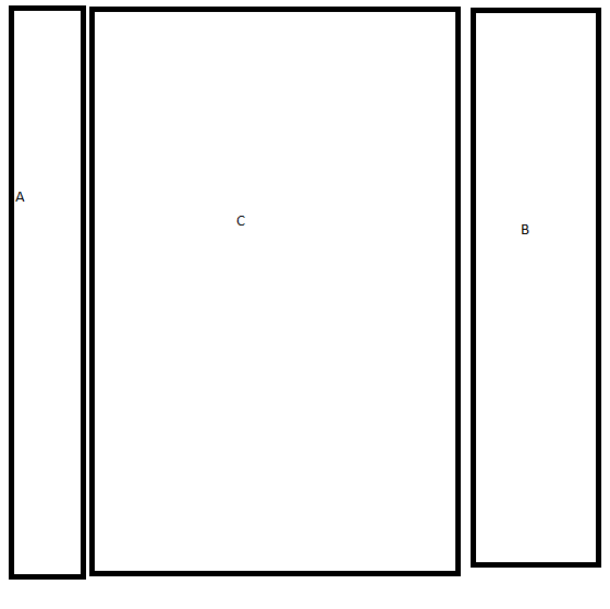
so i wanted it set out like this http://i1299.photobucket.com/albums/ag71/TheIronDoorProject/Untitled_zps5d81f4e3.png but when i go do this the main column pushes the other two columns down, this is my css http://pastebin.com/85b6ttTx

Dani AI

Generated

For the symptom (the centre column dropping below the side columns) almost always comes down to horizontal overflow or an element that isn't floated/positioned the same way as the others. pointed toward floats — that's on the right track — but the usual culprits are: the three columns' widths plus padding/border/margins exceeding the container, an image or element wider than its column, or an unexpected clear/wrapper breaking the float flow.

Quick checklist to narrow it down:

  • Inspect computed widths in browser devtools and add them up (include padding/border/margin).
  • Set box-sizing: border-box; on layout elements so padding is included in width.
  • Make images responsive with max-width:100%.
  • Ensure the same float/position strategy is used for all columns (or use margins for the middle column).
  • Make the parent clear floats (clearfix or overflow:auto) so layout behaves predictably.

Two simple patterns that avoid the stacking problem:

Bootstrap grid (minimal markup)

<div class="container">
  <div class="row">
    <aside class="col-md-3">Left</aside>
    <main class="col-md-6">Main</main>
    <aside class="col-md-3">Right</aside>
  </div>
</div>

Float + margin trick (CSS)

.left  { float:left;  width:25%; }
.right { float:right; width:25%; }
.main  { margin:0 25%; }
.container::after { content:""; display:block; clear:both; }

A note on 's table idea: tables work, but using them for layout harms responsiveness and accessibility. Modern approaches (Bootstrap grid or flexbox) are simpler and more robust.

Recommended Answers

All 4 Replies

You MainBody should be floating.

You MainBody should be floating. but how coz i only have the options Right and Left

Try this website's explanation. It gives much better insight on how to get it done.

Something like this?

<table width="100%" border="0" cellspacing="0">
  <tr>
    <td width="25%"><table width="96%" border="0" align="center">
      <tr>
        <td>&nbsp;</td>
      </tr>
    </table></td>
    <td width="50%"><table width="96%" border="0" align="center">
      <tr>
        <td>&nbsp;</td>
      </tr>
    </table></td>
    <td width="25%"><table width="96%" border="0" align="center">
      <tr>
        <td>&nbsp;</td>
      </tr>
    </table></td>
  </tr>
</table>
Be a part of the DaniWeb community

We're a friendly, industry-focused community of developers, IT pros, digital marketers, and technology enthusiasts meeting, networking, learning, and sharing knowledge.