Hi,

I have a #header class and a #menu class.

<body> 
<div id="page">
     <header id="masthead">
         <hgroup>
           <h1 class="site-title">
             <a href="#" >Demo</a>
           </h1>
         </hgroup>
         <nav class="site-navigation">
           <h1 class="menu-text">
           </h1>
           <div class="menu-text skip-link">
             <a href="#content">Home</a>
           </div>
         </nav><!-- .site-navigation .main-navigation -->
     </header><!-- #masthead .site-header -->
     <div id="primary" class="content-area">
       &lt;div id="primary" class="content-area"&gt;
       <div id="content" class="site-content" role="main">
         &lt;div id="content" class="site-content" role="main" &gt;
       </div><!-- #content .site-content -->
     </div><!-- #primary .content-area -->
</div>
</body>

CSS here:

#page {
  width: 800px;
  margin: auto;
  overflow: hidden;
  background: #8FCFFF;
}
#masthead{
  margin: auto;
  padding: 5px;
  background-color: #57A8EB;
  border-radius: 8px;
  overflow: auto;
}
.site-navigation {
  padding: 5px;
  background-color: #000;
  width: 100%;
  left: 0px;
  float: left;
}
#primary {
  float:left;
  margin: 1%;
  padding: 5px 1%;
  width:60%;
  min-width:300px;
  background-color: #05609e;
  border-radius: 8px;
  overflow: auto;
}
#content {
  margin: 1% 0;
  padding: 1%;
  background-color: #000099 ;
  border-radius: 8px;
  color: #fff;
}
a{
    color: #fff;
}

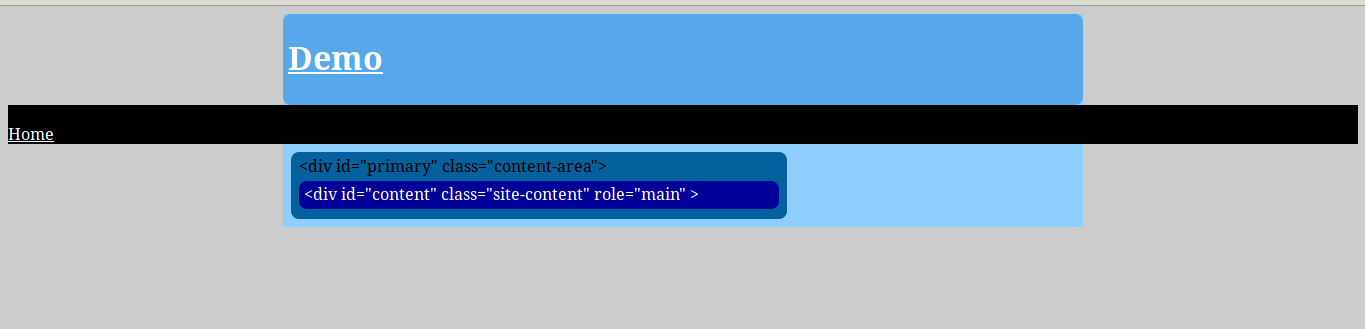
This produces the screenshot below: 613f5dc94f64450c42afe87b3c566a57
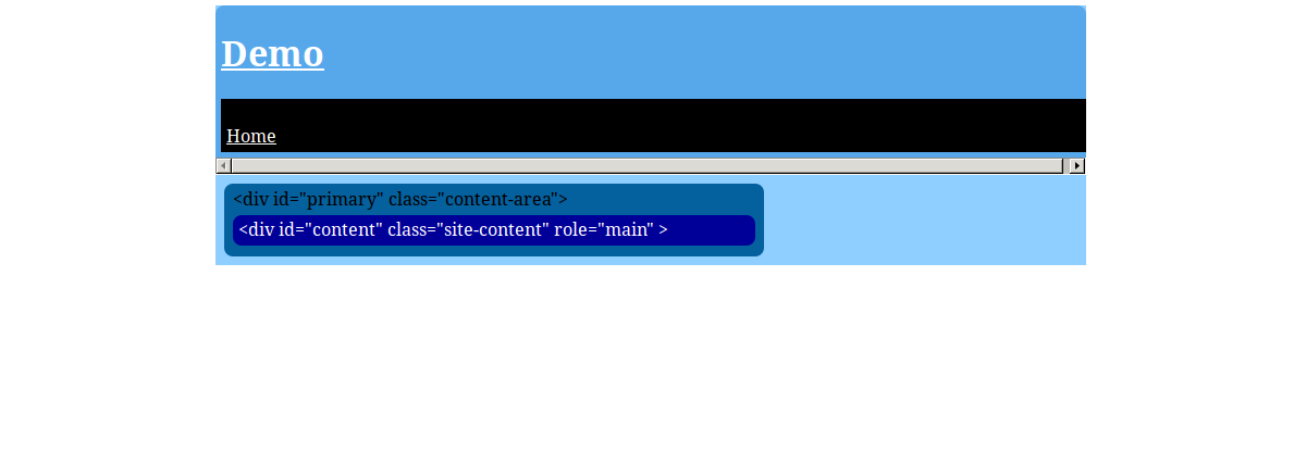
What I want is for the black menu area (with the 'Home' menu item in it) to extend outside of it's containing div (id "masthead").
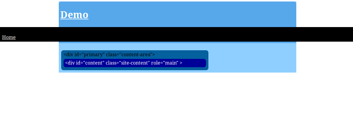
eb847bbf2770a423de14cdaeae0b38f2

Can anyone help? I'm having great difficulty.

Cheers,

Dave

Dani AI

Generated

This thread already has two practical fixes: ’s move‑the‑nav‑outside approach is the simplest and the one that avoids clipping, and the 8px gap came from the browser’s default body margin. Below are two reliable alternatives (one HTML change, one pure‑CSS) plus a few gotchas to watch for.

If you can change the markup, keep the page wrapper for centered content and put the nav as a sibling (outside the wrapper). That is robust across browsers and avoids clipping caused by any parent with overflow:hidden. If you prefer to keep the nav inside the same wrapper, use a CSS “breakout” so the nav visually stretches full viewport width while its inner links remain centered:

.site-navigation {
  position: relative;
  left: 50%;
  right: 50%;
  margin-left: -50vw;
  margin-right: -50vw;
  width: 100vw;
  box-sizing: border-box;
  z-index: 10;
}

.site-navigation .nav-inner {
  max-width: 800px;  /* match your page width */
  margin: 0 auto;
  padding: 0 16px;
}

Troubleshooting and cautions: a parent with overflow: hidden will clip the breakout, so remove that or use the sibling nav approach. Using 100vw can sometimes introduce a horizontal scrollbar (because vw counts the scrollbar); if that happens try a transform/translate centering variant or hide overflow-x at the document level with care. Also remove floats from the nav, use box-sizing: border-box so padding doesn’t cause overflow, and add a z-index if the nav must sit above rounded header backgrounds.

Which to pick: move the nav outside the fixed wrapper for the least surprises (what did). Use the CSS breakout when you cannot modify HTML. Either way, keep an inner centered container for the menu items so your links line up with the rest of the page.

Recommended Answers

All 6 Replies

i did this by removing the #masthead attribute from <header> and placing it in a <div> instead , and wraping <div id="masthead"> with <div id="page"> , that way your nav is still wrapped in <head> but isn't contained in #masthead or #page.

HTML

<body>

     <header>
     <div id="page">
     <div id="masthead">
         <hgroup>
           <h1 class="site-title">
             <a href="#" >Demo</a>
           </h1>
         </hgroup>
         </div>
         </div>
         <nav class="site-navigation">
           <h1 class="menu-text">
           </h1>
           <div class="menu-text skip-link">
             <a href="#content">Home</a>
           </div>
         </nav><!-- .site-navigation .main-navigation -->
     </header><!-- #masthead .site-header -->
     <div id="page">
     <div id="primary" class="content-area">
       &lt;div id="primary" class="content-area"&gt;
       <div id="content" class="site-content" role="main">
         &lt;div id="content" class="site-content" role="main" &gt;
       </div><!-- #content .site-content -->
     </div><!-- #primary .content-area -->
</div>
</body>

CSS

#page {
  width: 800px;
  margin: auto;
  overflow: hidden;
  background: #8FCFFF;
}
#masthead{
  margin: auto;
  padding: 5px;
  background-color: #57A8EB;
  border-radius: 8px;

}
.site-navigation {

  background-color: #000;
  width: 100%;
  left: 0px;
  float: left;
}
#primary {
  float:left;
  margin: 1%;
  padding: 5px 1%;
  width:60%;
  min-width:300px;
  background-color: #05609e;
  border-radius: 8px;
  overflow: auto;
}
#content {
  margin: 1% 0;
  padding: 1%;
  background-color: #000099 ;
  border-radius: 8px;
  color: #fff;
}
a{
    color: #fff;
}

Great.

That works.

Thanks.

A problem remains, though.

My Nav bar is rendered with a margin of around 8px on the left and right.

92c10cccb37dcf196d1c9d5847434c5e

This post has no text-based content.

html pages have a margin by default , simply add body {margin:0px;} to the top of your css

Thanks!

Be a part of the DaniWeb community

We're a friendly, industry-focused community of developers, IT pros, digital marketers, and technology enthusiasts meeting, networking, learning, and sharing knowledge.