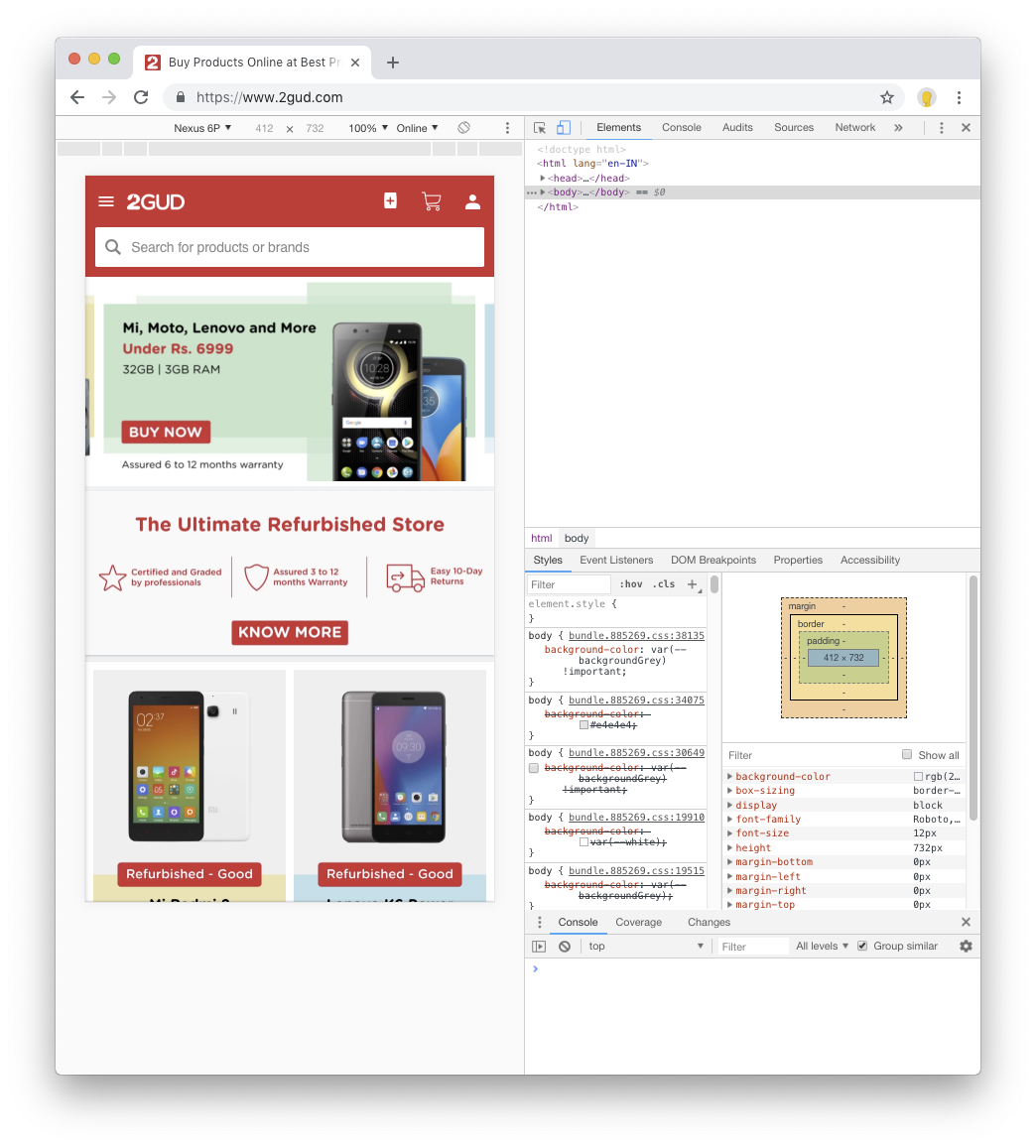
How can i show my website only display on a mobile phone not in pc.
Here the sample website 2gud.com,this website content only shows in mobile not in desktop.Is there any plugin in wordpress?

Dani AI

Generated

Short answer: technically possible but brittle and usually a bad idea. As pointed out, user-agent strings can be faked; and noted that screen size and pixel density overlap between phones and some desktops. Responsive CSS or serving different templates based on capability is the standard, more future-proof approach. Device-detection plugins and services exist (as and suggested), but they only reduce—not eliminate—false positives and caching problems.

A pragmatic server-side pattern (PHP) — run this before any output and before caches:

<?php
require_once 'Mobile_Detect.php';
$detect = new Mobile_Detect;

// allow a manual "view desktop" override stored in a cookie
if (isset($_COOKIE['view_desktop']) && $_COOKIE['view_desktop'] === '1') {
    // serve desktop view
} elseif (! $detect->isMobile() || $detect->isTablet()) {
    header('Vary: User-Agent');            // avoid cache poisoning
    header('HTTP/1.1 302 Found');         // temporary redirect, not 301
    header('Location: /desktop-only.html');
    exit;
}
// continue serving mobile site

A lightweight client-side alternative uses feature/viewport detection (less reliable because JS can be disabled):

if (window.matchMedia && window.matchMedia('(max-width: 767px)').matches) {
  // mobile layout
} else {
  // show desktop message or redirect
}

Practical checklist and cautions: ensure detection runs before caching layers (Varnish, CDN); use temporary redirects (302) while testing; provide a visible “View on desktop” toggle that sets a cookie; test with real devices and UA overrides (curl -A, browser devtools); monitor analytics and logs for false positives. Ultimately, hiding content from desktop harms discoverability and users more often than it helps—consider responsive templates or a dedicated app instead of strict blocking.

Recommended Answers

All 6 Replies

Search for browser and device detection plugin if you really have to.

commented: Yes. At least folk here can work around that. +15

No, that's not how the web works. If I want to browse 2gud.com (I don't, but bare with me) I can just override my user agent at the click of two buttons. Why go to a load of effort when there's no payback and it might just piss off your audience?

Screenshot_2018-10-02_at_17_42_41.png

If you want to enforce mobile only build an app.

commented: And the workaround is given. Don't PO the users. +15

*bear with me

Why would you want to do this? Using WP you are leveraging a Web interface so I'm assuming you're not interested in building native apps. You can set media queries to detect screen size and deliver different styling and possibly different content. This is simple but like the user agent method, not foolproof. Reducing a browser window on your pc could be enough to trigger the mobile site. All this seems a teeny bit pointless.

. It gets even weirder as I check my old iPhone 6. The iPhone 6 display is 4.7 inches in size with a 16:9 resolution of 1334x750 (326 ppi, minus one row of pixels), so there are PCs with about that pixel count so checking if it's mobile by screen pixel count looks to me a dead end.

My main phone is the Moto G5 Plus and has 1080 x 1920 pixels, 16:9 ratio (~424 ppi density so that's a run of the mill TV or PC today.

Just to check I looked at the site on PC and phone and it was fine. I have to woder if the OP is just spamming.

You can try this https://web.wurfl.io/.
I've used it check for device and redirect to a contact page on anything other than phone.

Be a part of the DaniWeb community

We're a friendly, industry-focused community of developers, IT pros, digital marketers, and technology enthusiasts meeting, networking, learning, and sharing knowledge.