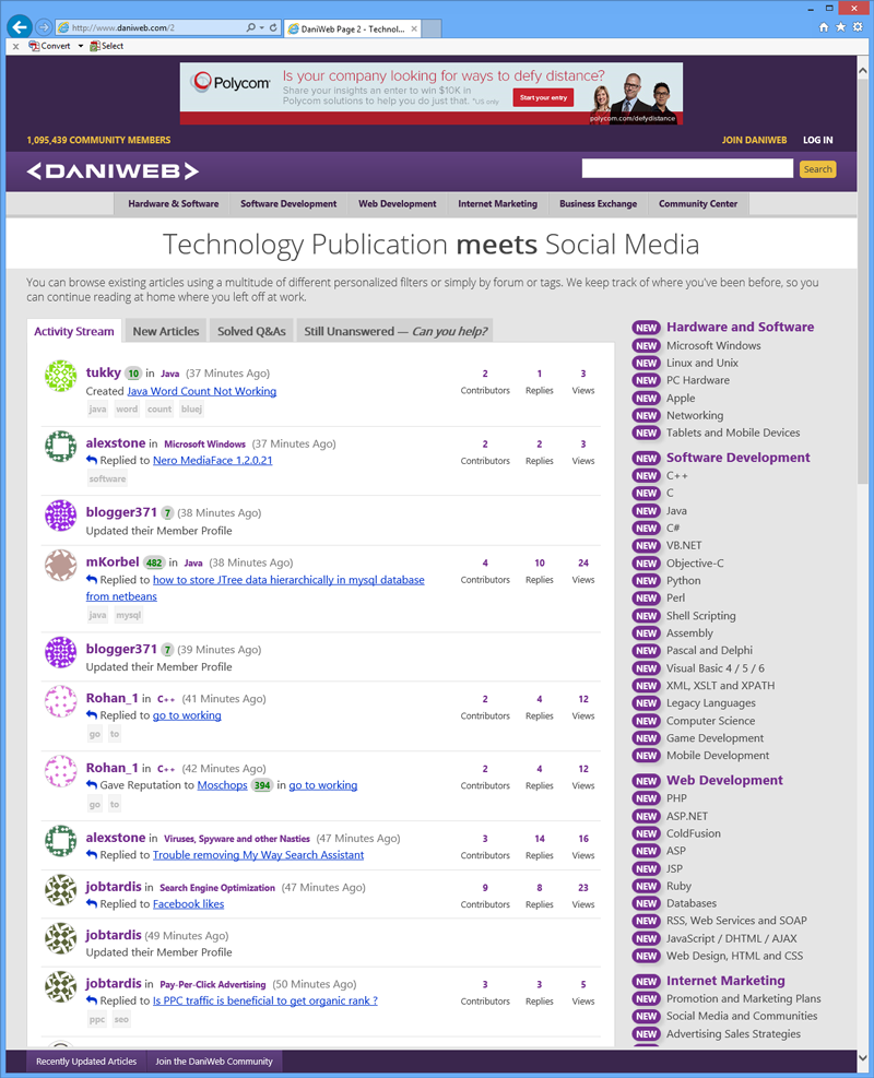
Nearly 5 am and I lost track of time and spent alllll night coding up our new homepage, which features our Activity Stream.

Secondly, there's now a 'New' tab within each of the forums to sort articles based on created date as opposed to last post date (which of course is the default).

<M/> commented: :D +0

Recommended Answers

All 71 Replies

Oh, and also, I know it's not that intuitive I guess, but when the activity stream tells you that someone replied to a thread, you can hover over the thread title to see a preview of the first post in the thread, and you can hover over the little 'reply' arrow icon to see a preview of the post that was just made.

commented: :D +0

I think that the earlier design was much better.
Anyways, this is also good design but i still say that the earlier was very much better.

That's my personal opinion.

commented: What about it don't you like? :) +0

I think that the earlier design was much better.

Agreed. It looks very chaotic, and imo the centering just doesn't work, especially since you don't use it anywhere else.

What do you mean by the centering? It's the same as every other page where the last column is centered?

UGH! That looks terrible! What browser are you using?! IE???

See attached for screenie in IE 10. I was able to reproduce behavior in IE 7/8/9 compatibility modes. Not sure how to replicate what you're seeing.

Oh, prit, dear, dear, prit ... Are you using any browser extensions to change the design around?

I'm not sure about how the name of the thread starter is more prevelant than the title of the thread. Maybe it's just something I need to get used to but as it stands I prefer thread titles to be more viewable than who has started the thread.

Are you using any browser extensions to change the design around?

No. IE11... plain and ahum simple.

div.thread div:first-child.left, div#sidebar div.status, div.top-list div.status 
{ 
    //center here appears to be it 
}

I beg to differ Prit, but your screenshot doesn't even show avatars.

Avatars is your own setting. Hidden with the sigs iirc.

Just tested, and yes, that's causing the issue. If I enable sigs then it shows correctly. So I beg to differ...

Stuugie,

It's not just who started the thread. The idea of the activity stream is that, instead of a list of forum threads, based on when they were last updated, like every other forum ... this actually tells a STORY about our community.

For example, pritaeas marked a thread solved, markjaiby joined the community, stultuske replied to an exisitng thread, harryroo created a new thread, Rohan_1 gave reputation to Moschops for his post in the go to working thread, etc.

The usernames aren't just the thread starter ... They are actually who the story is discussing. Check this out for more info:

http://www.daniweb.com/members/1/Dani/chat/2013/12/06

Member Avatar for Warrens80

I for one like it. Good job Dani

Member Avatar for Warrens80

It looks good on my ipad

Today's Most Active Members -- fades out so that I can't even read the bottom few lines. Was that on purpose?

Fixed and sorry about that Prit :)

AD, it's been like that for half a year. :)

AD, it's been like that for half a year. :)

Actually, this is the first time I bothered to read it, and then only because of this thread. Normally just go directly to the forums without looking at the home page.

Most members do. I'm constantly playing around with the homepage to find the perfect formula that attracts members.

I'd use the homepage more if Fred and the new discussion panels didn't take up so much room. Perhaps you could add a way to collapse those and store the preference in a cookie?

I'd use the homepage more if Fred and the new discussion panels didn't take up so much room

That is particularly true for the long introduction text when viewed on my mobile.

Apart from that, I'd love a way to hide the avatars.

This may be browser related but there is also a problem with overlapping of text. See pic.

Fred's a bad boy!

I think it's browser specific. What u usin', Stuugie?

Apart from that, I'd love a way to hide the avatars.

We've been moving away from this over the past few months as we emphasize membership and community.

We've got IE8 (only [Still]) at work. That's probably exactly what the problem is.

Just double checked. Yup, it looks fine in IE 9 which is still at least one revision back, so I think we're all good. It's not totally breaking.

OK, so now I ask. New homepage or old?

Be a part of the DaniWeb community

We're a friendly, industry-focused community of developers, IT pros, digital marketers, and technology enthusiasts meeting, networking, learning, and sharing knowledge.