Is this a bug, or are you seriously keeping this? It's horrible.

matrixdevuk commented: It's disgusting. +0

Recommended Answers

All 50 Replies

Seems pretty subjective to me. I don't have a problem with it. Then again, my eyes are quite a bit older than yours so perhaps that has something to do with it.

Seems pretty subjective to me

It always is ;)

I think the font size is too big.

I'm running a test to see if a larger OP font size has an affect on bounce rate and some other statistics.

I agree with prit, it's pretty vomit-inducing.

well, I'd state my opinion as well "It's too big" >.>

Can we change the font to Comic Sans also? Because that would just be too awesome.

Member Avatar for diafol

Bloody horrible. Cut it out Dani. You been messing with font sizes / faces elsewhere too? Seems like every time I visit, it looks a little different. But that large font has just got to go - urgh. It looks all blurry and minging too. Seriously, was any acid dropped before thinking that was a good look?

Everyone hates it that much, eh?? Geez, I don't think it's bad at all. That being said, however, I'm going with what Rev Jim and Prit have to say ... that it's always subjective. The only thing that never lies are actual statistics. I really want to continue my test for the next 24-48 hours and see if it makes a major impact to bounce rate.

commented: Not everyone. +0

OK, I'll bite. I don't want everyone mad at me. So my thought process is that someone comes into a thread from a Google search, and the very first thought that runs through their mind is, "What kind of page is this? Is there a question here? Is the question being asked the same as the problem I'm trying to solve?"

My answer was to run a test enlarging the OP post to make it the very first thing shouting at the user when they load the page. The result: after the first 12+ hours, we have so far seen the lowest bounce rate in over a year.

However, I'm fully willing to admit it might be a fluke, or just a random happenstance. I'm giving it some more time for the stats to even out.

And for everyone who absolutely hates the larger font ....... do you have any better solutions to achieve my goal?? Suggestions welcome. I'm open ...

BTW, I like the new social media buttons... except that they're too big.

I must be the exception, as the size doesn't bother me at all here (at least on the lappy and big screen, not tried the tablet yet)

Member Avatar for diafol

I accept your reasoning, however, on my monitor (a crisp 17") it looks really blurred and uncomfortable to read. And yes it's very subjective - I accept that too. It reminds me of my first year pupils writing their first report - oversized font and textart all over the place. OK, perhaps not that bad, but along that vein. However, if it works, then well done and I shall have to put up with it - either that or apply my own script over it.

The social media buttons look nicer, but I agree that they're too big - for me - who doesn't give a fig about them. I'm hoping that there will be an option to hide them in the profile page sometime.

The blurry look is the problem. Why isn't it the same font as the replies?

I don't mind the large buttons, I don't use any. Looks like it says fugin, close enough to fucking :) Why are the top ones yellow, and the bottom ones blue?

commented: fugin +1 he he +0
Member Avatar for diafol

fugin hell, missed that until you mentioned it!

The blurry look is the problem. Why isn't it the same font as the replies?

I didn't like the way it looked in the same font as the replies. I don't think that font tends to look good at larger sizes. So I instead opted for the font that we use for headings and subheadings, which I think looks better at larger sizes. Plus, the fact that it's our 'headings' font, I thought it would subliminally be considered 'important'.

That being said, I kept the social media icons in the same order the old ones were, based on popularity / usage. It's unfortunate that it says fugin. Or, perhaps, just a happy coincidence. :-P

Oh, and throughout the site, yellow buttons are used to indicate primary calls to action, and blue buttons are used to indicate secondary buttons / navigation / management / etc.

The sidebar buttons are yellow because they are specific to the article, and it's a primary call to action to share the article you're reading.

Thbe bottom buttons are blue because they are just a part of the shared footer, and are used to share the DaniWeb.com domain as a whole.

The social media buttons look nicer, but I agree that they're too big - for me - who doesn't give a fig about them. I'm hoping that there will be an option to hide them in the profile page sometime.

They are actually smaller than the old ones. The old ones were 90px high. These are only 60px high. Same width. They just look bigger because each button is just one big image as opposed to having the social media logo along with a counter.

Where these win is that, by no longer using the official widgets for Facebook, Twitter, Google+, and LinkedIn, we save a TON in page loading and resources without all of that javascript and all the tracking pixels and data mining involved. In all honesty, the number of external resources needed to generate an entire page was cut in half.

Member Avatar for iamthwee

In regards to the bluriness I came across this.

https://github.com/Glimpse/Glimpse/issues/711

Don't know if it helps.

I think it is a combination of the bold and that gradient effect you got going in the background, doesn't help readability IMO

The problem is that it's the same font as in that link ... Segoe UI. It's a Microsoft font that was specifically designed for the Windows 7/8 UI, and it looks great on Windows 7 and 8, but I guess other platforms don't play nice with it??

Member Avatar for diafol

Aha! I was wondering what you'd done. I noticed a massive improvement in speed. Ok, in that case I'm ok with it. My main bugbear was the load time - moot point now. Well done on that btw.

Still not sure about the yellow/blue though. Primary/secondary - flies over my head. But not a biggie.

Re: font - I think iamthwee has a point about the text on top of the gradient. Gives it a blurry look. I'm on W7 and have access to W8 - looks the same - blurry. Quite unpleasant. Sorry, am repeating myself, said my said.

Member Avatar for iamthwee

@Dani

I don't think it is segoe, so ignore the link I posted.

Your css file shows:

font-family: 'Open Sans', 'segoe ui', helvetica, 'lucida grande', lucida, tahoma, arial, geneva, verdana, 'ms sans serif', sans-serif;

So the first font it picks up for me is Open sans as I have it installed on my mac and it is still as blurry as hell, are you not seeing this? Maybe not being a windows 7/8 user, I am not (mac, linux or winXP depending on what time of day it is) When I inspected the element and de-selected bold the readability improved.

I noticed you have got anti-aliasing enabled so it isn't that either.

Just the combination of the bold and that gradient... Hmm not sure.

Get rid of the bold for sure, just make the font size bigger.

Member Avatar for diafol

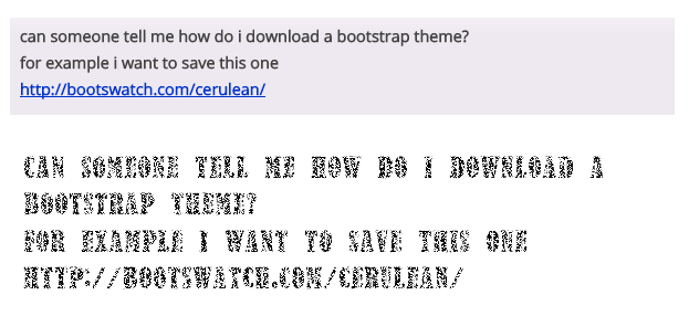
Well, it looks like this on my W7 laptop. I think my font below it is an improvement...

which_font.png

I really don't mind it as long as it's just one size bigger than the actual answer text.

I think the bigger problem is identifying what's the question/who is asking it etc. Daniweb is one of the few forums I have seen that has a lot of "stuff" between the question title and the actual content. Look at any other forums like dreamincode, SO and so on. You have the question title which is immediately followed by a description/actual question. Or in case of some forums it's followed by small buttons or links. In the case of Daniweb, we have the title followed by a lot of free space and then a row of pretty big buttons.

Not to mention the way reputation is shown for OP is different when compared to the actual answers. Wouldn't having a special highlight/border solve the issue?

Just a thought, I'm not exactly claiming that this might be the reason but I wouldn't disagree if someone claims that this forum is unfamiliar, something which is what you should really aim for (familiarity) so that people hopping between forums feel right at home as opposed to confused.

Member Avatar for diafol

I have to agree with SOS - the amount of crud between the OP and the replies is substantial. Also nothing to make the OP obvious - other than the big font. The avatar below the OP may be the issue. When I want to see who started the thread, my eyes swivel to the side - force of habit maybe - but I haven't got used to the new style yet.

I see what you're saying about there being a lot of white space between the title and the OP. My challenge is that I need to find a way to still keep the text ad above-the-fold, and also have the page navigation be above the first post. The big buttons are just there because there was a lot of empty white space between the ad and the pagination, and so it was a good spot to stick them. Or so I thought.

Member Avatar for diafol

For the record - I don't think SO is that clear either. On those rare SO threads that do have pagination, the OP is repeated at the top of each page with the pagination links appearing directly below the OP (and repeated at the bottom). Handy - but possibly a side-effect is to make the OP more obvious. Not sure how that helps a single page thread though.

I've removed, or so I think, the blurry look. Is this a bit better?

Be a part of the DaniWeb community

We're a friendly, industry-focused community of developers, IT pros, digital marketers, and technology enthusiasts meeting, networking, learning, and sharing knowledge.