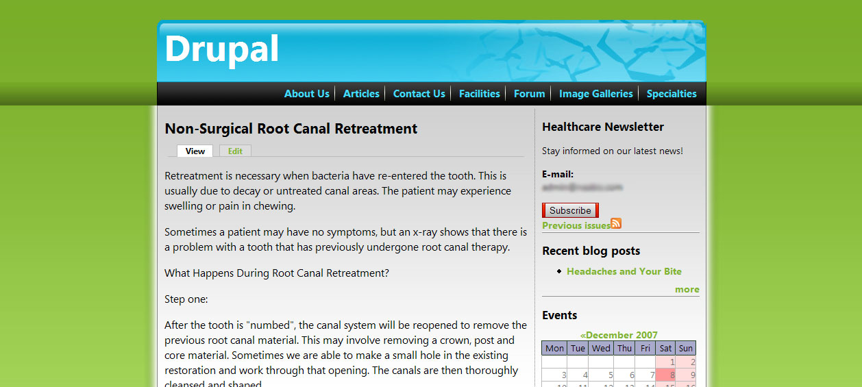
I developed a theme for Drupal. Its my first proper theme ever. But I feel its not so good. For some reason it doesn't look 'professional'. Could you criticize it please? I've included a screenshot...I'll put up a working model if required. Thanks.

Dani AI

Generated

Good first effort, — several replies already sketched useful directions, so here is a compact, practical plan that builds on those comments and turns them into changes you can apply quickly.

Start with a tight design system: choose one neutral (background), one primary (branding/CTAs), and one accent. Limit the palette to 3-4 hues plus neutrals and use a tool like Adobe Color or the Material Design color system to generate coordinated swatches. Confirm legibility by testing text and controls with the WebAIM Contrast Checker (aim for 4.5:1 for body text). Small palette changes often lift the whole theme.

Fix spacing and hierarchy next. Adopt a single spacing unit (an 8px grid is common), apply consistent padding/margins, and set a simple typographic scale so headings, captions, and body are visibly ordered. Keep line length around 60-75 characters for comfort. For practical guidelines on visual hierarchy and readable text, see Nielsen Norman Group on visual hierarchy and the MDN typography resource: and MDN Styling Text.

Finally, add one unique element so the theme stops feeling generic: a distinctive header treatment, a simple pattern, refined iconography, or a subtle motion on hover. Build a tiny style guide (tokens for colors, type, spacing, button states) so future tweaks stay consistent. A working demo or screenshot after these changes makes feedback far more actionable — it helps reviewers like , , and point to specifics instead of impressions.

Recommended Answers

All 8 Replies

I think that is better than some of the "professional" overkill many sites use.

I think the colors don't really match up. You've got green, black and grey, blue and red going on in there.

Additionally, the green you chose is very hard and doesnt mesh well with the other colors.

I noticed some lines in the green backround and black horizontal bar, but I think it's your gradients reacting to the lower image-quality output.

I'm not trying to be harsh or anything, but this is not something I would use. And I've been known to produce and use some of the ugliest designs known to man.

Don't be discouraged by my words though, because although my designs still suck, they're not so ugly anymore. What I'm saying is that you learn what goes with what as you go along.

@Midi
Thanks!


You're right. It's not something I'd use either! It's really hard to make good design. It just doesnt come naturally to me! But I check out all the inspiration sites, I can easily admire themes. But I really can't point out whats wrong.

Thanks anyway. I'll work on bettering my theming skills.

Hi,

First of all there is not format at all based on that color combination also. Sorry if i gvn harsh words to u.

kavitha kesav

Not bad for the first Drupal Theme I wish I could even design theme like that. On the other hand the actual theme looks generic. by comparing it to all the other themes it kinds similar except for the color combination. Thats what I want to learn is how do design Drupal themes. Most of my sites use Drupal. Great start

The theme seems to be lacking something actually. I just couldn't think what it is. But it lacks something. But overall, it kinda nice.

Neat. The structure is a bit of a professional plus funky colors.

yes

Be a part of the DaniWeb community

We're a friendly, industry-focused community of developers, IT pros, digital marketers, and technology enthusiasts meeting, networking, learning, and sharing knowledge.