Hi,
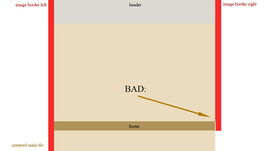
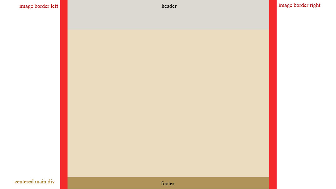
I'm having trouble with this layout (attached image). I need to have images as borders, but I don't want to use multiple backgrounds in CSS3 (small browser support). I tried to make two floating divs, but then I deleted it because I can't set width: 100% - my main div needs width: auto. Then I tried two main divs - one that will have left top tiled background image, the other with right top tiled background image. This produced a bad thing - footer and right border moved about 60px up (attached image).
CSS:

.body {
position: relative;
top: 0;
width: 1022px;
margin-left: auto;
margin-right: auto;
min-height: 100%;
height: auto;
background: black url(../images/border.png) repeat-y left top;
padding-left:11px;
}
#rightborder {
background: black url(../images/border.png) repeat-y right bottom;
height: 100%;
}
.header {
width: 1000px;
height: 118px;
background: #000000 url(../images/header.png) no-repeat center top;
position: relative;
left: 11px;
}
.footer {
width: 1011px;
height: 38px;
background: #000000 url(../images/mainfooterbckg.png) repeat-x left top;
position: relative;
bottom: 0;
left: 0;
overflow: auto;
}
.footer img { 
display: block; 
margin-left: auto; 
margin-right: auto; 
}

HTML:

<div class="body">
<div id="rightborder">
<div class="header"></div>
<div class="footer"><img src="../images/copyright.png"/></div>
</div>
</div>

Do you know how to fix it? Thanks :)
-and sorry for my English if there were any mistakes
Dani AI

Generated

Two facts explain the symptom saw (right border and footer moving up): percentage heights only work when the parent has an explicit height, and using relative offsets (for example position: relative with bottom: 0) only shifts an element in its normal flow — it does not pin it to the container bottom. The reliable ways to get vertical, tiled image borders that do not disturb document flow are: (A) draw the borders as absolutely positioned side elements (or pseudo-elements) inside a positioned wrapper, or (B) use CSS multiple backgrounds on the wrapper if CSS3 support is acceptable.

A compact, robust pattern that avoids height:100% problems is to give the page wrapper position: relative and create the borders as absolutely positioned children (or use ::before / ::after). Reserve the same amount of horizontal space as the border using padding on the wrapper so content does not overlap the images.

/* wrapper */
.wrap {
  position: relative;
  width: 980px;
  margin: 0 auto;
  padding: 0 12px; /* reserve border space */
  background: #000;
}

/* vertical tiled borders */
.wrap::before,
.wrap::after {
  content: "";
  position: absolute;
  top: 0;
  bottom: 0;
  width: 12px;
  background-repeat: repeat-y;
}

.wrap::before { left: 0; background-image: url("left-border.png"); }
.wrap::after  { right: 0; background-image: url("right-border.png"); }

If modern browser support is fine, a simpler single-element approach uses CSS multiple backgrounds:

.container {
  width: 980px;
  margin: 0 auto;
  background:
    url("left-border.png") left top repeat-y,
    url("right-border.png") right top repeat-y,
    #000;
  padding: 0 12px;
}

Avoid positioning the footer with position: relative; bottom: 0; — that moves it visually rather than anchoring it. If floats are used anywhere, clear them (clearfix or clear: both) so the footer stays after content. For details on positioning, pseudo-elements and multiple backgrounds see MDN: position, ::before and Using multiple backgrounds.

Note: marked the thread SOLVED; posting the final working code helps others with the same problem.

SOLVED

Be a part of the DaniWeb community

We're a friendly, industry-focused community of developers, IT pros, digital marketers, and technology enthusiasts meeting, networking, learning, and sharing knowledge.