Member Avatar for TheNinjaForce

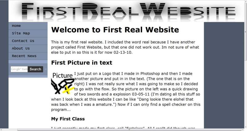
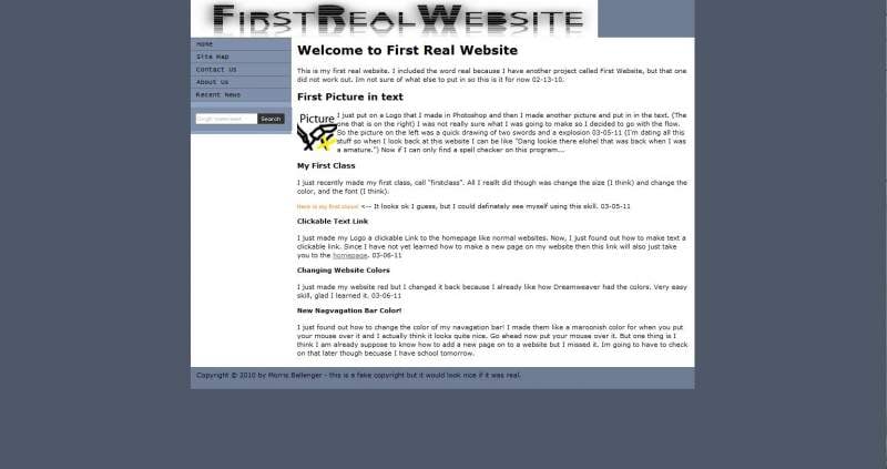
I am trying to get my Logo to work right on my website and it wont resize right at different zooms. Like I went into my internet browser at 100% 75% and 150% and none of them looked right what could I be doing wrong. (I am using dreamweaver.)
www.theninjaforce.com

Recommended Answers

All 20 Replies

What is your goal? What width do you want it to have?

Member Avatar for TheNinjaForce

See when you zoom in and doom out I want it to just fit with the rest of the screen.

"fit with the rest of the screen", does that mean 100% width? Be clear, please.

Member Avatar for TheNinjaForce

Ummm...I mean how like when you go to it and you zoom in and out do you notice how it is doesnt look right.

Member Avatar for TheNinjaForce

Can I attach pictures?

Member Avatar for TheNinjaForce

To this thread?

Yes. There's an attachment sign somewhere if you click on advanced editor.

Member Avatar for TheNinjaForce

Here is how it looks at 69% and at 144%.

Member Avatar for TheNinjaForce

See how the logo is too little and then too big?

Yes, but "does not look right" and "fit with the screen" are not clear descriptions. Well. Did you try to give it a width of 100%?

commented: Thank you! +1
Member Avatar for TheNinjaForce

Ok I will try

Member Avatar for TheNinjaForce

I GOT IT THANKS YOU ARE A AMAZING PERSON!!!!!

(to anybody reading this just put the width at 100% not width and height.)

When you zoom in the text gets bigger and the confines of the div the main text is in make it wrap, as you'd expect. Your logo on the other hand just gets bigger, and as the div it is in has no constraint on size, that two gets bigger. Try applying a max and min width to the header div, the same as the container div.

Okay, nice it works!
Sorry for the screaming :)

Member Avatar for TheNinjaForce

When you zoom in the text gets bigger and the confines of the div the main text is in make it wrap, as you'd expect. Your logo on the other hand just gets bigger, and as the div it is in has no constraint on size, that two gets bigger. Try applying a max and min width to the header div, the same as the container div.

twiss already fixed it for me

you have worse problems than that
fixed column looks ridiculous on widescreen monitors, pushes content offscreen in small windows or displays

px are not layout tools px are used for images
current best practice for layout is em or % scalar dimensions that adjust to window size screen resolution and user preference
these standard test beds may assist you http://analyze.websiteoptimization.com/authenticate.php?url=http://www.yoursite.com&/ Speed tweaks

http://validator.w3.org/check?uri=http%3A%2F%2Fwww.yoursite.com&charset=%28detect+automatically%29&doctype=Inline&group=0 html check

http://jigsaw.w3.org/css-validator/validator?uri=http%3A%2F%2Fwww.yoursite.com&profile=css21&usermedium=all&warning=1&lang=en CSS check

http://demo.opera-mini.net/demo.html?www.yoursite.com handheld

http://www.browsershots.org other browsers
many problems (if present) will show
serious code errors in the w3c validator sites will produce blankscreens in browsershots

Valid code does not ensure the site will work ...
Invalid code ensures the site will not work ...
.. in all browser OS combinations

not all layouts work in handheld devices
strictly code based, you understand your content more than I would

site map: is a machine readable xml file for search engines, human readable html sitemap indicates you have a crappy menu system

Its by far NOT the worst, but you may as well begin at the top

commented: Shame most newbie web developers can't appreciate the merit of this post +15
Member Avatar for TheNinjaForce

you have worse problems than that
fixed column looks ridiculous on widescreen monitors, pushes content offscreen in small windows or displays

px are not layout tools px are used for images
current best practice for layout is em or % scalar dimensions that adjust to window size screen resolution and user preference
these standard test beds may assist you http://analyze.websiteoptimization.com/authenticate.php?url=http://www.yoursite.com&/ Speed tweaks

http://validator.w3.org/check?uri=http%3A%2F%2Fwww.yoursite.com&charset=%28detect+automatically%29&doctype=Inline&group=0 html check

http://jigsaw.w3.org/css-validator/validator?uri=http%3A%2F%2Fwww.yoursite.com&profile=css21&usermedium=all&warning=1&lang=en CSS check

http://demo.opera-mini.net/demo.html?www.yoursite.com handheld

http://www.browsershots.org other browsers
many problems (if present) will show
serious code errors in the w3c validator sites will produce blankscreens in browsershots

Valid code does not ensure the site will work ...
Invalid code ensures the site will not work ...
.. in all browser OS combinations

not all layouts work in handheld devices
strictly code based, you understand your content more than I would

site map: is a machine readable xml file for search engines, human readable html sitemap indicates you have a crappy menu system

Its by far NOT the worst, but you may as well begin at the top

What you talkin bout willis? You just confused the heck out of me?

If your web site was built by an 8 year old, it would be appropriate,
it does not approach the possibilities available,

this is a widescreen monitor 2600px wide, your single column fixed design looks ridiculous floating in the middle
on a phone/tablet, the content is pushed offscreen right,
in a partscreen window, or small display content is pushed offscreen right
users do not scroll sideways, mice do not have hscroll wheels, but they will follow a page down forever
properly laid out in em or % the logo issue would not arise, the page layout would auto adjust to window size

replace yoursite.com in the inactive links above with your uri, and follow the instructions to fix the site up, to current code standards
There are many 'professional' sites far worse than yours,
there are commercial sites that do not display in google chrome, firefox or safari, because they were built using IE specific code, there are other sites that refuse IE because the developers think they are superior to the 70% of users still using IE

your site, its actually pretty good, it displays in most browsers,
just that you might as well learn best practice, (its simpler to code) and produce a good site, instead of just a site

dunno if you get this, havent replied to a solved thread b4

instead of having the image with a. number , make it a percent. that way no matter how much you zoom, it stays same size

Example

<img src="jdkkd.com/img.png" width="30%">
Member Avatar for TheNinjaForce

If your web site was built by an 8 year old, it would be appropriate,
it does not approach the possibilities available,

this is a widescreen monitor 2600px wide, your single column fixed design looks ridiculous floating in the middle
on a phone/tablet, the content is pushed offscreen right,
in a partscreen window, or small display content is pushed offscreen right
users do not scroll sideways, mice do not have hscroll wheels, but they will follow a page down forever
properly laid out in em or % the logo issue would not arise, the page layout would auto adjust to window size

replace yoursite.com in the inactive links above with your uri, and follow the instructions to fix the site up, to current code standards
There are many 'professional' sites far worse than yours,
there are commercial sites that do not display in google chrome, firefox or safari, because they were built using IE specific code, there are other sites that refuse IE because the developers think they are superior to the 70% of users still using IE

your site, its actually pretty good, it displays in most browsers,
just that you might as well learn best practice, (its simpler to code) and produce a good site, instead of just a site

dunno if you get this, havent replied to a solved thread b4

Thank you I will try that.

Be a part of the DaniWeb community

We're a friendly, industry-focused community of developers, IT pros, digital marketers, and technology enthusiasts meeting, networking, learning, and sharing knowledge.