
good morning all!
i'm struggling at the present time to style a drop down select menu that will fit into my current design for mobile devices (i.e. especially the iPhone right now)
http://i.stack.imgur.com/Gn7se.png
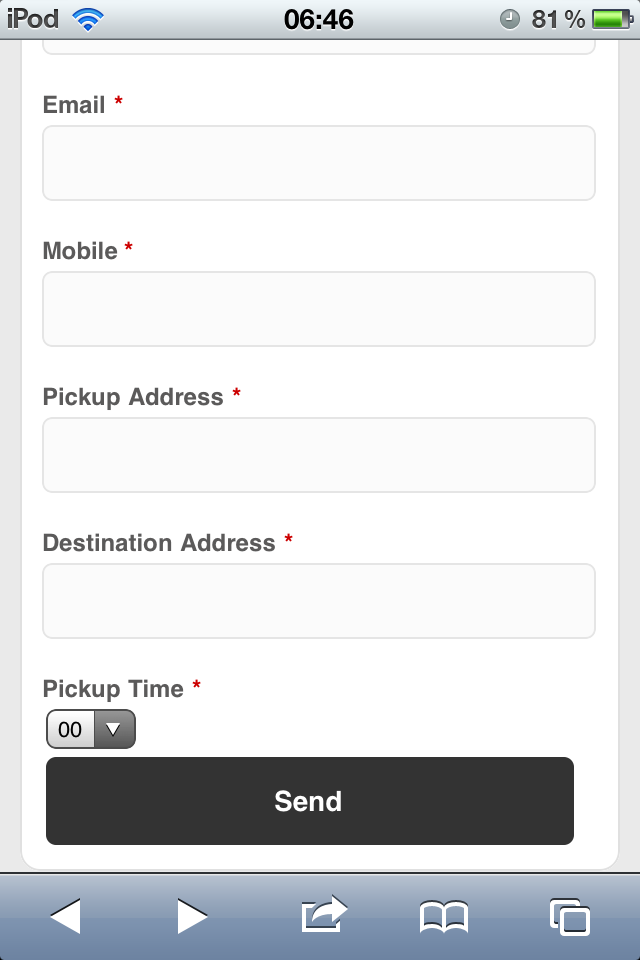
^^^ this is how it looks like at present time on my iPod
http://i.stack.imgur.com/wsEtQ.png
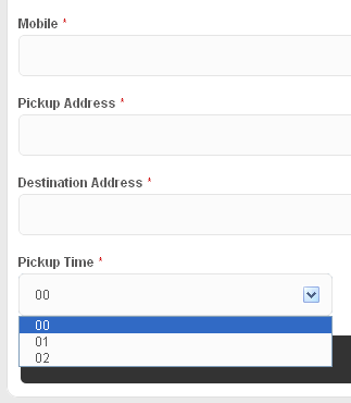
^^^ this is how it looks at present on Google Chrome
i would really like for the iPod select drop down to mirror the desktop drop down if possible as demonstrated with the textfields but i seem to be stuck at a hard point.
please find the current css code i am using below:
/************************************************************************
FORM STYLING
*************************************************************************/
button.button{
    font-size: 14px;
    font-weight: bold;
    background-color: #333;
    width: 95%;
    -webkit-border-radius: 5px;
    -moz-border-radius: 5px;
    padding: 10px;
    text-align: center;
    color: #CCC;
    border: none;
}
input, textarea{
    font-family:Helvetica,Arial,sans-serif;
    -webkit-border-radius: 5px;
    -moz-border-radius: 5px;
    color:#555555;
    background:#FBFBFB none repeat scroll 0 0;
    border:1px solid #E5E5E5;
    font-size:12px;
    line-height: 16px;
    margin-bottom:16px;
    margin-right:6px;
    margin-top:2px;
    padding:10px;
    display: block;
    width: 92%;
}
select {
    font-family:Helvetica,Arial,sans-serif;
    -webkit-border-radius: 5px;
    -moz-border-radius: 5px;
    color:#555555;
    background:#FBFBFB none repeat scroll 0 0;
    border:1px solid #E5E5E5;
    font-size:12px;
    line-height: 16px;
    margin-bottom:16px;
    margin-right:6px;
    margin-top:2px;
    padding:10px;
    display: inline-block;
    width: 30%;
}
label{
    font-size: 12px;
    font-weight: bold;
    color:#5B5A5A;
    display: block;
}
    label span, .required {
        color: #C00;
    }
i would appreciate any help in resolving this css conundrum!
many thanks in advance