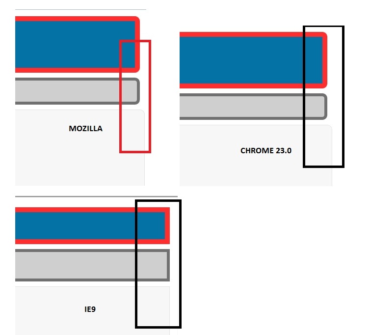
I would like to know why the content section is taking more width in my design page?
Here is my CSS code :

body {
    font-family: Verdana, Arial, Helvetica, sans-serif;
    font-size: 13px;
    color:#414141
}

p {
    padding-left: 10px;
    padding-right: 10px;
}

#wrapper {
    width: 100%;
    min-width: 100%px;
    max-width: 100%px;
    margin: 0 auto;
}

#headerwrap {
    width: 100%;
    float: left;
    margin: 0 auto;
}

#header {
    height: 75px;

    margin: 5px;
}

#navigationwrap {
    width: 100%;
    float: left;
    margin: 0 auto;
}

#navigation {
    height: 100%px;
    background: #CFCFCF;
    border-radius: 10px;
    border: 6px solid #707070;
    margin: 5px;
}

#contentliquid {
    float: left;
    width: 100%;
    height: 500px;

}

#contentwrap {
    width: 100%;
    float: left;
    margin: 0 auto;
}

#content {
    padding-top: 40px;
    padding-left: 30px;
    background: #F7F7F7;
    border-radius: 10px;
    border: 1px solid #e3e3e3;
    margin: 5px;
    height: 450px;
    width: 100%;
}


#footerwrap {
    width: 100%;
    float: left;
    margin: 0 auto;
    clear: both;
}

#footer {
    height: 60px;
    margin: 5px;
}​

Dani AI

Generated

The extra width comes from the CSS box model and a few small CSS mistakes visible in the code. As pointed out, padding, borders and margins are being added on top of the declared width under the default content-box model; that makes an element with width:100% actually overflow its parent. ’s suggestion to use pixel widths is also valid — it avoids fractional rounding — but both approaches need a couple of clarifications to eliminate the remaining 2–4px.

A short checklist of fixes and clarifications tied to the thread:

  • Apply a global box-sizing reset at the very top of the stylesheet (so padding/border are included in the element’s width). Also ensure pseudo-elements inherit that rule, otherwise ::before/::after can still cause layout drift. This is the same idea recommended but must be placed globally, not inside #content.
  • Remove margins from elements that are set to 100% width (margins sit outside the box-sizing calculation and will still add extra space). Either reduce the width to account for margins, move spacing inside a wrapper, or use a fixed pixel width if exact alignment is required (as suggested).
  • Fix obvious typos: declarations like "100%px" or "100%px" are invalid and will be ignored by browsers; use correct units (for example, 100% or 500px). A missing/incorrect DOCTYPE or IE compatibility mode can also make IE behave differently, so confirm the document is in standards mode.

The small remaining gap is frequently caused by subpixel rounding when using percentage widths, scrollbars, or an unexpected margin/border on a child element. Browser devtools’ computed-box view will reveal which property is contributing to the overflow. For pixel-perfect cross-browser parity, prefer a single fixed-width wrapper or explicitly subtract combined padding/border/margin from percentage widths.

Recommended Answers

All 12 Replies

It is due to the fact that padding, borders and margins all add to the overall width of the div they are applied to (if you remove all these elements from your content div you will see what I mean). One solution is to add this to the top of your stylesheet (I am not saying this is the correct thing to do)

* {
  -webkit-box-sizing: border-box;
  -moz-box-sizing: border-box;
  box-sizing: border-box;
}

Otherwise you need to calculate your margins, borders and padding as percentages and reduce the overall width of the div by the total of these percentages.

@simplupixie

Thanks a lot for the reply. But the problem is same code is running perfectly in IE9. It creates problems in Mozila Firefox and Chrome.

I would like to know the reason behind this and i have set width 100% for header,navigation,content and footer. I mean for all.

Let me know where should i change in order to GET the result in ALL three listed browsers.

Have you actually tried what I suggested as the issue of padding, margins and borders being added to a div width only happens in Firefox and Chrome?

Also, you haven't got any padding, margins or borders combined with width of 100% on your header, navigation or footer as you say you have, what you have is outer containers (i.e. #navigationwrap) with a width of 100% and the margin, padding and border applied to the inner container (i.e. #navigation), this is not the same as having one div (as in your #content) that has all of these elements and therefore adds all the 'widths' together to form an overall width.

@simplupixie

Yes, i added your code into (#content). It works nearly expected. But still, there is just additional width like 2 or 4 px. I don't know why. But quite better than before. Thank you so much.

Actually, the problem you have is caused by the width, which you have set to 100%. The div element ist now width+padding+margin+borders. This is definitly more than 100%.

I would suggest you make use of px or em when defining the width. Only then you can make precise definition of the total width.

If you don't know the actual pixel size, then simply omit the padding. Then place another div into your content and define padding or margin for that element.

This should solve your issue.

In order to prevent misunderstandings:

#content {
/*padding-top: 40px; omitted*/
/*padding-left: 30px; omitted */
background: #F7F7F7;
border-radius: 10px;
border: 1px solid #e3e3e3;
/*margin: 5px; omitted /*
height: 450px;
width: 100%;
}

#content > div{
margin: 45px 5px 5px 35px;
}

Your content div had a margin of 5 Pixels. Besides there was a padding of 40px at top and 30px on the left.

I placed a div inside your content and gave it a margin of 5px on all sides + 40 on top and 30 on the left.

Good luck!

Thanks a lot. It sounds really good. I have note your code and take into the account. But it changes the format of the page. I got content part is not set as earlier. Is it possible to design the page like "CONTENT OF PAGE" automatically sets height according to to table height or other elements of the data.

I would like to set width same for all.

Once again, thanks for your time.

Can you give us a link to the page in question?

BORDER_CSS

body {
    font-family: Verdana, Arial, Helvetica, sans-serif;
    font-size: 13px;
    color:#414141
}

p {
    padding-left: 10px;
    padding-right: 10px;
}

#wrapper {
    width: 100%;
    min-width: 100%px;
    max-width: 100%px;
    margin: 0 auto;
}

#headerwrap {
    width: 100%;
    float: left;
    margin: 0 auto;
}

#header {
    height: 75px;
    background: #0572a5;
    border-radius: 10px;
    background-color: #0572a5;
    -moz-border-radius-topleft: 10px;
    -webkit-border-top-left-radius: 10px;
    -moz-border-radius-bottomright: 10px;
    -webkit-border-bottom-right-radius: 10px;
    border: 10px solid #FE2E2E;
    padding: 10px;    
    text-align:center; 
    color:#FFFFFF;
    font-size:20px;
    margin: 5px;
}

#navigationwrap {
    width: 100%;
    float: left;
    margin: 0 auto;
}

#navigation {
    height: 100%px;
    background: #CFCFCF;
    border-radius: 10px;
    border: 6px solid #707070;
    margin: 5px;
}

#contentliquid {
    float: left;
    width: 100%;
    height: 500px;

}

#contentwrap {
width: 100%;
float: left;
margin: 0 auto;
}


#content {
padding-top: 40px;
padding-bottom: 30px;
background: #F7F7F7;
border-radius: 10px;
border: 1px solid #e3e3e3;
margin: 5px;
height: 450px;
width: 100%;
-webkit-box-sizing: border-box;
-moz-box-sizing: border-box;
box-sizing: border-box;
}


#footerwrap {
    width: 100%;
    float: left;
    margin: 0 auto;
    clear: both;
}

#footer {
    height: 60px;
    background: #0572a5;
    border-radius: 10px;
    background-color: #0572a5;
    -moz-border-radius-topleft: 10px;
    -webkit-border-top-left-radius: 10px;
    -moz-border-radius-bottomright: 10px;
    -webkit-border-bottom-right-radius: 10px;
    border: 10px solid #FE2E2E;
    text-align:center; 
    color:#FFFFFF;
    font-size:16px;
    margin: 5px;
}​

Can anyone have idea to get the solution?

The CSS I gave you for box-sizing is supposed to be at the top of your CSS on its own, not in one of your other divs (which is why it has the star, not a div name as it is to apply to everything in the website) so take it out of #content.

* {
  -webkit-box-sizing: border-box;
  -moz-box-sizing: border-box;
  box-sizing: border-box;
}
body {
font-family: Verdana, Arial, Helvetica, sans-serif;
font-size: 13px;
color:#414141
}

/* The rest of your CSS here

Thanks a lot.

Be a part of the DaniWeb community

We're a friendly, industry-focused community of developers, IT pros, digital marketers, and technology enthusiasts meeting, networking, learning, and sharing knowledge.